15. Color, text, and annotations in mapping
Color
As usual, Lisa Charlotte Muth has done great, simple roundups of working with color: see Muth (2024b) and Muth (2024a).
In data visualization, you’ll generally need to put something on your map besides just boundaries. One of the big ways you’ll do this is by making choropleths or other thematic maps.
With a choropleth, the main encoding for your data is the color. Color is generally not read as accurately as encodings like length, position, and angle, so you need to weigh some pros and cons before deciding to make a choropleth. You can maximize the legibility of your color—wide variation in lightness and saturation, some variation in hue.
Here’s an example of a choropleth with a bad palette. It’s not incorrect as far as how the values are encoded to color, but it’s not good. Why not? Try to change the assignment of bad_pal to make it better.
acs_sf <- tracts_sf |>
  left_join(acs, by = c("geoid" = "name", "county")) |>
  st_transform(2248)

bad_pal <- RColorBrewer::brewer.pal(n = 5, name = "YlGnBu")[c(1, 5)]

ggplot(acs_sf, aes(fill = foreign_born)) +
  geom_sf(linewidth = 0, color = "white") +
  scale_fill_gradient(low = bad_pal[1], high = bad_pal[2])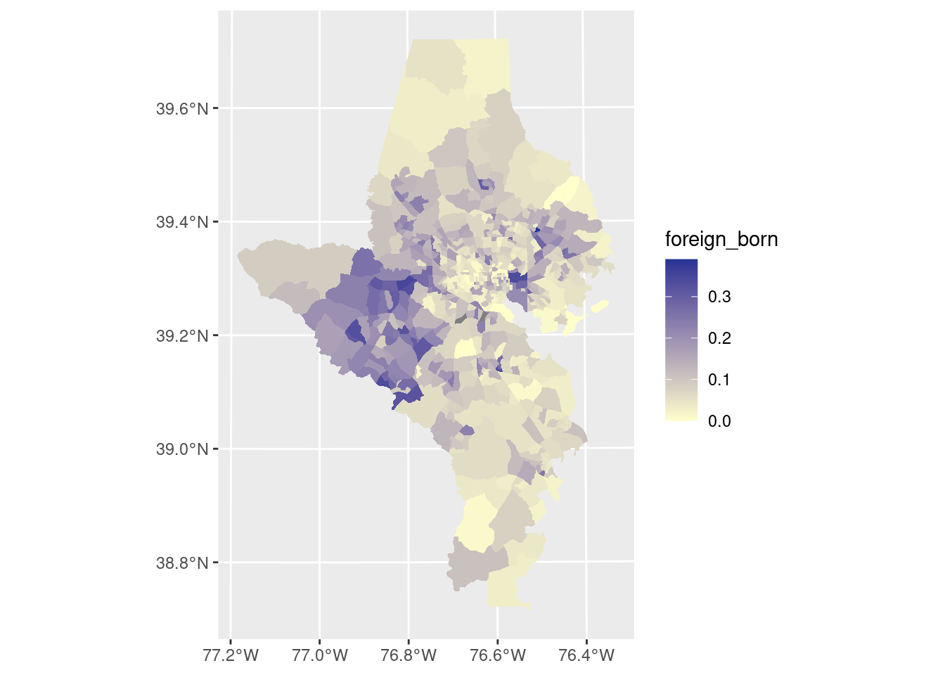
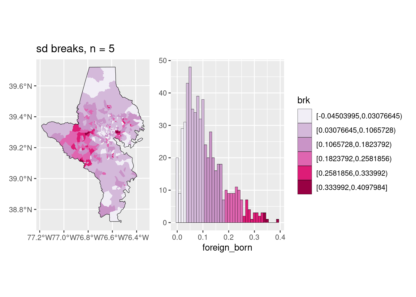
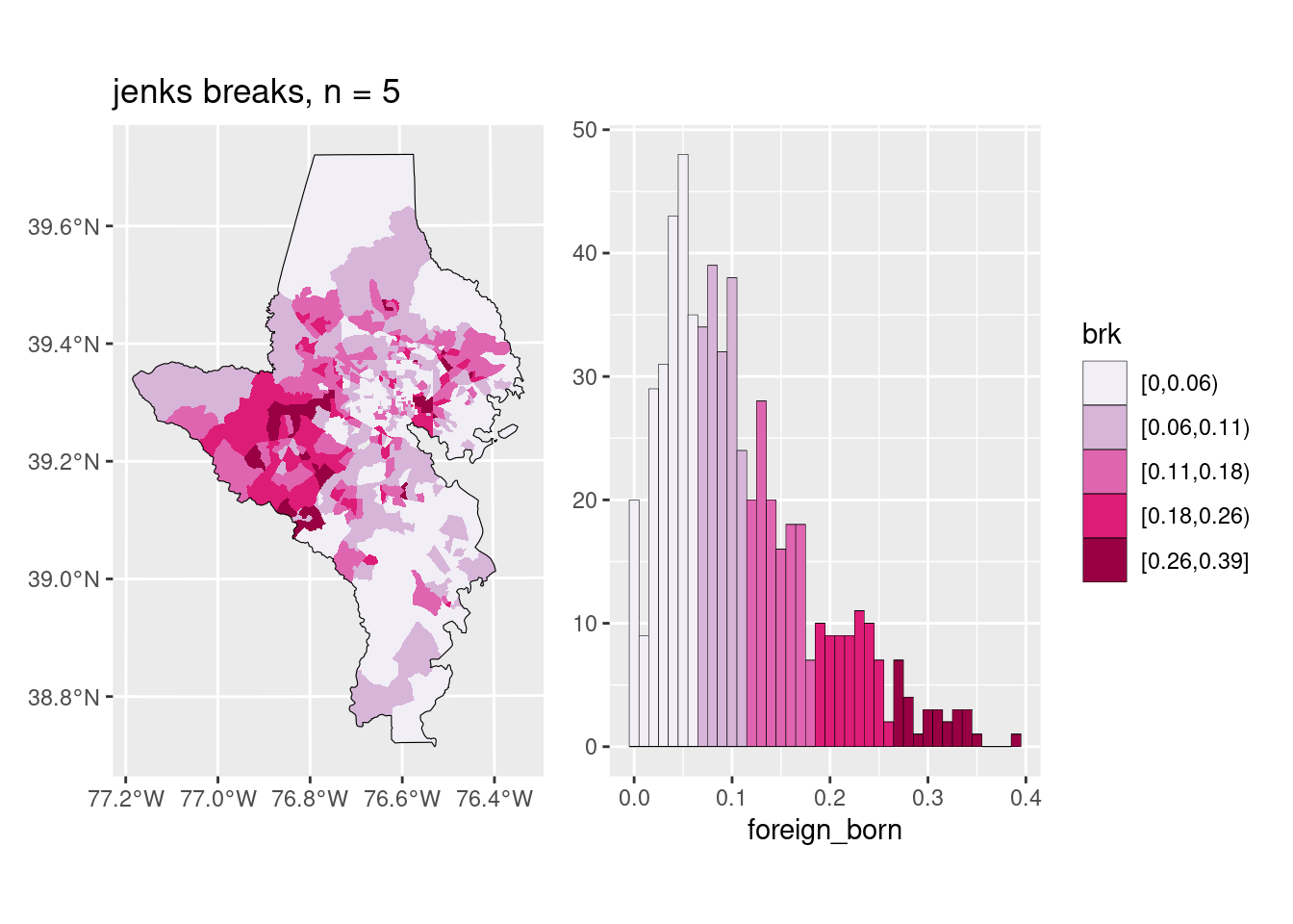
Breaks
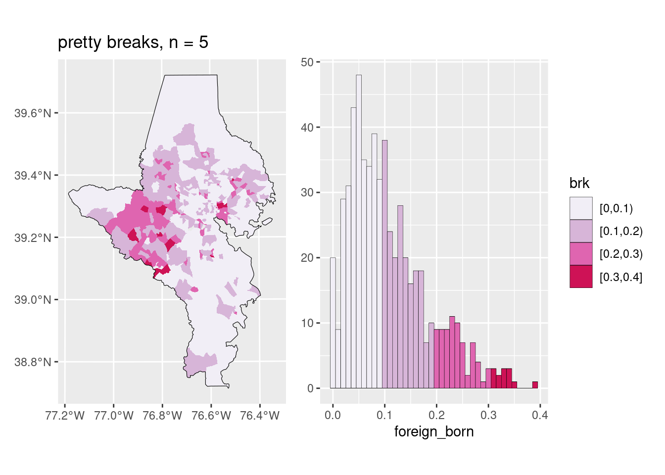
The big decision is a choropleth is whether you want to keep the color scale continuous or cut it into bins, and if so, how. I almost always cut my choropleths into bins, but some people argue against it. Color scales broken into bins can be easier to read quickly, but you do lose some of the granularity. This is the part that Lisa Charlotte Muth called a “compromise between truthfulness and usefulness”, and it’s one of those decisions you make as a data viz designer that will impact how the data are perceived.
There are many different algorithms for deciding on breaks, and some are more appropriate than others depending on the data. In my day job, I almost always use natural breaks (also called Jenks breaks after the statistician who came up with them); these are well-suited for showing skewed distributions, and since most of my work is about inequality of various sorts, it’s often a good choice. The downside is the breaks aren’t obviously clear or easy to explain (some people say if you’re going to cut your data, you need to explain the breaks, and I never do…). On the other hand, if a value ranges from 0% to 50%, and you break it into 0-9, 10-19, …, it might not show the pattern in the data as well but it’s easy to understand (these are usually called pretty breaks).
You should also inspect whether the bins make sense and are useful: if you have a value that ranges from 0% to 10%, are 5 different bins really that important? Maybe they are for something where any increase is urgent, like child lead poisoning, but in many cases it might not be. Muth’s posts on color give examples of this as well.
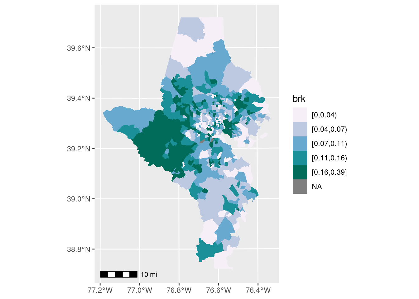
There are several functions that will help you cut your data into breaks (including base R’s cut); I wrote one in a work package just for Jenks breaks. The classInt package has several of these algorithms, and now has a function to easily cut your data up for you.
pal <- RColorBrewer::brewer.pal(n = 5, name = "PuBuGn")

choro1 <- acs_sf |>
  mutate(brk = classInt::classify_intervals(var = foreign_born, n = 5,
                                            style = "quantile")) |>
  ggplot(aes(fill = brk)) +
  geom_sf(linewidth = 0, color = "white") +
  scale_fill_manual(values = pal)

choro1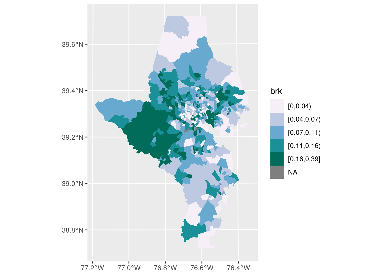
The function to make this choropleth-histogram exploration plot is in the lab.
Does this scale?
Sometimes you choose an algorithm for your data that doesn’t work well once you change something—maybe you zoom out to include more areas, or you want a different number of breaks. If you switch to a larger area (e.g. all tracts in the state) or a smaller area (e.g. all tracts in Howard County, only 59), you might need to adjust the algorithm and/or number of bins. It also, once again, might depend on your purpose: a planning group looking at towns in a small region might only want to know relative high, low, and middle values (3 bins), whereas the state’s public health department might need much more granular breaks (5 or maybe more bins).
Text
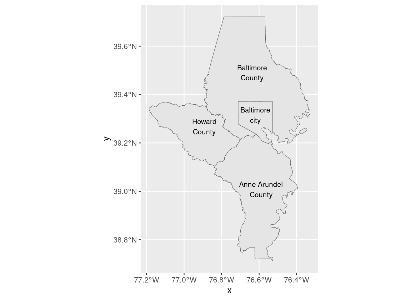
You wouldn’t want to put text labels on every tract, because there would just be too many, but you could on something with fewer geographies, like counties in the metro area. We can also start using boundaries to give context and make things easier to read. You can use geom_sf_text to place labels near the centroid of each shape.
Annotations
I usually don’t use scales and north arrows because it’s just not relevant to my usual audience. If I were in a field like planning or environmental engineering, I’d probably use them all the time. The package ggspatial has ggplot add-ons for this. Here’s an example of the scale annotation with the defaults: