3. Visual encoding
This is a walkthrough of Wickham et al. (2023) chapter 9 on chart layers, using the ACS data in the justviz package. For simplicity, we’ll focus on Maryland census tracts. I’m throwing in a few additional variables just to match the examples from the book.
# create a variable that flags tracts being in the city or surrounding counties.
# other values get lumped into "other counties" group
local_counties <- c("Baltimore city", "Baltimore County", "Anne Arundel County", "Howard County")
acs_tr <- acs |>
  filter(level == "tract") |>
  mutate(county2 = ifelse(county %in% local_counties, county, "Other counties")) |>
  na.omit() |> # we'll talk about missing data in the next notebook
  mutate(income_brk = cut(median_hh_income,
                          breaks = c(0, 1e5, Inf),
                          labels = c("under_100k", "above_100k"),
                          include.lowest = TRUE, right = FALSE))
Aesthetic mappings
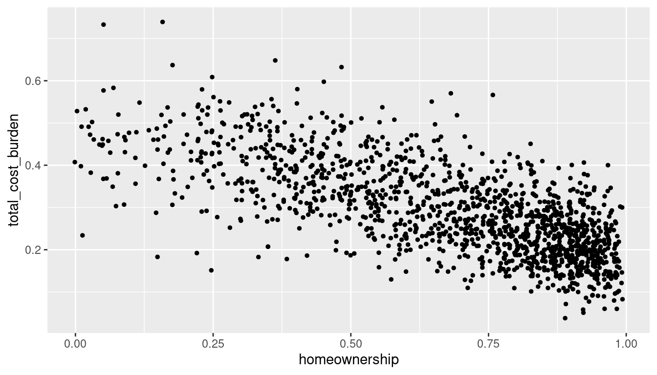
ggplot(acs_tr, aes(x = homeownership, y = total_cost_burden)) +
  geom_point(aes(color = county2), size = 1)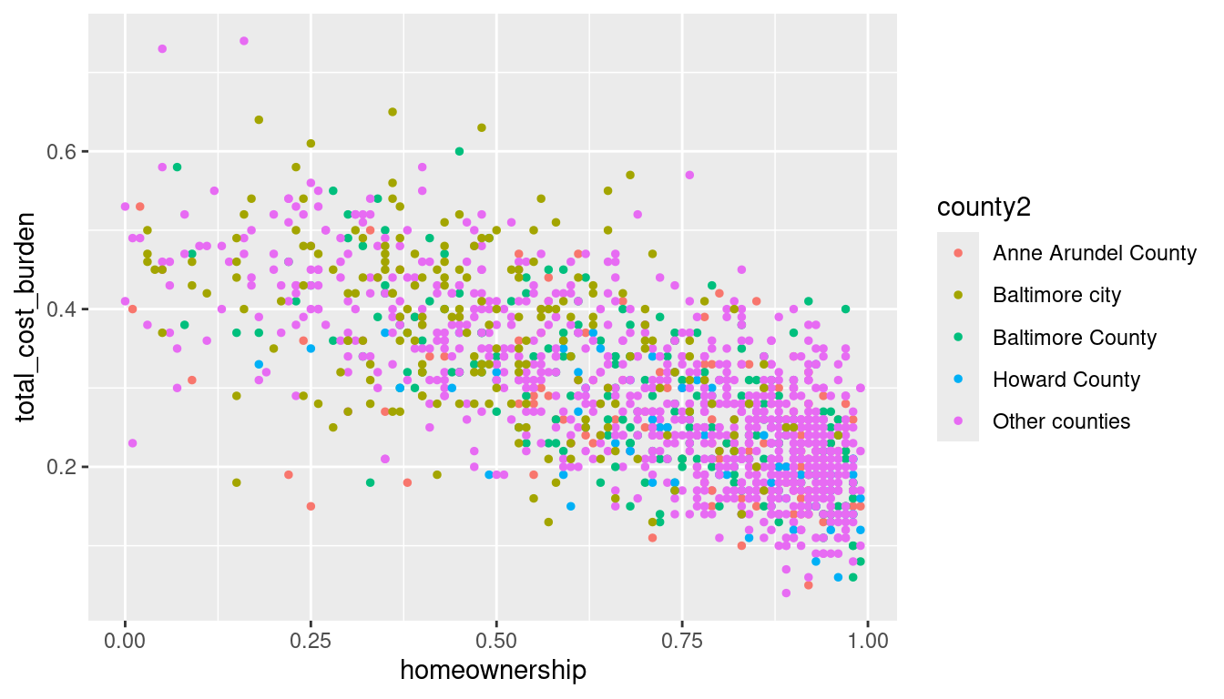
ggplot(acs_tr, aes(x = homeownership, y = total_cost_burden)) +
  geom_point(aes(shape = county2), size = 1)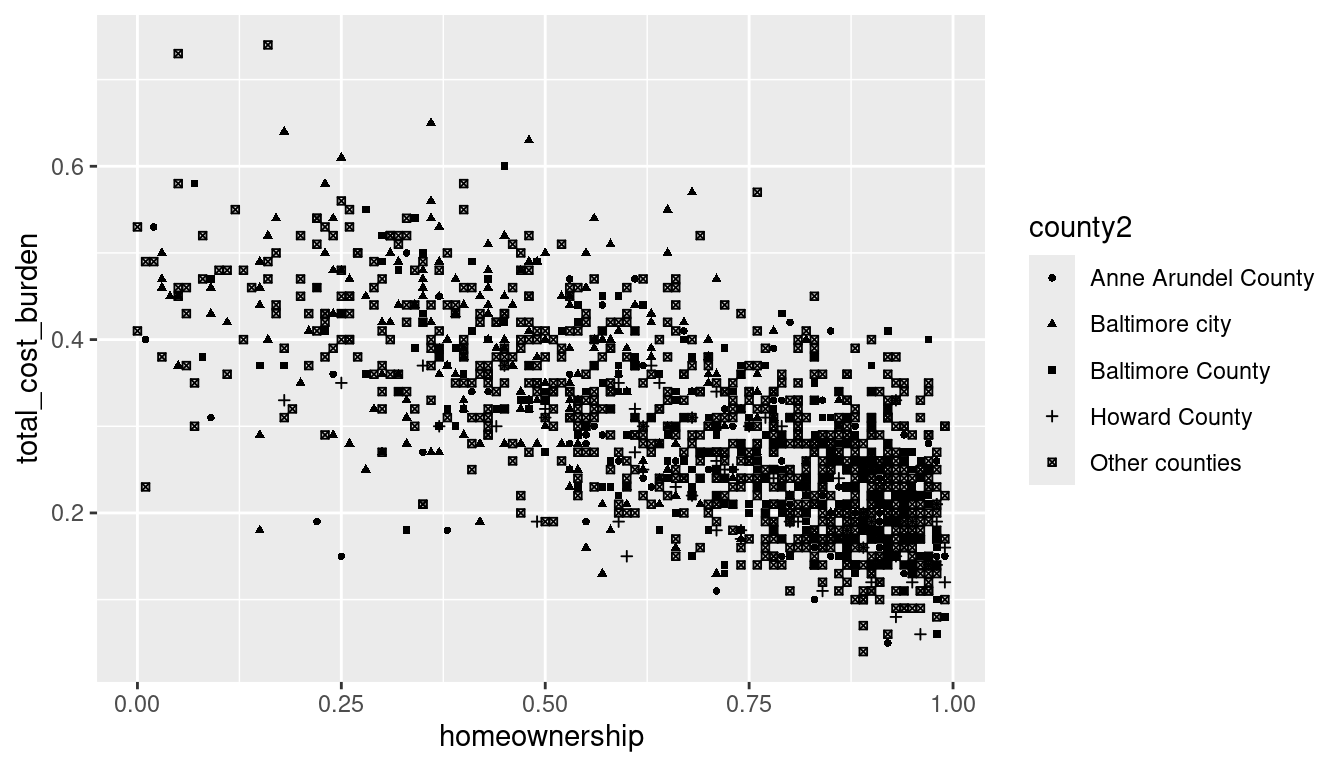
As noted in the book, these are bad ideas:
ggplot(acs_tr, aes(x = homeownership, y = total_cost_burden)) +
  geom_point(aes(size = county2), alpha = 0.5)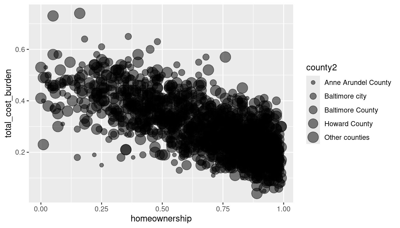
ggplot(acs_tr, aes(x = homeownership, y = total_cost_burden)) +
  geom_point(aes(alpha = county2), size = 1)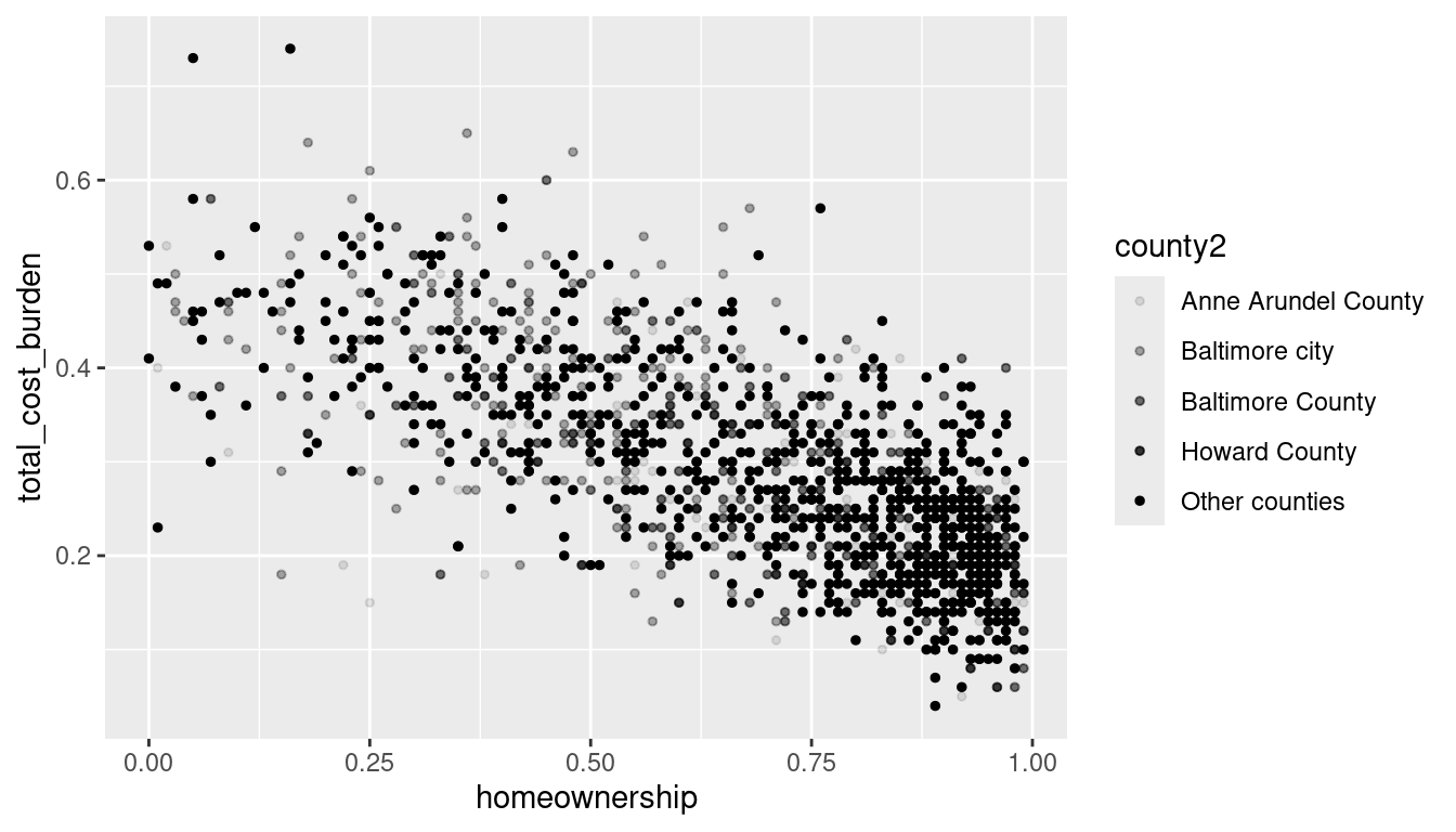
Can you think of any exceptions to this?
What’s going on with the next two charts?
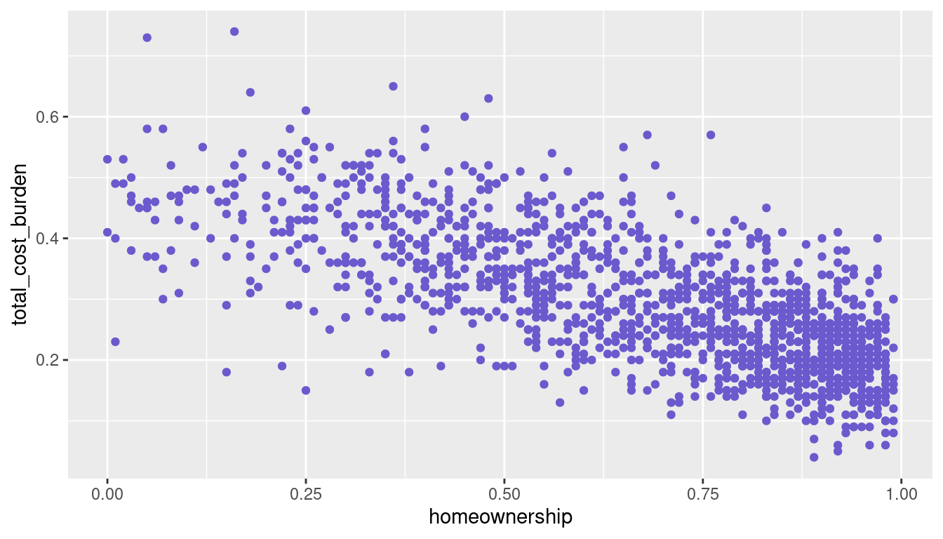
ggplot(acs_tr, aes(x = homeownership, y = total_cost_burden)) +
  geom_point(aes(color = "slateblue"))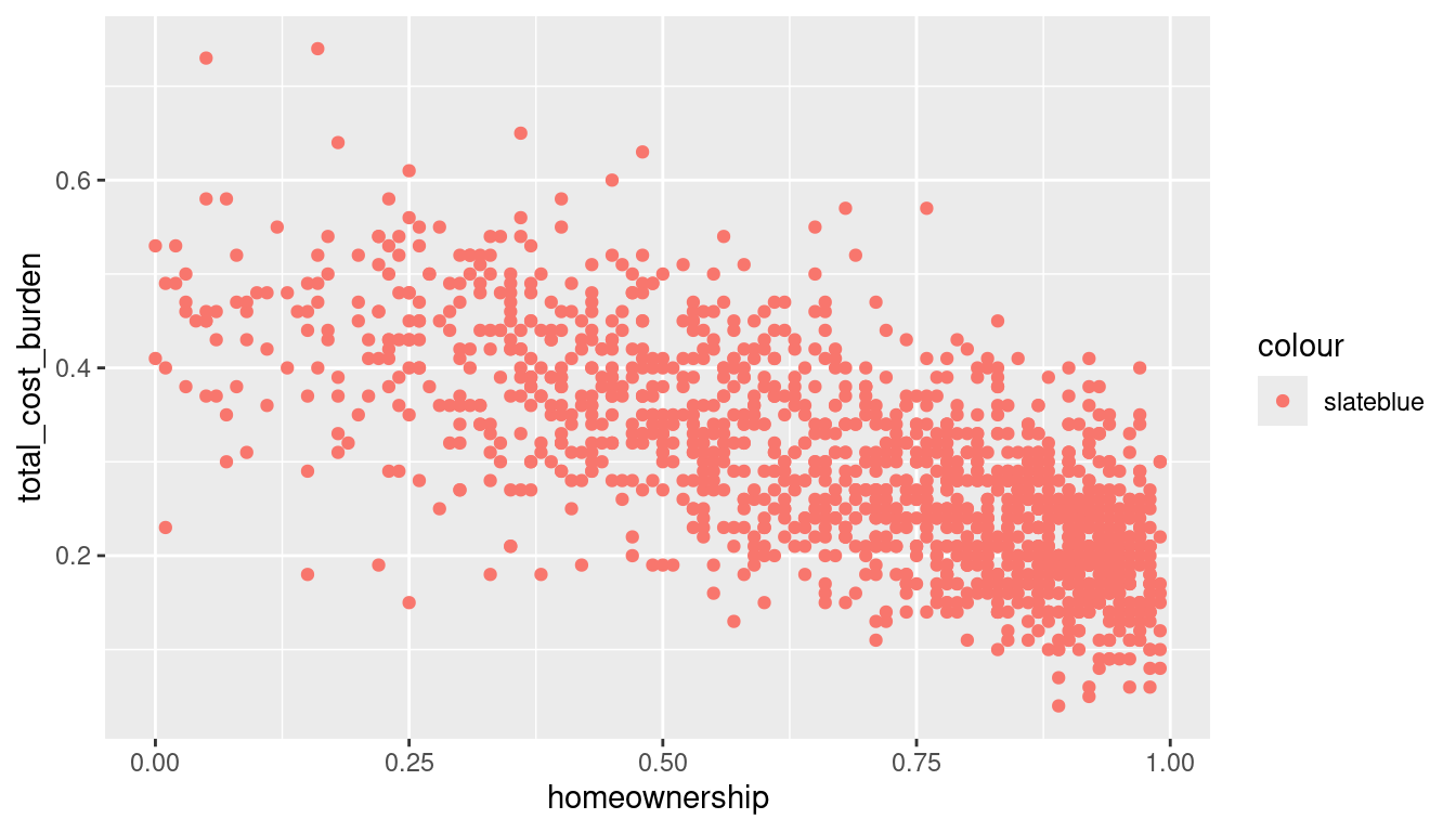
Why does this one throw an error?
Geometric objects

ggplot(acs_tr, aes(x = homeownership, y = total_cost_burden, color = county2)) +
  geom_point(size = 1) +
  geom_smooth()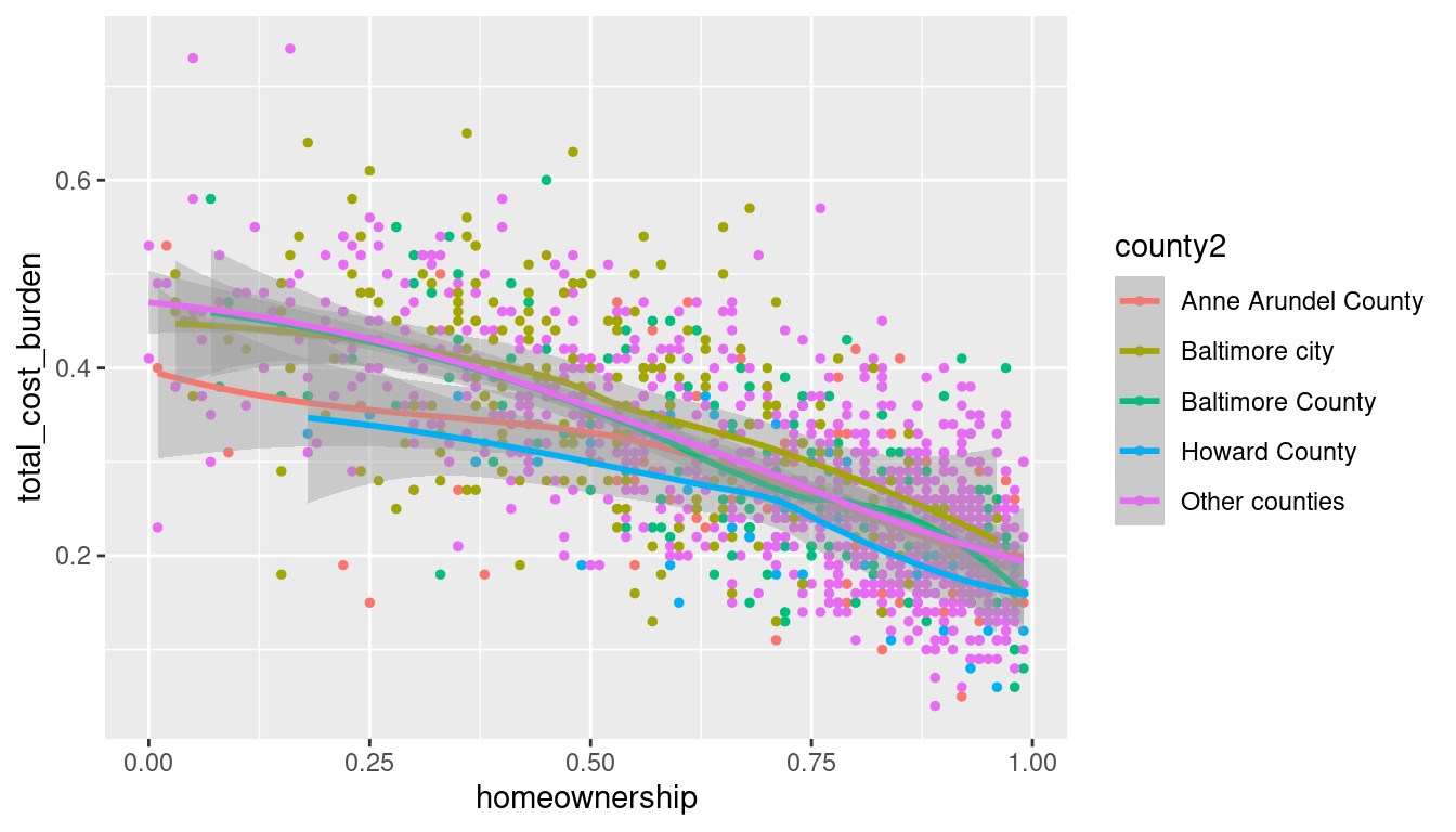

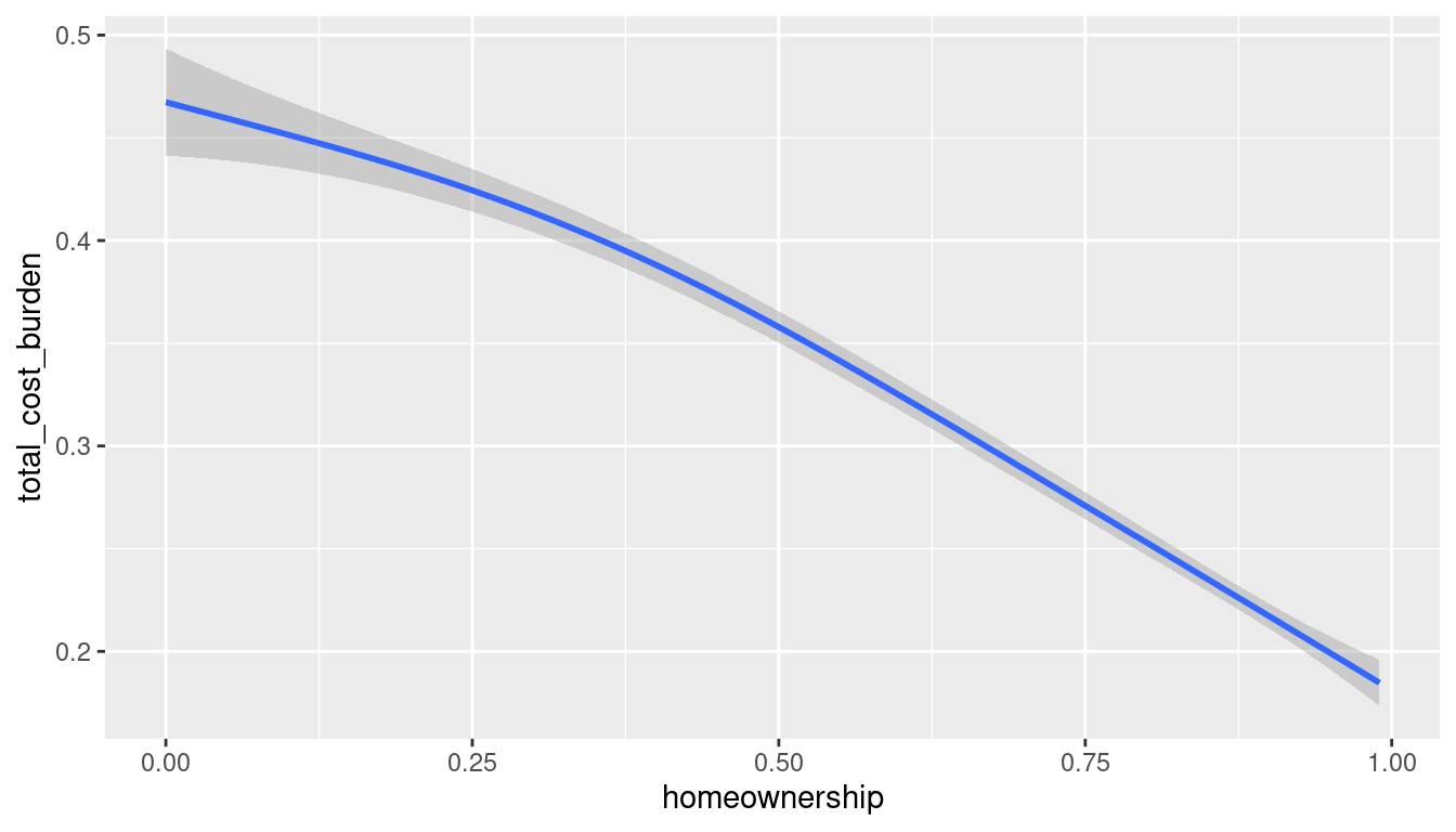
ggplot(acs_tr, aes(x = homeownership, y = total_cost_burden)) +
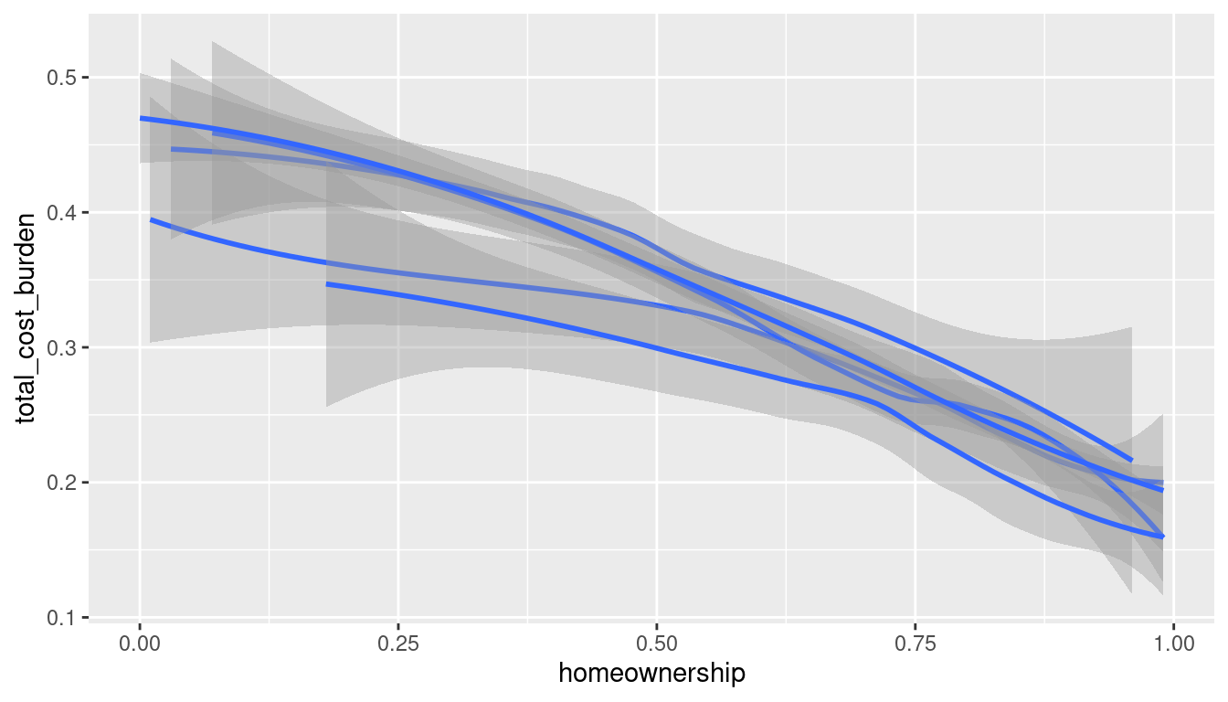
geom_smooth(aes(color = county2), show.legend = FALSE)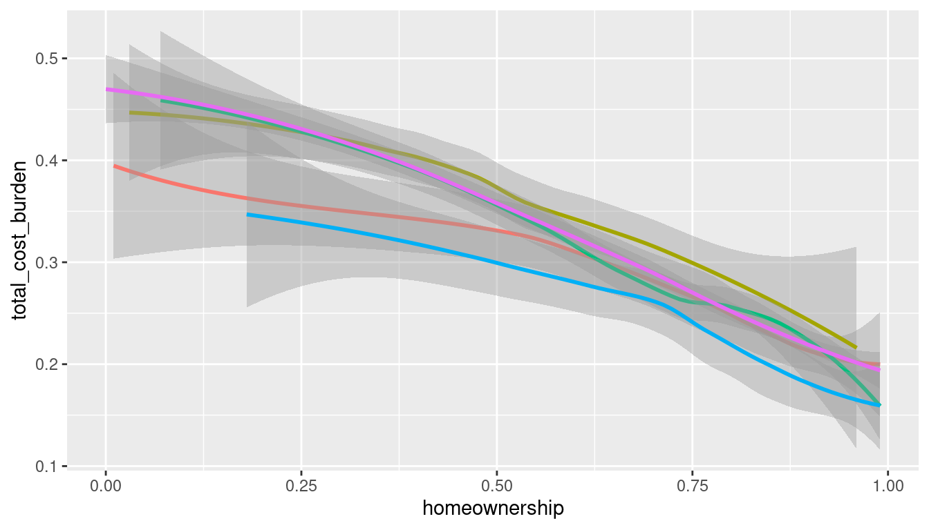
ggplot(acs_tr, aes(x = homeownership, y = total_cost_burden)) +
  geom_point(aes(color = county2), size = 1) +
  geom_smooth()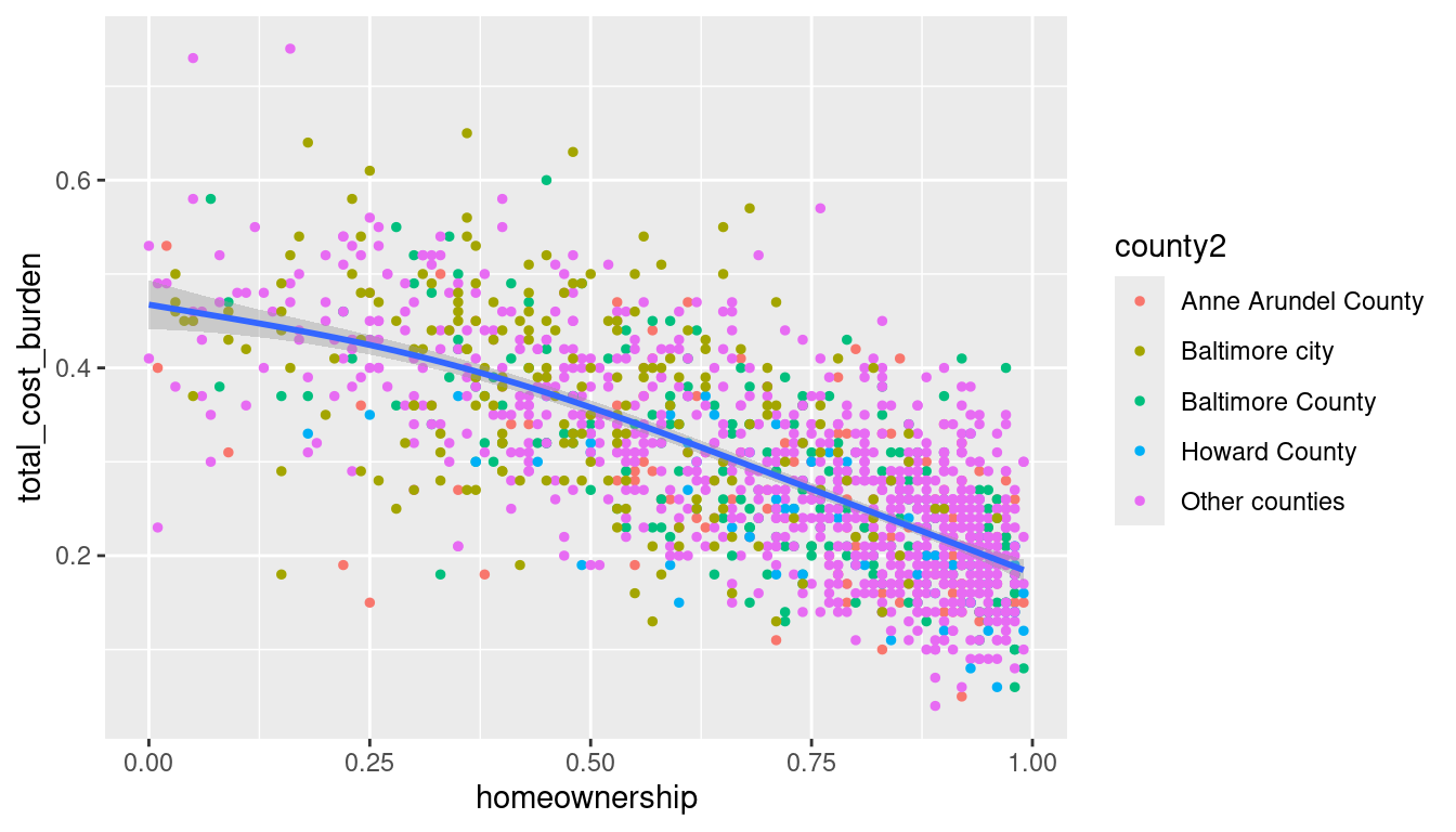
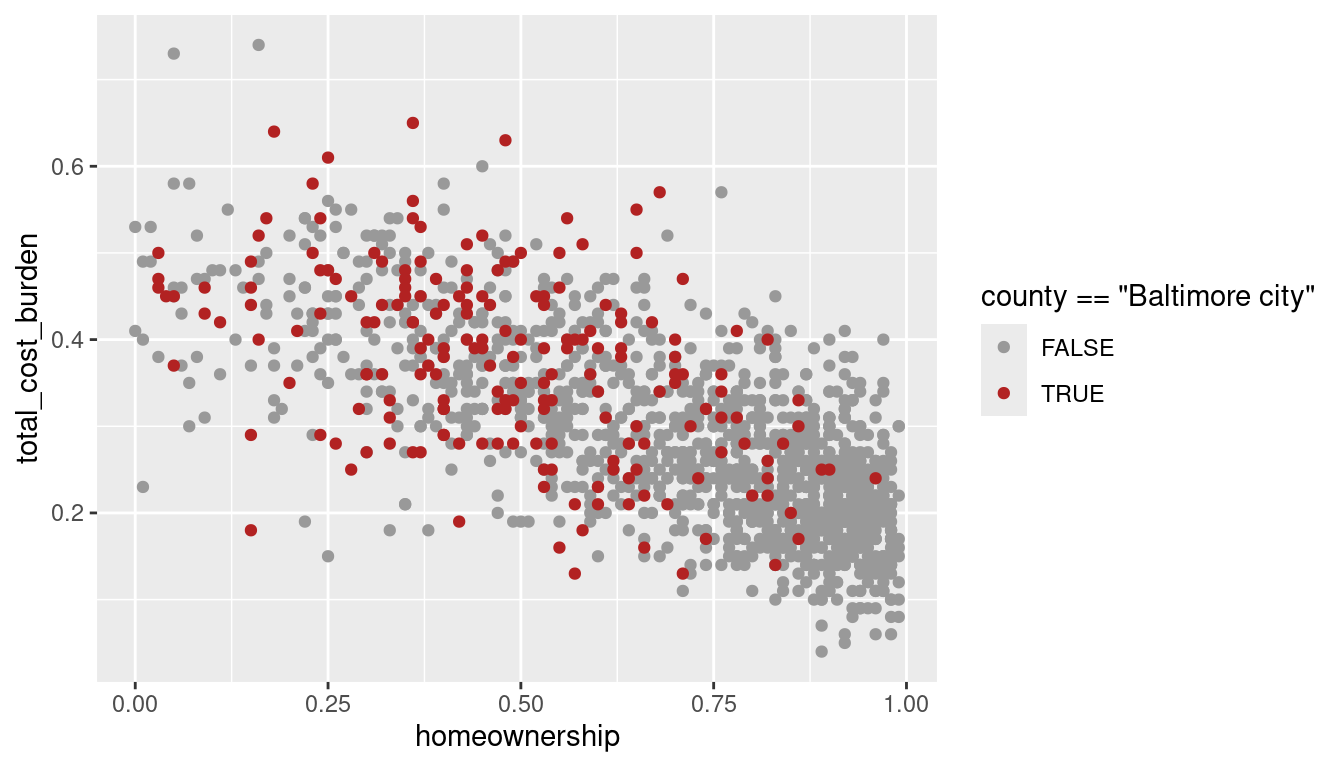
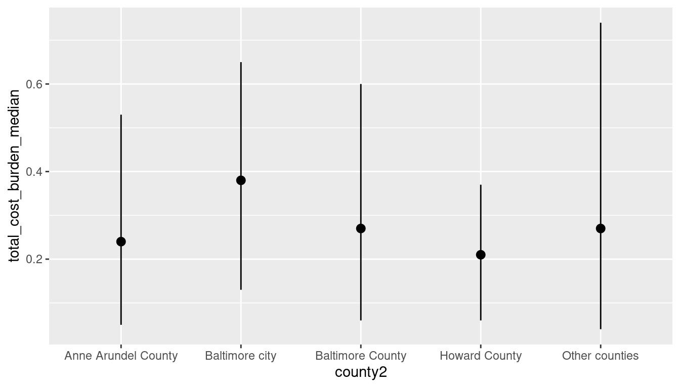
I don’t like how they did this highlighting example in the book. Here’s a better one.
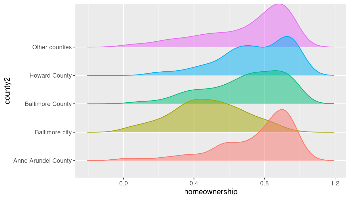
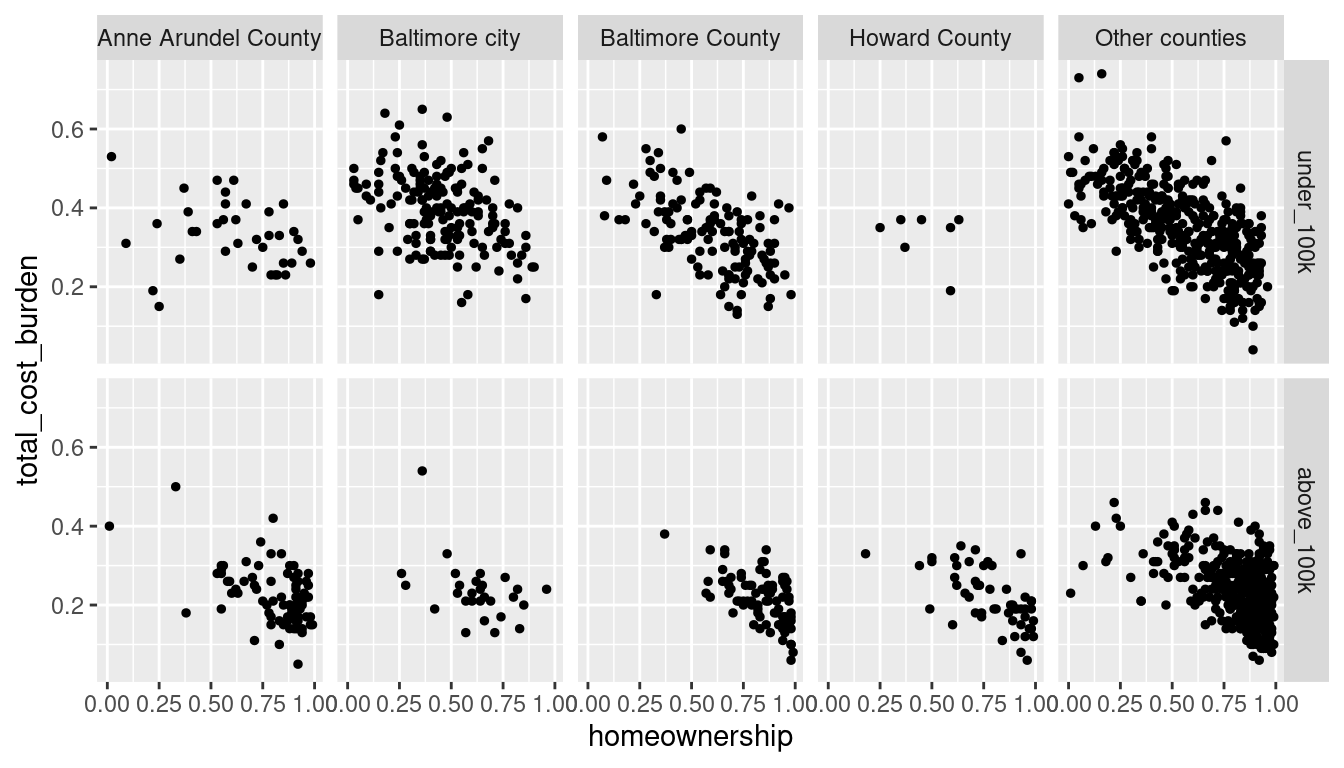
Facets
Statistical transformations
I am of the opinion that if you want to visualize summary statistics or other aggregations, you should calculate them explicitly, not let ggplot do them ad hoc, so I think the examples in section 9.5 are not great. Comparable charts with calculations:
acs_tr |>
  group_by(county2) |>
  summarise(n = n()) |> # these 2 steps can be done with `count`
  ggplot(aes(x = county2, y = n)) +
  geom_col()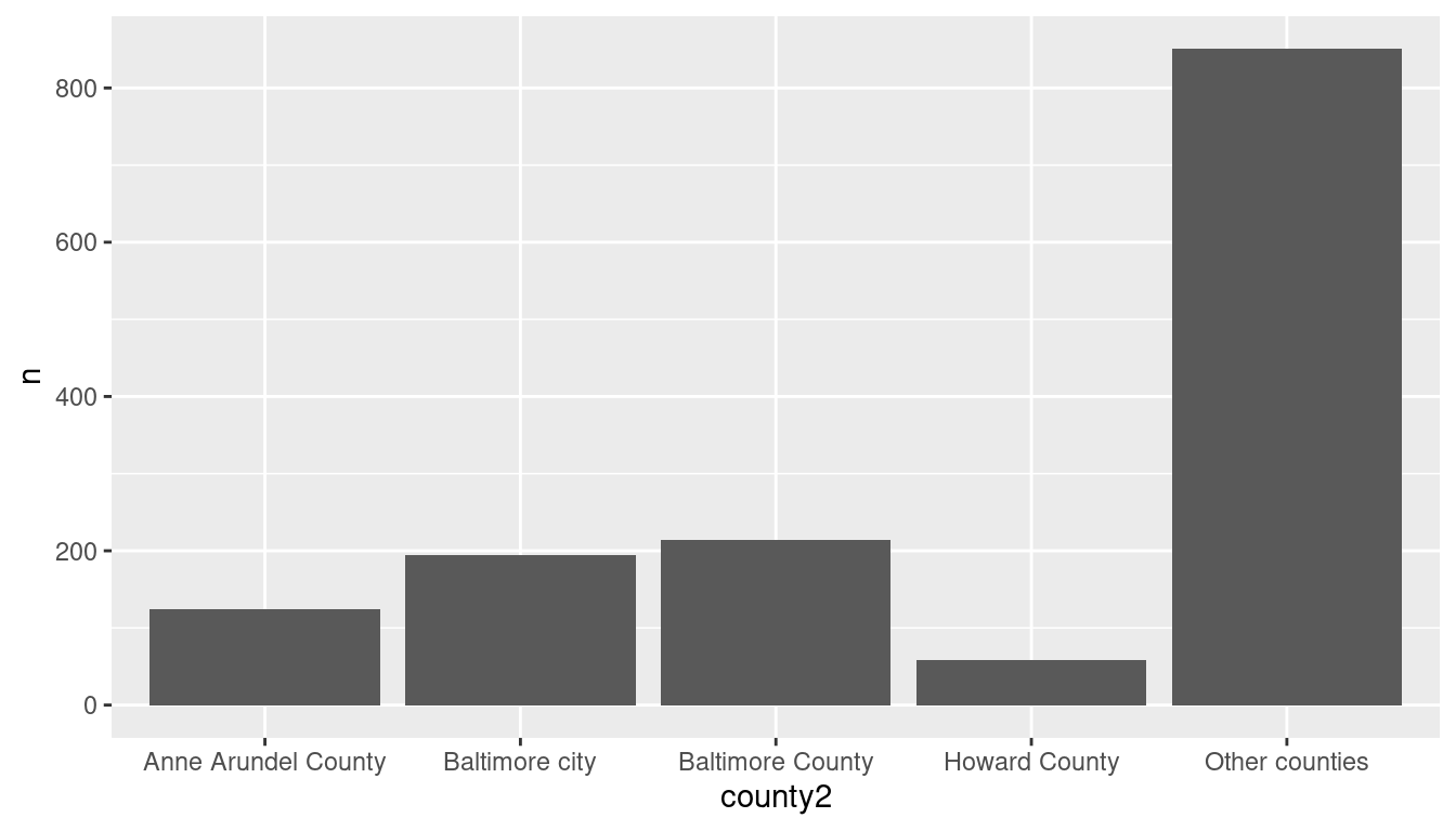

Position aesthetics
inc_by_county <- acs_tr |>
  group_by(county2, income_brk) |>
  summarise(n = n())

ggplot(inc_by_county, aes(x = county2, y = n, color = income_brk)) +
  geom_col()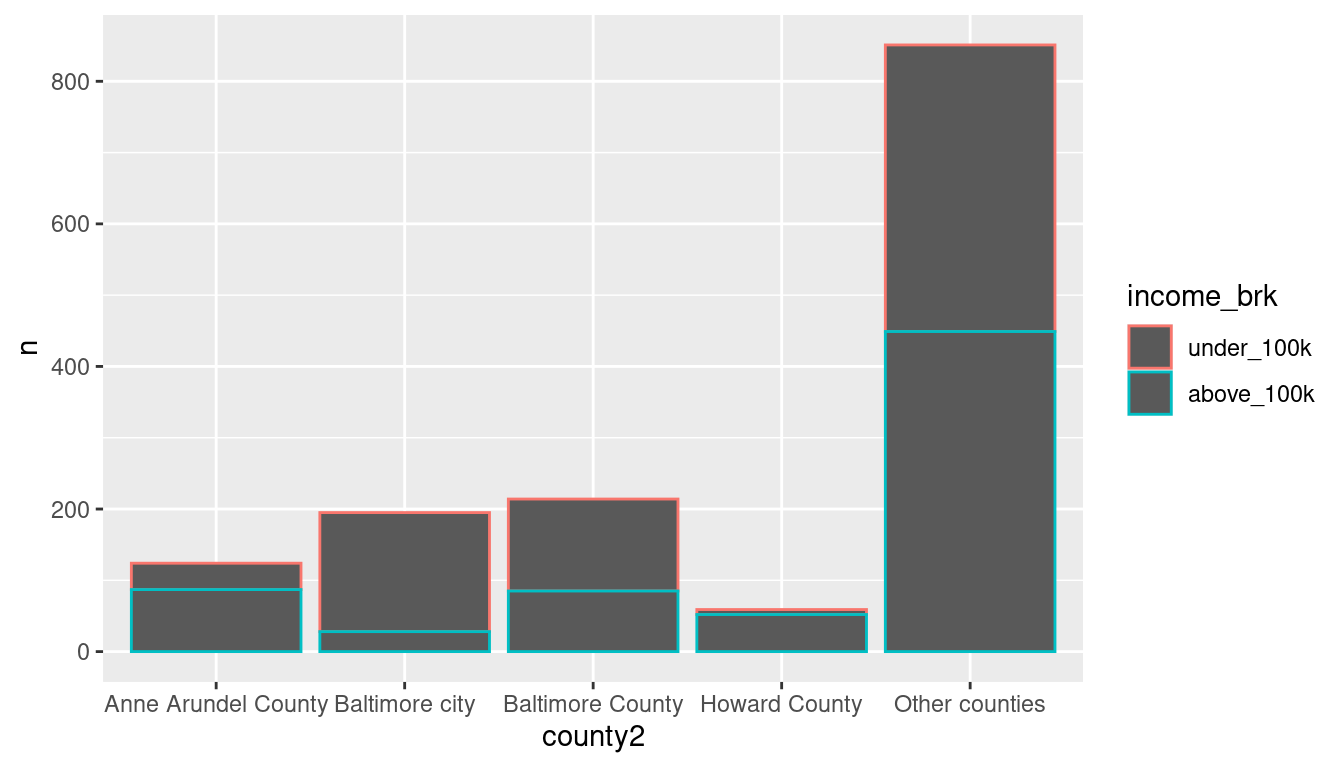
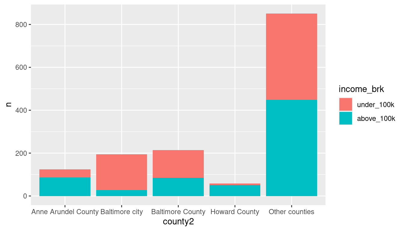
ggplot(inc_by_county, aes(x = county2, y = n, fill = income_brk)) +
  geom_col(alpha = 1/5, position = position_identity())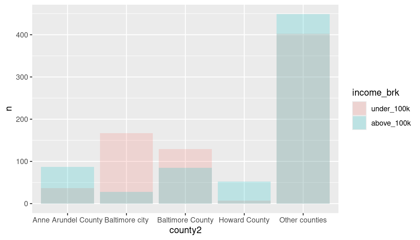
ggplot(inc_by_county, aes(x = county2, y = n, fill = income_brk)) +
  geom_col(position = position_fill())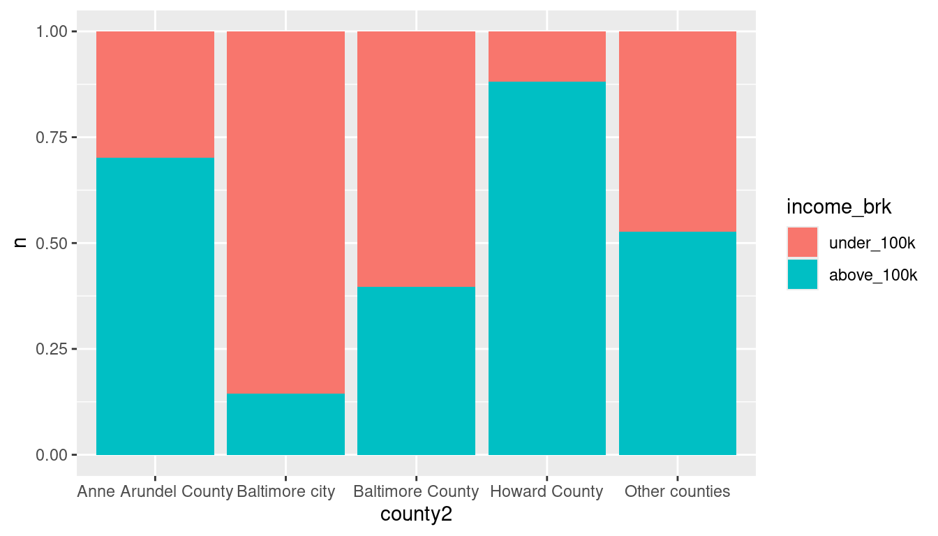
ggplot(inc_by_county, aes(x = county2, y = n, fill = income_brk)) +
  geom_col(position = position_dodge())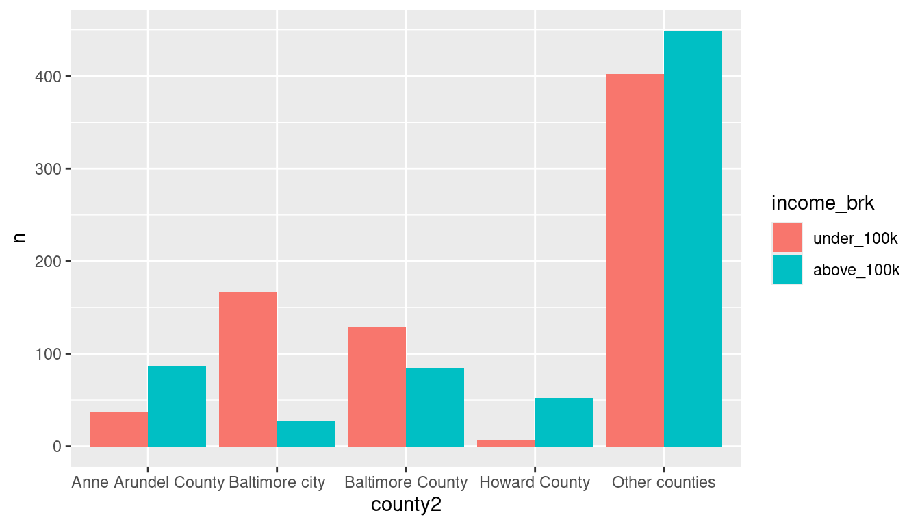
ggplot(inc_by_county, aes(x = county2, y = n, fill = income_brk)) +
  geom_col(position = position_dodge2())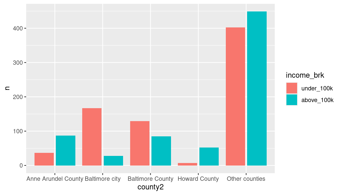
Other than the first chart with the weird opacity, which kinda sucks, these give you different views of the same data. What can you pick up from each?