1. Walkthrough
Making a chart might seem like a pretty straightforward task: you have data, you make a chart. But there are a lot of things to consider, and they depend on all sorts of factors, like the type of data, your audience, your purpose in visualizing it, the context, and on and on.
First question you should ask yourself:
Do you even need a chart?
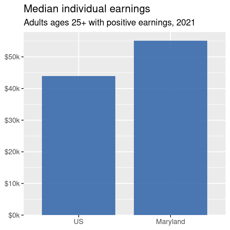
That chart is fine, but it takes up a lot of space to only show 2 numbers. Oftentimes projects that require visualization have caps on length, such as grant applications or print reports where every additional page adds to the budget. In a lot of contexts, you’re probably better off with written text, either just a written sentence if it’s for a report or article, or bullet points or a pull-out quote. You’ll often see documents with something formatted like this:
Maryland adults ages 25 and up had median earnings of about $55,000 in 2021, more than $11,000 higher than the US average.
Maybe you have a lot of data and your audience wants to see every number exactly, or you just have 2 or 3 numbers but you’re short on space: a nicely formatted table might be better.
| Location | Median earnings |
|---|---|
| US | $43,961 |
| Maryland | $55,108 |
But if you have somewhere in between a couple data points and too many data points, then making a chart could work. So we’re gonna make a lot of charts.
In fact, this data gets at a super pet peeve of mine that can be illustrated well with data visualization.
The wage gaps
So we already established that Maryland has higher earnings, on average, than the US. Usually when people say “the wage gap,” they’re talking about women’s pay versus men’s pay, e.g. women make x cents on the dollar.1
1 All of this analysis is based on Census data, which only records gender as male and female, so that’s what we’ve got to work with.
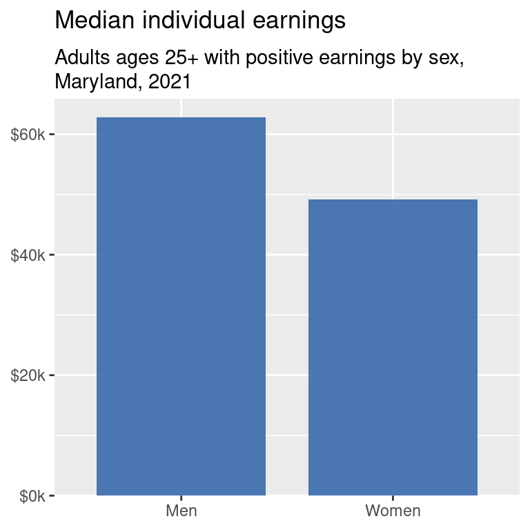
Again, super important point but doesn’t quite warrant a chart. You’d get a better sense of the comparison that’s more memorable by just writing:
Working women in Maryland make about 78 cents on the male dollar.
(And then in the footnotes include the specifications of “among adults ages 25 and up with positive earnings in 2021.”)
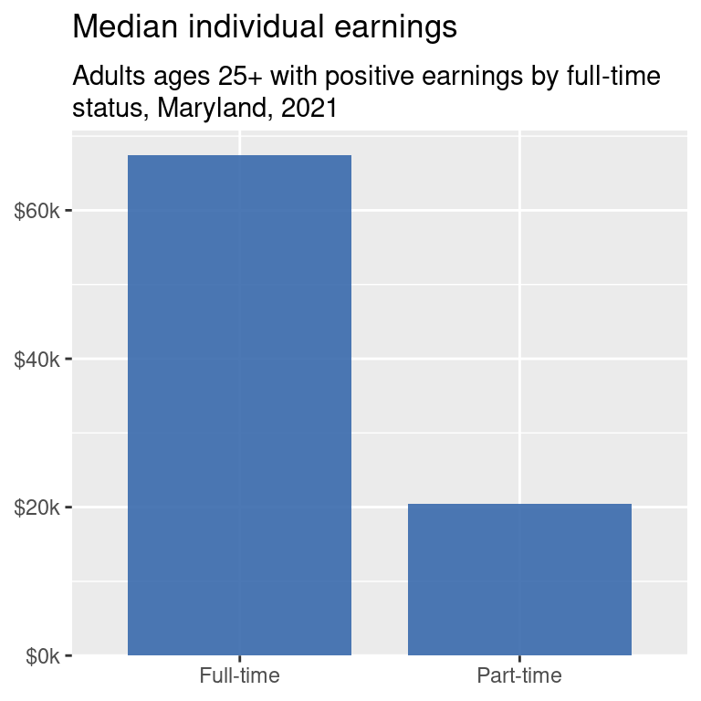
One explanation often given for women’s pay being less is that women are more likely to work part-time, and part-time jobs pay much less on average.
So now we’ve established that there are differences in median earnings between women and men, and between full-time and part-time workers, and that Maryland has a higher median earning than the US as a whole. One of the frameworks we’ll use for understanding our data is data feminism (D’Ignazio, 2015; D’Ignazio & Klein, 2020), which looks at how data can be used to highlight intersections between the patterns we’ve established.
D’Ignazio, C. (2015). What would feminist data visualization look like? https://civic.mit.edu/feminist-data-visualization.html
D’Ignazio, C., & Klein, L. F. (2020). Data feminism. The MIT Press. https://data-feminism.mitpress.mit.edu/
A good place to start, then, is earnings by sex and full-time status. Let’s make a table:
| Status | Men | Women |
|---|---|---|
| Full-time | $72,222 | $62,802 |
| Part-time | $21,579 | $19,200 |
Just kidding, that’s hard to get a pattern from, and we now have enough comparisons to warrant a chart:
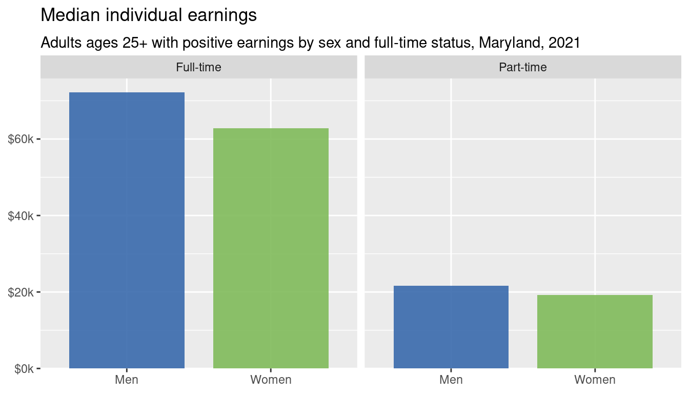
The gaps are actually smaller within groups (full-time men vs full-time women or part-time men vs part-time women) than across (all men vs all women). So the tendency of women to work part time explains some of the wage gap, but not all of it. If the difference were only about work status, we would expect to see no within-group gaps here.2
2 We’ll talk about annotations in a couple weeks, and we’ll return to these charts to practice. Think about what you might want to annotate on these multidimensional charts.
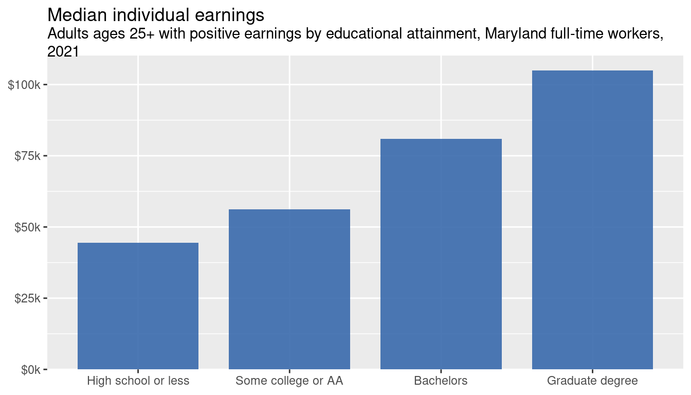
Wages by educational attainment aren’t surprising—higher educational attainment corresponds to higher incomes. This is just for adults working full-time.
We might as well look at both education and sex. Let’s naively assume the pattern will be the same for men and women.
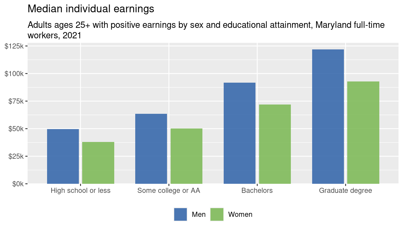
Even among only full-time workers, there are gaps at every education level so severe that men at any given education level are paid roughly as much as women at the next level above them. For example, after getting a graduate degree and working full time, women only earn about $1,100 more than men with only a bachelor’s. That’s a pattern that would be hard to glean from just reading a table of numbers or from only seeing the within-groups ratios.
Here’s a chart of those within-groups ratios that is technically fine but practically not very useful:
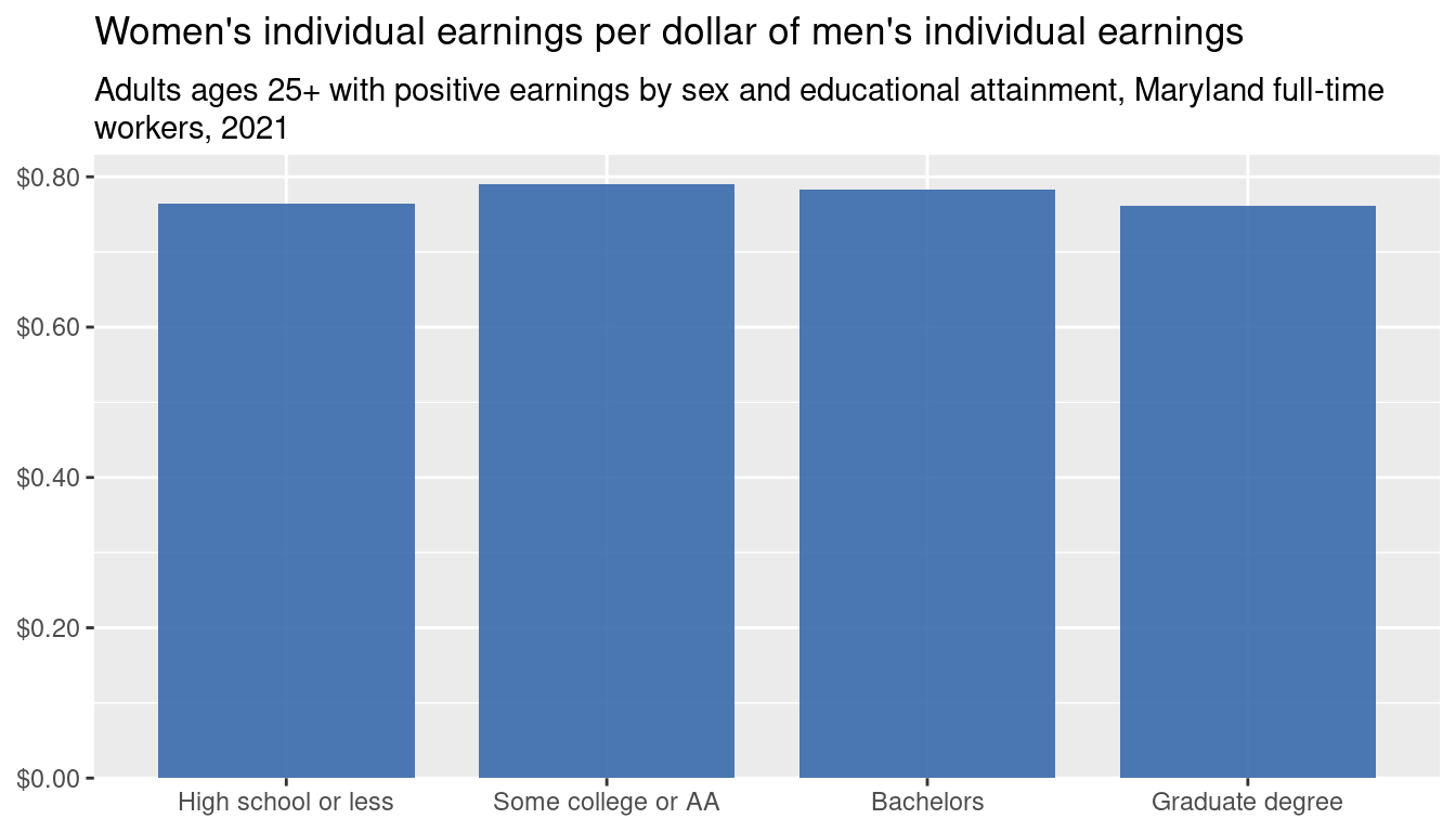
Which is more important to know, the gap within education levels, or the gap across education levels? Or both? What’s missing that makes this chart alone not very useful?
So far we’ve worked through identifying several important patterns using just a very simple type of chart that people commonly know how to read—the charts are almost identical, just different slices of the data. But other chart types might help with highlighting different things, such as those gaps.
Exercises
- Revise the code to break down values by race/ethnicity and sex instead of education and sex (i.e. filter for
dimension == "race"anddimension == "race_x_sex"instead of education.) - Browse through the Data Visualisation Catalogue (Ribecca, 2024) and see if you find any other chart types that would be appropriate for visualizing the sex and education chart (Figure 6). Which chart types would be better, especially for highlighting the gaps or exploring other aspects of the story? What about (Figure 7)?
- Following question 2, Wilke gives a brief example in section 6.3 of switching from bar charts to dot plots or heatmaps; how could this be adapted here?
Ribecca, S. (2024). The Data Visualisation Catalogue. https://datavizcatalogue.com/