pkgs <- c(
  "sf",         # sf : spatial data :: dplyr : tabular data
  "osmdata",    # batch download data from OpenStreetMap
  "terra",      # sf-friendly raster tools
  "ggspatial",  # map annotations for ggplot
  "tigris",     # download shapefiles from the Census Bureau TIGER database
  "ggmap",      # basemaps for ggplot
  "rmapshaper", # command line tool to edit geographies
  "geojsonio"   # work with geojson data
)

install.packages(pkgs)12. Spatial data
Warm-up
- Imagine you have a friend staying with you. They want to go for a walk around your neighborhood, without a phone or other source of directions. Without looking anything up, sketch a map of your neighborhood for them. Don’t focus on accuracy, just on the places and landmarks that characterize the area.
- Think back through the past few days and list all the maps you remember using. These don’t have to be maps of real places or strictly used for navigation.
What is a map?
These are the same questions as we talked about the first week with non-spatial data. Many of the answers will be similar as well.
Just like with data visualization, many of our sources can explain all sorts of things about maps without saying what a map is. One interesting definition comes from John Nelson at Esri:
A map is a model of a specific phenomenon in the real world—a communication device. You take an idea or an insight that’s in your brain and magically transport it into somebody else’s. – O’Donohue (n.d.)
O’Donohue, D. (n.d.). Communicating With Maps - The Art Of Cartography. Retrieved March 31, 2024, from https://mapscaping.com/podcast/communicating-with-maps-the-art-of-cartography/
Why make a map?
Warning
A confession: in a lot of situations, I am anti-map. Just like with charts versus tables, bulletpoints, or just a sentence, maps—especially thematic maps—tend to be overused. I’ve been asked to make maps of phenomena that have little or nothing to do with geography, just because people like maps. I won’t rant again about making data viz decisions for the sake of being cute, but the first question in how to make a map should always be whether you actually should. Kenneth Field gets into this in his interview on Storytelling with Data. Much like using aggregates in place of finer-grained values, you can gain simplicity but lose accuracy and ease of understanding your data. It’s a trade-off, so don’t trade away important aspects of your data just to be cute!
- Explore
- Explain
- Both
Unlike with nonspatial data, with maps we’re more accustomed to exploration being part of the process. Think about it: how often do you dig around through a chart to find a bar or point that represents you and the places that are familiar to you, versus when you see a map?
How are maps used?
Brainstorming
Positive / constructive
Negative / destructive
Types of spatial data
What type of spatial data you have will affect what you can do with it and how you go about mapping it. The main types are:
- Point data, where observations are characterized by their location. These points might also have attributes associated with them.
- Grid data, where measurements are taken at locations distributed throughout an area. These don’t need to be on a strict square grid; values might be interpolated between measured locations. Rasters are a common form of this where observations are more or less taken on a grid, often represented as one pixel per location (either observed or interpolated).
- Areal data, where values are associated with two-dimensional regions. These are often based on man-made boundaries such as countries, towns, etc.
We’ll be working with areal data the most. It has some drawbacks that we’ll talk about, but it is also flexible. For example, we have easy access to tract boundaries that cover all of Maryland. We have lots of data associated with each of those tracts. We can also join those tract geographies with other spatial data, including points within the tracts or overlaps between tracts and some other area.
Spatial data in R
The spatial ecosystem
A few packages to install first (cross your fingers):
Much of the R spatial ecosystem has migrated from an older set of packages (sp, rgeos, rgdal) to a newer one (sf, plus its friends like stars and terra) designed to fit into the tidyverse packages. 1 sf is also nice because many of the functions are based on PostGIS, so if you’ve worked with spatial databases (or might in the future) it’s easy to translate code.
1 This was actually a major concerted effort over the past few years because the original maintainer of many of those packages was retiring.
There are a few sf-based shapefiles in the justviz package, and many others are easy to get (tigris is very easy to use for Census Bureau data, and we’ll use osmdata to get OpenStreetMap shapefiles and data).
sf objects can be data frames with a geometry column, so you can work with them in many of the same ways as regular data frames; you might also see just plain geometry objects without any data attached.
Plotting
sf objects have a plot method, so you can just call plot(very_cool_sf_data) and get a basic plot:
| county | geoid | geometry |
|---|---|---|
| Baltimore city | 24510160300 | POLYGON ((-76.64612 39.3031… |
| Baltimore city | 24510020100 | POLYGON ((-76.59047 39.2916… |
| Baltimore County | 24005402602 | POLYGON ((-76.76732 39.3673… |
| Baltimore city | 24510190300 | POLYGON ((-76.64696 39.2881… |
| Baltimore city | 24510271801 | POLYGON ((-76.68336 39.3517… |
| Anne Arundel County | 24003730403 | POLYGON ((-76.62029 39.1510… |
A note about object-oriented programming (OOP): When you have a function that’s a method of some type of object, just as plot, you can look at help pages for that function by specifying the object type. So ?plot.sf will show you the docs for plot as it applies specifically to sf objects.
ggplot also has geoms for spatial data.
You can aggregate these geometries like you would other data frames, and you can layer the spatial geoms like you would in other types of ggplots.
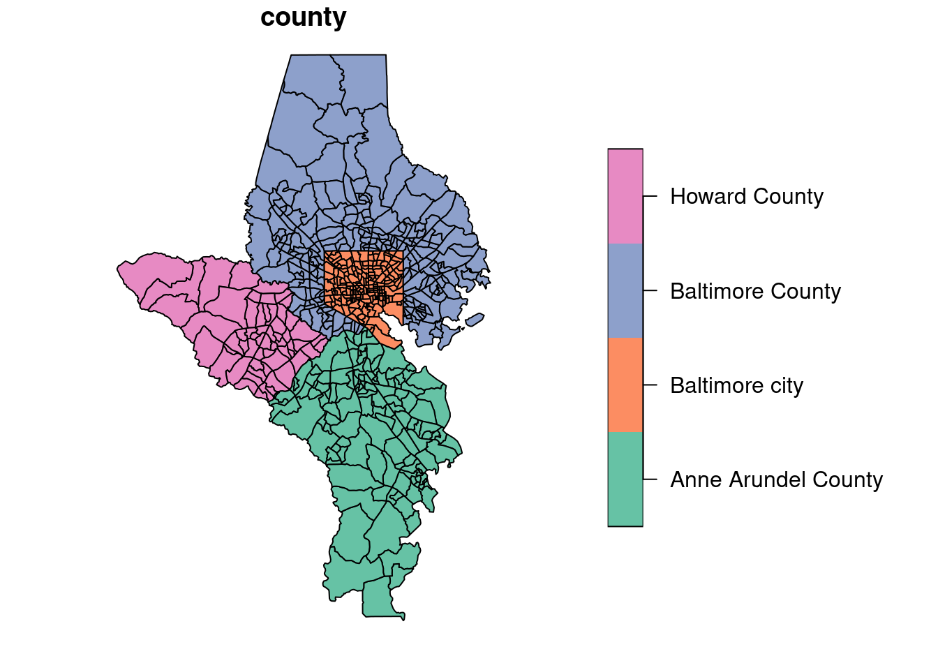
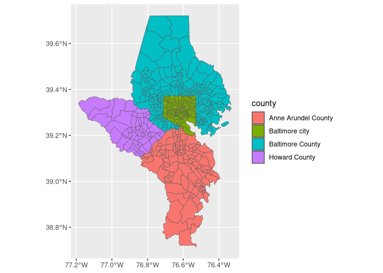
counties_sf <- tracts_sf |>
group_by(county) |>
# if you don't include args to summarise, you'll just get the union
# of the geometries
summarise()
counties_sf| county | geometry |
|---|---|
| Anne Arundel County | POLYGON ((-76.4746 38.98177… |
| Baltimore County | MULTIPOLYGON (((-76.38591 3… |
| Baltimore city | POLYGON ((-76.71139 39.3495… |
| Howard County | POLYGON ((-76.70608 39.2181… |
ggplot(tracts_sf) +
geom_sf(aes(fill = county)) +
geom_sf(data = counties_sf, fill = NA, color = "black", linewidth = 0.6) 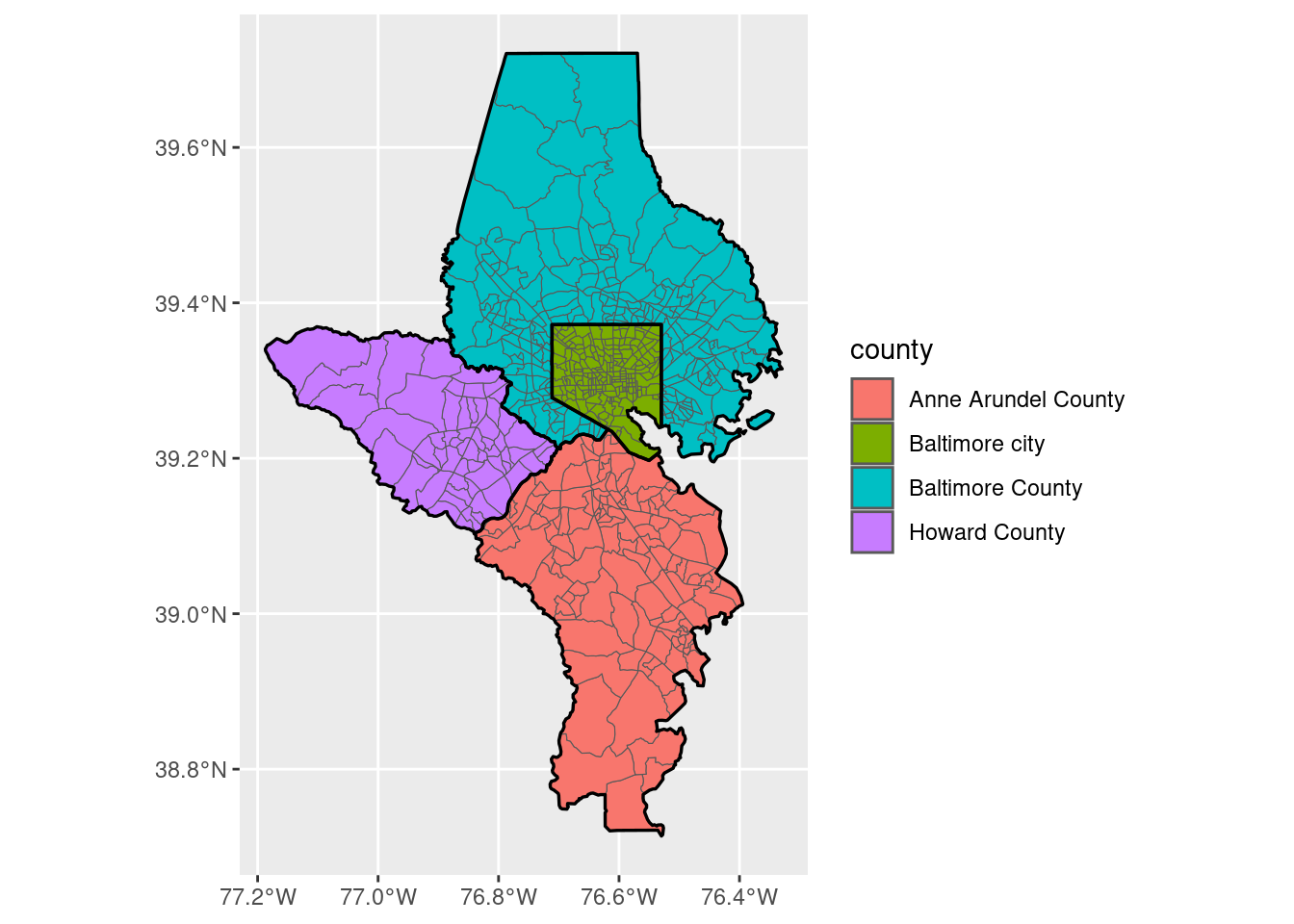
Projections
For small geographies like these, the map projection won’t change too much of how the map looks, but for the US it’s very noticeable. Check the CRS first.
# drop island areas that aren't states
states_sf <- tigris::states(cb = TRUE, progress_bar = FALSE) |>
  select(state = STUSPS) |>
  filter(state %in% state.abb) # dataset in base R

sf::st_crs(states_sf)
Coordinate Reference System:
User input: NAD83
wkt:
GEOGCRS["NAD83",
DATUM["North American Datum 1983",
ELLIPSOID["GRS 1980",6378137,298.257222101,
LENGTHUNIT["metre",1]]],
PRIMEM["Greenwich",0,
ANGLEUNIT["degree",0.0174532925199433]],
CS[ellipsoidal,2],
AXIS["latitude",north,
ORDER[1],
ANGLEUNIT["degree",0.0174532925199433]],
AXIS["longitude",east,
ORDER[2],
ANGLEUNIT["degree",0.0174532925199433]],
ID["EPSG",4269]]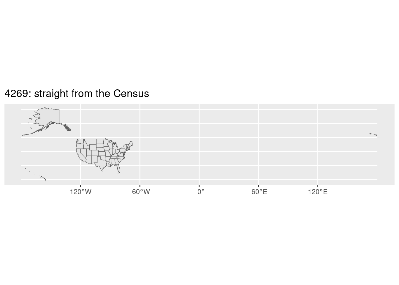
states_sf |>
  # common crs for GPS, etc
  sf::st_transform(4326) |>
  ggplot() +
  geom_sf() +
  labs(title = "4326: unprojected")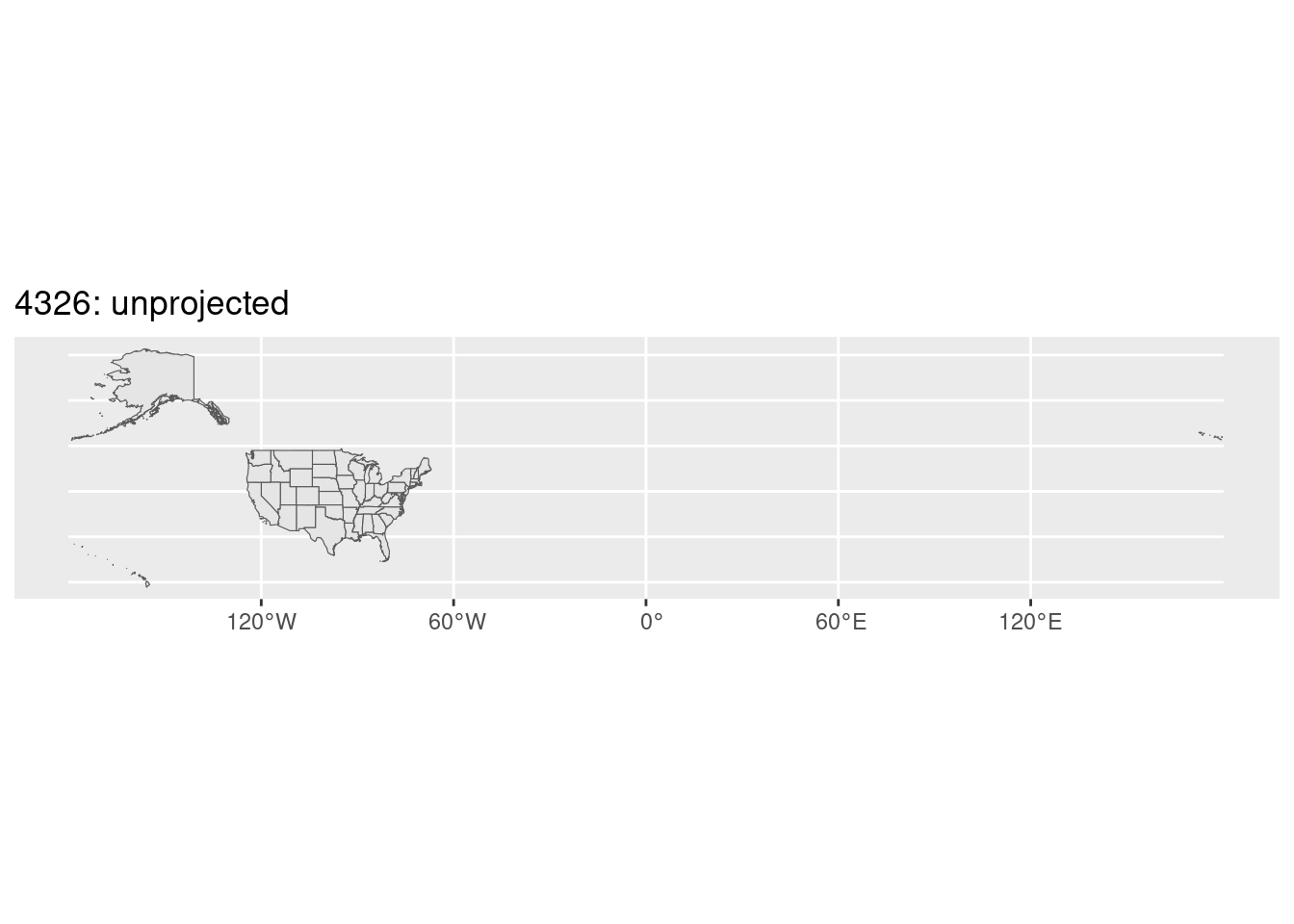
states_sf |>
  sf::st_transform(4326) |>
  # rotate to avoid splitting Alaska
  sf::st_shift_longitude() |>
  ggplot() +
  geom_sf() +
  labs(title = "4326 + shifting")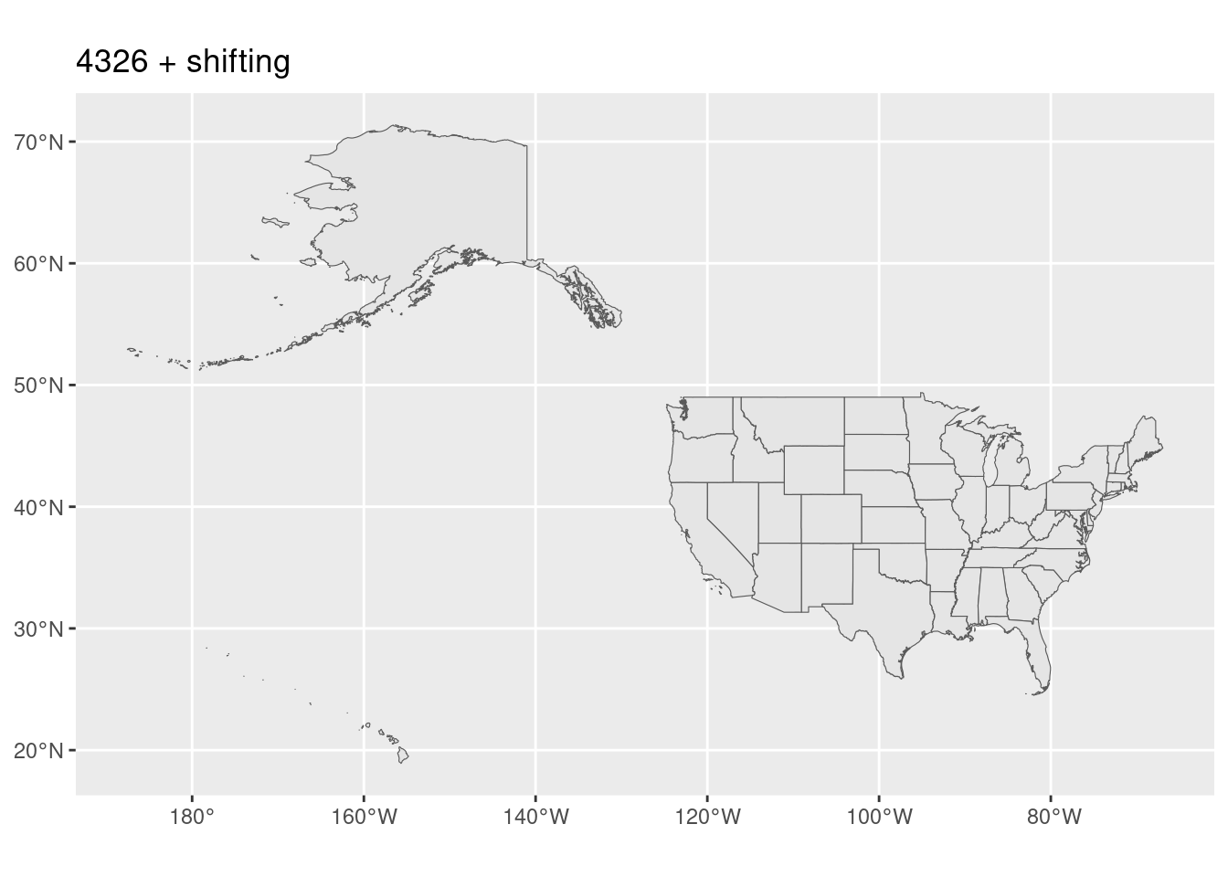
states_sf |>
  # mercator
  sf::st_transform(3857) |>
  ggplot() +
  geom_sf() +
  labs(title = "3857: web mercator")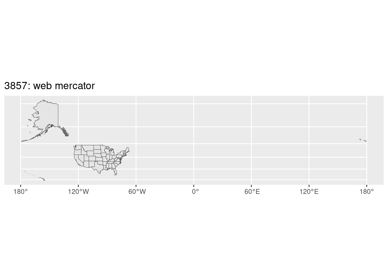
states_sf |>
  # us natl atlas
  sf::st_transform(9311) |>
  ggplot() +
  geom_sf() +
  labs(title = "9311: US equal area")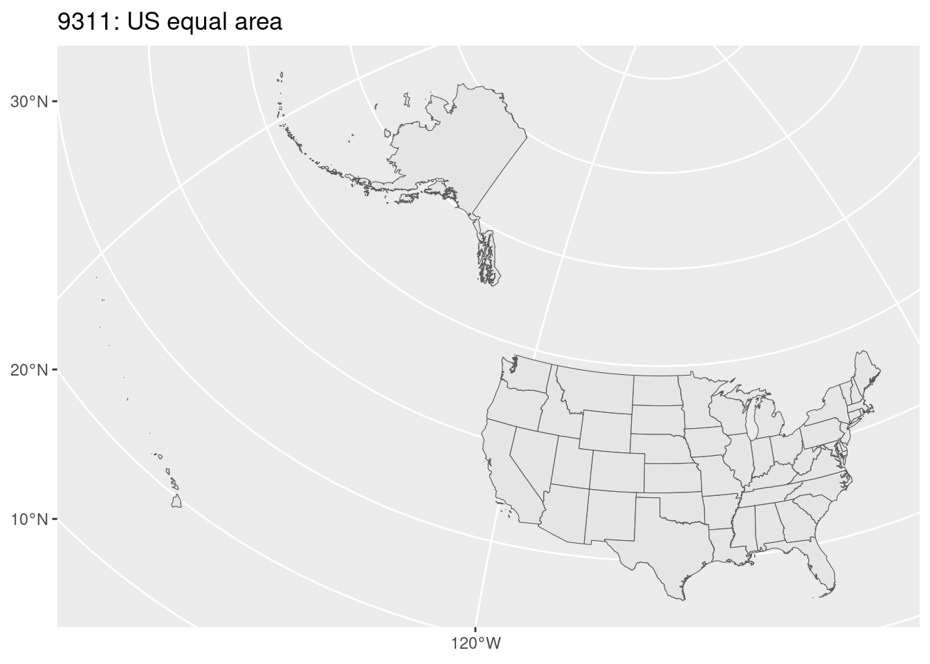
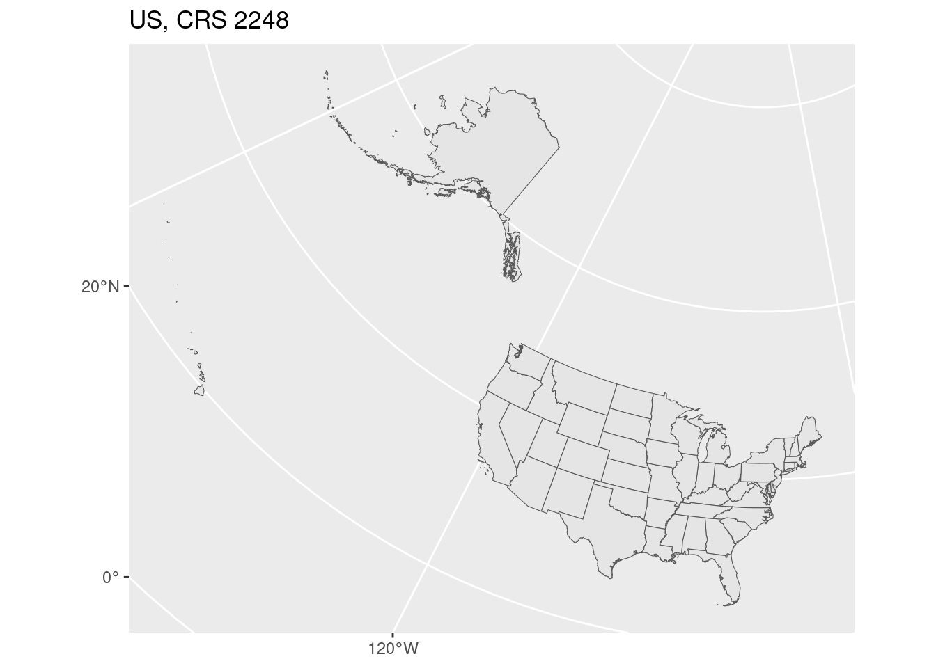
Exercise
The codes to refer to different projections are standardized, and there are several different databases. GeoRepository seems like the easiest to work with (if you have another favorite please share!). Use the text search to find a projection that is:
- Designed for Maryland
- Uses feet (units will be listed as “ftUS”) 2
- In the NAD83 system (not NAD27)
2 Using feet for your units (or a different projection that uses meters) is useful for doing things like buffers or measuring distances; we’ll do a bit of this later.
You might find more than one that fits these requirements, just pick one. (For this sort of work you won’t be able to see any difference.)
Fill in the missing CRS code below and draw the maps. What do you notice?
crs_code <- 2248

md_sf <- states_sf |> filter(state == "MD")

md_sf |>
  sf::st_transform(crs_code) |>
  ggplot() +
  geom_sf() +
  labs(title = stringr::str_glue("Maryland, CRS {crs_code}"))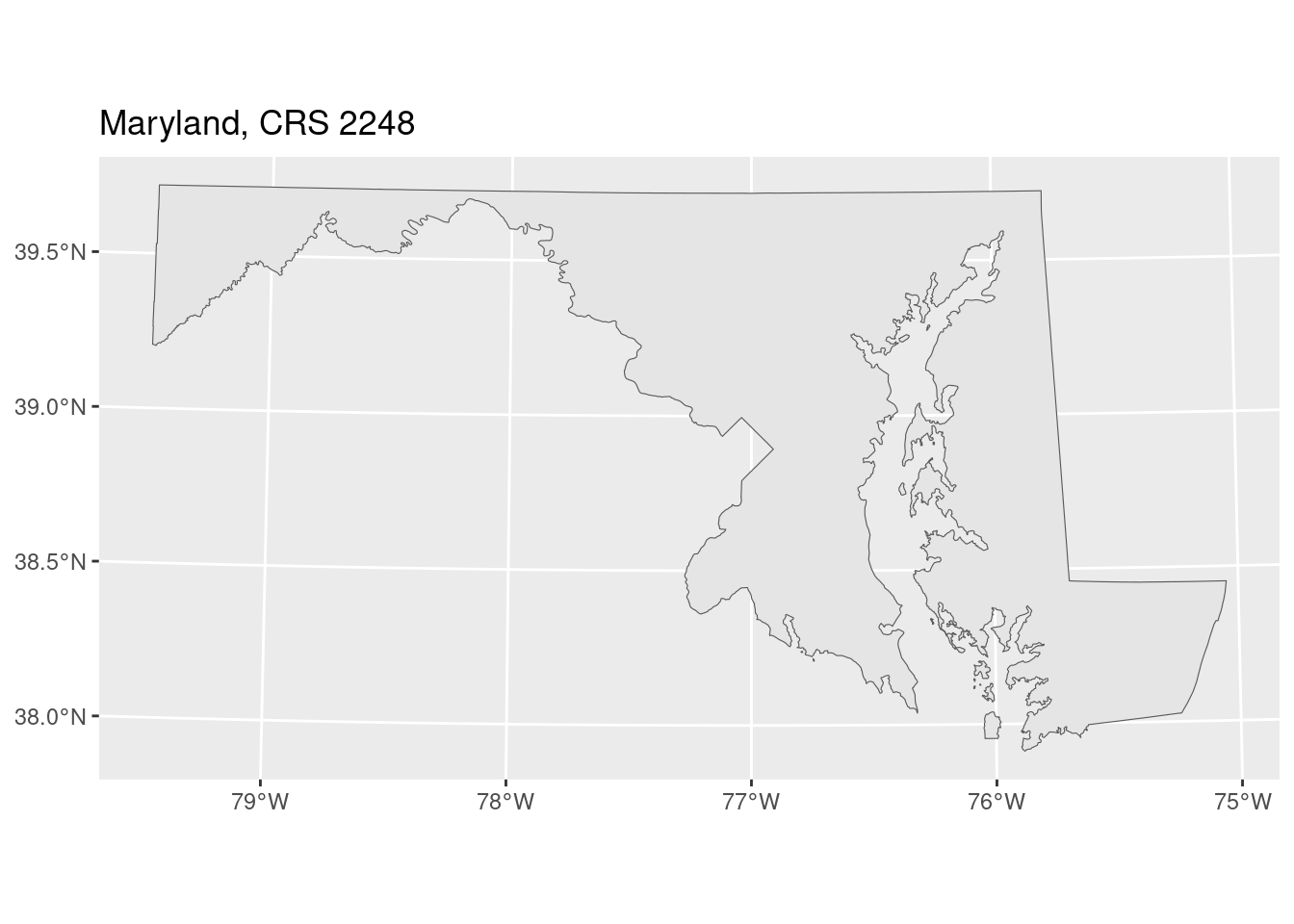
states_sf |>
  sf::st_transform(crs_code) |>
  ggplot() +
  geom_sf() +
  labs(title = stringr::str_glue("US, CRS {crs_code}"))