Exporting and distributing your work
tl;dr
Exporting your work: when, why & how
When & why
So far we’ve just left our charts in their notebooks. Sometimes that’s fine—you can use RMarkdown or Quarto notebooks to write a paper or report or build a website, then render the whole thing directly to another format. I do a lot of my work in Quarto notebooks, and these generally take one of three routes:
- EDA or drafts of sections of a project that’s being written elsewhere
- Spend just enough time adjusting figure sizes, layout, fonts, etc to be legible
- Render to a markdown document (set
format: gfm, short for GitHub-flavored markdown) - Push it to GitHub so my coworkers & I can reference it
- Most likely don’t save charts outside of the notebook
- Full standalone documents (blog posts, reports to distribute, webpages)
- Spend a lot of time getting figure sizes, layout, fonts, color, etc exactly right
- Render to something portable depending on the project type (pdf, html, docx)
- If colleagues or clients might want separate copies of charts, export each chart into its own hi-res image file (usually pdf and png)
- If clients might use charts for presentations, etc, attach our logo to the chart when exporting it
- Chart-only projects not part of a larger document
- Spend a lot of time getting figure sizes, layout, fonts, color, etc exactly right
- Make sure charts are self-contained (annotations and titles give full picture, source in caption)
- Render to markdown to have reproducible reference to how charts were created
- Export each chart into its own hi-res image file (usually pdf and png; svg if working with graphic designers) with our logo
The first important thing to do to export your work is to make sure it renders. Documents like RMarkdown or Quarto need to be self-contained; if you assign some variable in your console, then reference it in your Quarto document, you’ll get an error that the variable is undefined. That’s because the knitting/rendering process by default happens in a separate environment. That is, the notebook only knows what you’ve told it directly. That’s by design to make your work reproducible. If you’re collaborating with someone else and they can’t reproduce your work, what was the point in doing it?
Rendering a document in certain formats (html, markdown) will actually save a local copy of each image. If I render a notebook called cool_analysis.qmd into cool_analysis.md, it will actually create a folder in the same directory called cool_analysis_files; in that folder will be all the images that are displayed in the markdown document. That’s because some formats, particularly text-based ones, don’t have a way of directly embedding images; they just reference an image file from somewhere else. Those images will be named after the code chunks that created them (one good reason to name your chunks!). They’ll have whatever characteristics were set either for the document defaults or for the specific chunk (dimensions, resolution).
How
If you need to distribute your images, it’s better to be intentional about how they’re saved.
- Make a folder where you write all your charts (unsurprisingly I usually call it “plots”).
- Write your code to export the charts to that folder within code chunks so they’re always up to date. Don’t just do it one time in the console, make it part of your workflow.
- Open the image in a separate program (your OS’s default image preview program is fine) to verify that things came out the way you expected and wanted. Zoom in to make sure the resolution is high enough.
- Adjust dimensions, etc as necessary.
The easiest way to export a ggplot-based chart is with ggplot2::ggsave:
library(ggplot2)
library(dplyr)

source(here::here("utils/plotting_utils.R"))

wage_chart <- justviz::wages |>
  filter(dimension == "race_x_sex") |>
  mutate(race_eth = forcats::fct_reorder(race_eth, earn_q50, .fun = max),
         name = forcats::fct_reorder(name, earn_q50, .fun = max, .desc = TRUE),
         sex = forcats::fct_reorder(sex, earn_q50, .fun = mean, .desc = FALSE)) |>
  ggplot(aes(x = earn_q50, y = race_eth, group = race_eth)) +
  geom_path(color = "gray70", size = 2) +
  geom_point(aes(color = sex), size = 4) +
  scale_x_continuous(labels = dollar_k) +
  scale_color_manual(values = c(Men = qual_pal[3], Women = qual_pal[6])) +
  facet_grid(rows = vars(name)) +
  labs(title = "Median individual earnings by race/ethnicity and sex",
       subtitle = "Maryland adults ages 25+ working full time, 2021",
       x = NULL, y = NULL, color = NULL) +
  theme_nice() +
  theme(panel.grid.major.x = element_line(),
        panel.grid.major.y = element_line(linetype = "dotted", color = "gray50"),
        legend.position = "bottom")

wage_chart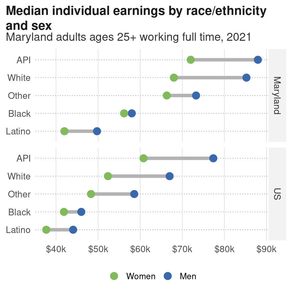
Now there’s a chart saved to ./plots/wages_by_race_x_sex.png that is ready to post somewhere, use in a document outside of R, or distribute.
Double check that the file type is what you expected—if you don’t give ggsave a file type or graphics device to use, it will infer from the path’s extension (in this example, the path I gave has a “.png” extension, so it write out a PNG file). There are ways you can tinker with the graphics devices, but in general the default device used for the extension you choose is fine. 1
1 The argument bg = "white" is necessary for PNG files because otherwise they’ll have a transparent background by default. This isn’t the case with other file types like PDF.
2 I realized this the hard/annoying way a few years ago. I was working with a graphic designer, pushing plots to GitHub for her to edit. She thought I kept messing with them after I’d said they were ready for her. Finally I realized I had made randomly-placed labels with ggrepel but hadn’t set the seed, so every time I edited the notebook, the placement changed slightly, which got picked up in Git as me having changed the charts. When you set a seed, (pseudo)random numbers will be generated in the same sequence, avoiding this problem.
One last tip: if anything in your chart depends on randomization (ggplot2::position_jitter or anything from the ggrepel package for example, or if you’re taking a random subset of data like with sample or dplyr::slice_sample) set a seed in the same chunk as the plot. Many of these functions will have an argument for this. If not, call set.seed(1) or some other number before the code that has the randomization. 2