2. Components of a chart
Revisiting the wage gaps to break down a chart into its pieces and what they mean. This will be a subset of the wages data with just full-time workers by sex and education in Maryland.
sex_x_edu <- wages |>
  filter(dimension == "sex_x_edu",
         name == "Maryland") |>
  select(sex, edu, earn_q25, earn_q50, earn_q75) |>
  mutate(across(where(is.factor), forcats::fct_drop))

knitr::kable(sex_x_edu)| sex | edu | earn_q25 | earn_q50 | earn_q75 |
|---|---|---|---|---|
| Men | High school or less | 33158 | 49737 | 70000 |
| Men | Some college or AA | 43105 | 63586 | 93000 |
| Men | Bachelors | 60000 | 91712 | 135000 |
| Men | Graduate degree | 82661 | 121873 | 171555 |
| Women | High school or less | 26974 | 38000 | 55475 |
| Women | Some college or AA | 35000 | 50241 | 75000 |
| Women | Bachelors | 49737 | 71842 | 101684 |
| Women | Graduate degree | 65817 | 92842 | 129475 |
    sex                     edu       earn_q25        earn_q50
 Men  :4   High school or less:2   Min.   :26974   Min.   : 38000
 Women:4   Some college or AA :2   1st Qu.:34540   1st Qu.: 50115
           Bachelors          :2   Median :46421   Median : 67714
           Graduate degree    :2   Mean   :49556   Mean   : 72479
                                   3rd Qu.:61454   3rd Qu.: 91994
                                   Max.   :82661   Max.   :121873
    earn_q75
 Min.   : 55475
 1st Qu.: 73750
 Median : 97342
 Mean   :103899
 3rd Qu.:130856
 Max.   :171555
Starting point
This is the decent but not great chart from last week. We’re going to take a step back to break it into its components.
wages |>
  filter(dimension == "sex_x_edu",
         name == "Maryland") |>
  ggplot(aes(x = edu, y = earn_q50, fill = sex)) +
  geom_col(width = 0.8, alpha = 0.9, position = position_dodge2()) +
  scale_y_barcontinuous(labels = dollar_k) +
  scale_fill_manual(values = gender_pal) +
  labs(x = NULL, y = NULL, fill = NULL,
       title = "Median individual earnings",
       subtitle = "Adults ages 25+ with positive earnings by sex and educational attainment, Maryland full-time workers, 2021") +
  theme(plot.subtitle = element_textbox_simple(margin = margin(0.2, 0, 0.2, 0, "lines")),
        legend.position = "bottom")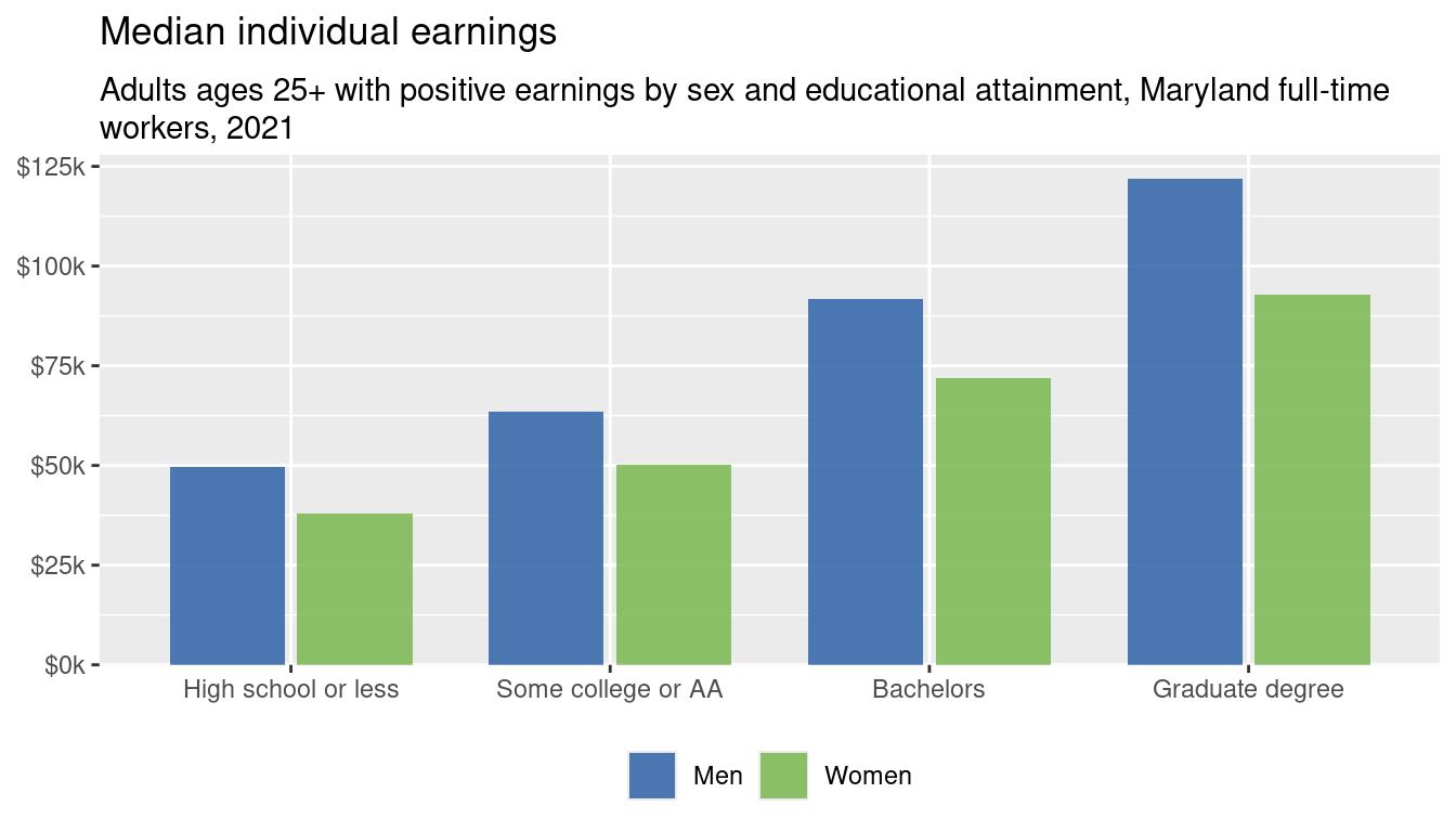
Basics
Focusing first on median wages (earn_q50), values here range from 38,000 to 121,873, so we should expect our dependent axis (usually y, but we might change it) to range from somewhere below that to somewhere above that. If we make a chart and it goes down to e.g. 10,000 that’s a sign that something weird might be happening. On the dependent axis, we have 2 categories of sex :-/ and 4 of education; if we end up with only 3 bars, or with 15 bars, something’s wrong.
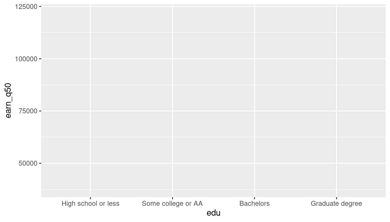
These scales make sense so far—I haven’t signaled that sex will be included here, or that we’re making a bar chart which is why the dependent axis doesn’t have to go down to 0.
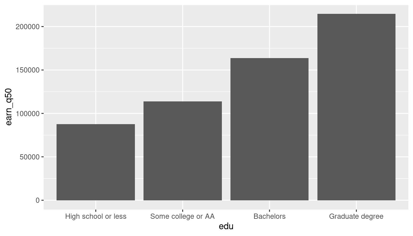
The dependent scale has changed: it goes down to 0, which makes sense because now we have bars, but it goes up to 200,000, which is weird.
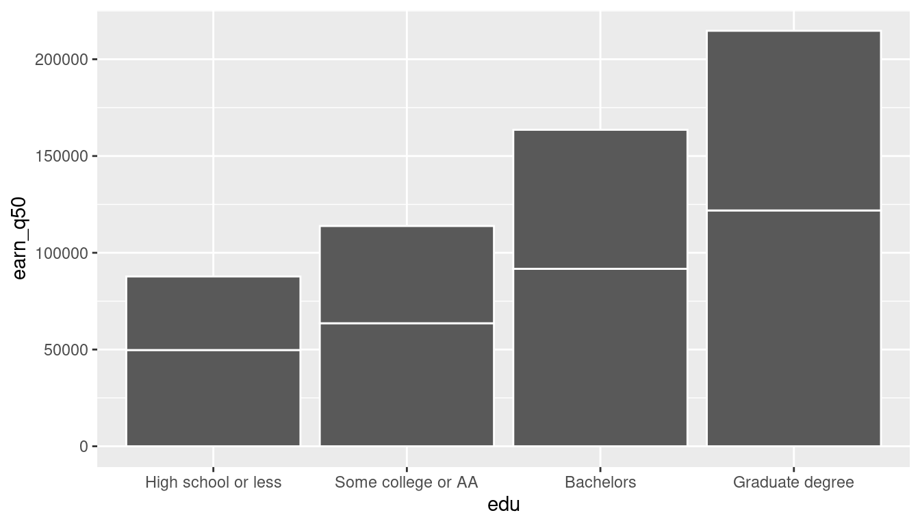
This still includes both men and women, but sex isn’t assigned to any aesthetic, so bars just get stacked. Setting the fill makes that clear.
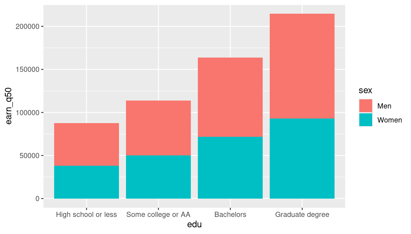
These bars shouldn’t be stacked, though. Why not?
ggplot(sex_x_edu, aes(x = edu, y = earn_q50, fill = sex)) +
  geom_col(position = position_dodge2()) +
  labs(title = "Median earnings by sex & education, Maryland, 2021")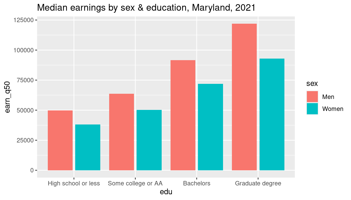
So now we have a chart that represents the data appropriately. We can make it look nicer, but for now we have all the basic components set.
What are all the components here?
- axes (x & y)
- tick values (dollar amounts, education levels)–horizontal
- legend (placement, title, labels, keys)
- axis titles
- background
- gridlines (x & y gridlines, x-axis major, y-axis major & minor)
- title
- bars with color
- tick marks
- units (not included)
- text choices (font, size, boldness)
A nicer chart
That chart is fine but not great. Next we could clean up the axes, their labels, ticks, and gridlines. For each of these components, you should ask yourself if they’re necessary, or what they add to the chart that isn’t already provided through some other means. This helps you maximize your data-to-ink ratio, Wilke (2019)
Live code: clean up this chart
gg <- ggplot(sex_x_edu, aes(x = edu, y = earn_q50, fill = sex)) +
  geom_col(position = position_dodge2())

gg +
  scale_y_continuous(labels = dollar_k) +
  theme(panel.grid.major.x = element_blank()) +
  theme(panel.grid.minor.y = element_blank()) +
  theme(axis.ticks = element_blank()) +
  labs(title = "Median individual earnings",
       subtitle = "Adults ages 25+ working full time by sex and educational attainment, Maryland, 2021",
       y = "Median earnings", x = NULL, fill = NULL) +
  scale_fill_manual(values = gender_pal)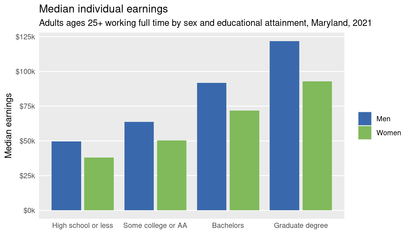
Goal: one option
This is one more complicated option of how I might do this. It uses a function from the package stylehaven which I wrote for work, and which you all are free to use. It also uses showtext to set the fonts, which can be very finicky.
# can't get fonts to not be totally weird
library(showtext)
showtext_auto()
showtext_opts(dpi = 300)
sysfonts::font_add_google("Barlow Semi Condensed")
# use both true/false and gender palettes
comb_pal <- c(purrr::map_chr(gender_pal, colorspace::darken, amount = 0.2, space = "HCL"), tf_pal)
sex_x_edu |>
mutate(edu = forcats::fct_recode(edu, "Some college / Associate's" = "Some college or AA", "Bachelor's" = "Bachelors")) |>
stylehaven::offset_lbls(value = earn_q50, fun = dollar_k, frac = 0.03) |>
ggplot(aes(x = edu, y = earn_q50, fill = sex, group = sex)) +
geom_col(width = 0.8, position = position_dodge2()) +
geom_text(aes(y = y, label = lbl, vjust = just, color = is_small),
family = "Barlow Semi Condensed", fontface = "bold", size = 9.5,
position = position_dodge2(width = 0.8)) +
geom_text(aes(label = sex, color = sex, x = as.numeric(edu) - 0.18, y = earn_q50 - off/2),
data = ~filter(., edu == first(edu)), vjust = 0, hjust = 0,
family = "Barlow Semi Condensed", fontface = "bold", size = 8,
position = position_dodge2(width = 0.8)) +
scale_fill_manual(values = gender_pal) +
scale_color_manual(values = comb_pal) +
scale_x_discrete(labels = scales::label_wrap(15)) +
scale_y_barcontinuous(breaks = NULL) +
theme_minimal(base_family = "Barlow Semi Condensed", base_size = 28) +
theme(text = element_text(lineheight = 0.5)) +
theme(panel.grid = element_blank()) +
theme(legend.position = "none") +
theme(axis.text = element_text(color = "black", size = rel(0.9))) +
theme(plot.title = element_text(family = "Barlow Semi Condensed", face = "bold")) +
theme(plot.subtitle = ggtext::element_textbox_simple(family = "Barlow Semi Condensed", lineheight = 0.7)) +
theme(plot.caption = element_text(color = "gray30")) +
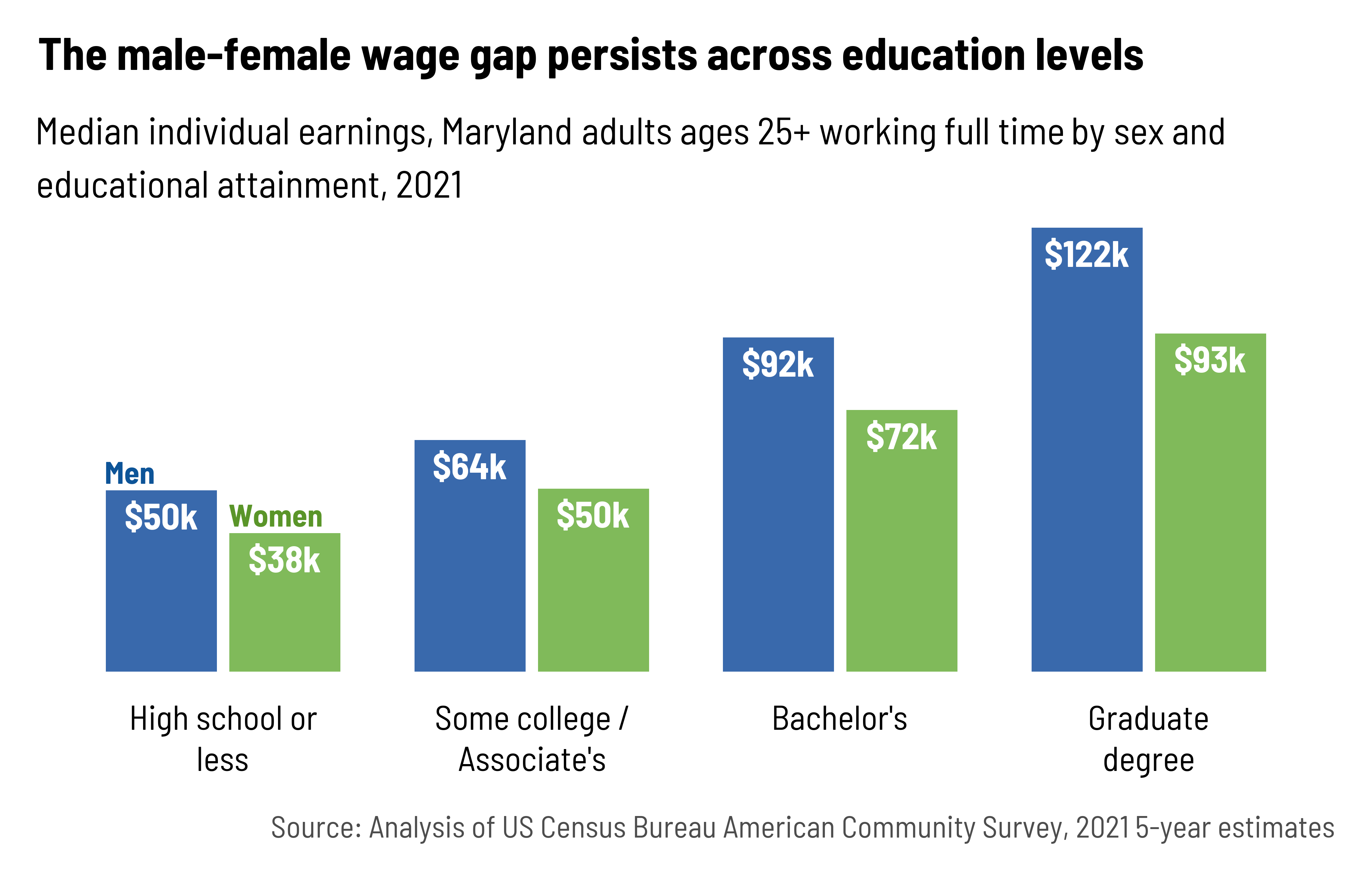
labs(x = NULL, y = NULL,
title = "The male-female wage gap persists across education levels",
subtitle = "Median individual earnings, Maryland adults ages 25+ working full time by sex and educational attainment, 2021",
caption = "Source: Analysis of US Census Bureau American Community Survey, 2021 5-year estimates")