“Until the systems of power recognise different categories, the data I’m reporting on is also flawed,” she added.
In a bid to account for these biases, and any biases of her own, Chalabi is transparent about her sources and often includes disclaimers about her own decision-making process and about any gaps or uncertainties in the data.
“I try to produce journalism where I’m explaining my methods to you,” she said. “If I can do this, you can do this, too. And it’s a very democratising experience, it’s very egalitarian.”
In an ideal scenario, she is able to integrate this background information into the illustrations themselves, as evidenced by her graphics on anti-Asian hate crimes and the ethnic cleansing of Uygurs in China.
But at other times, context is relegated to the caption to ensure the graphic is as grabby as possible.
“What I have found is literally every single word that you add to an image reduces engagement, reduces people’s willingness or ability to absorb the information,” Chalabi said.
“So there is a tension there. How can you be accurate and get it right without alienating people by putting up too much information? That’s a really, really hard balance.”
A data visualization is not a piece of art meant to be looked at only for its aesthetically pleasing features. Instead, its purpose is to convey information and make a point. To reliably achieve this goal when preparing visualizations, we have to place the data into context and provide accompanying titles, captions, and other annotations.
The type of text you use, phrasing, and placement all depend on where your visualizations will go, who will read them, and how they might be distributed. For example, I might put less detail in the titles and labels of a chart that will be part of a larger publication than a chart that might get distributed on its own (I’ll also tend towards more straightforward chart types and simpler analyses for something standalone).
Different styleguides and publication requirements may have different standards in how you need to use text. Some styleguides require every axis be explicitly labeled, for example, whereas I usually assume my readers know that an x-axis with ticks for 2010, 2015, 2020, … is a date, or I’ll squeeze that sort of explanation into a subtitle (e.g. “Share of households without a vehicle, Maryland tracts, 2024”) instead of directly on the axis. You might be required to do differently, so just be mindful of that.
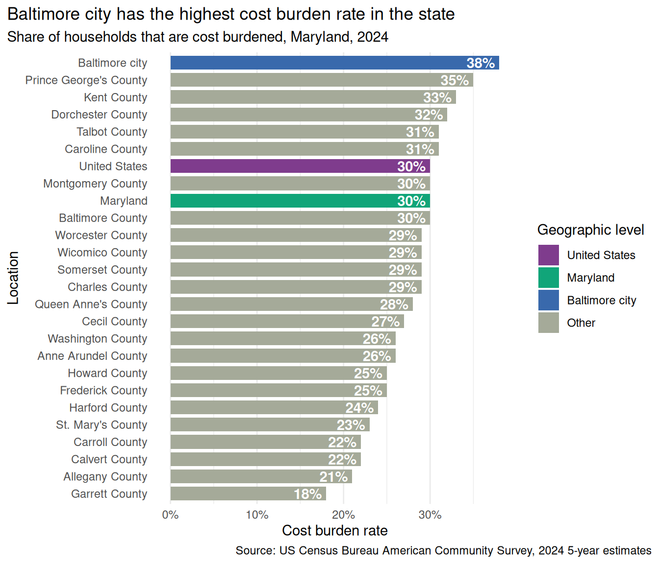
Identify all the text in this chart, what purpose it serves, and whether that could be done better through other means.
ggplot( cost_burden_county,aes(y = name, x = total_cost_burden, fill = level2)) +geom_col(width =0.8) +geom_text(aes(label = pct),hjust =1,color ="white",fontface ="bold",nudge_x =-0.005 ) +scale_x_continuous(labels = percent) +scale_fill_manual(values = qual_pal) +labs(title ="Baltimore city has the highest cost burden rate in the state",subtitle ="Share of households that are cost burdened, Maryland, 2024",caption ="Source: US Census Bureau American Community Survey, 2024 5-year estimates",x ="Cost burden rate",y ="Location",fill ="Geographic level" ) +theme(panel.grid.major.y =element_blank(),panel.grid.major.x =element_line(),plot.title.position ="plot",plot.caption.position ="plot" )
TipBrainstorm
Text element
Purpose
Improvements?
y-axis labels
identifying names of places
not necessary. abbreviate county?
title
take-home message
do we need it if chart doesn’t stand alone?
subtitle
description of the measure
x-axis title
definition of values
could go either way
x-axis labels
orient you to different values
depends on direct labeling
legend
show type of geographies
redundant (but could also be more specific)
Titles
Different organizations and publications will also have guidelines for the types of text you write. My organization’s work needs to generally be publicly accessible. Several years ago, we decided to try transitioning most of our charts from descriptive titles (“Cost burden rates by county”) to narrative ones (“Baltimore city has the highest cost burden rate in the state”). This frames the chart so that the reader is guided toward what we think is the most important takeaway message, and doesn’t require them to be able to make that judgment on their own. However, there is often not a single most important finding or pattern, so this may be a way you unintentionally introduce bias and subjectivity to your work (hot take: none of the data we work with is purely objective and unbiased anyway).
We don’t always do narrative titles, though: in a more technical document we might not, and we generally think of tables as a more technical counterpart to a chart, so we usually just use descriptive ones there too.
Direct labeling
Direct labeling is a use of text that is more about your specific data than the messaging, but it’s again a technique that helps your reader make sense of the data. This is where you place labels at specific points, such as labeling the value at the end of every bar in a bar chart, or labeling the endpoints of each line in a line chart. This can also let you eliminate some annotations, such as axis labels or legends, leaving your reader with fewer separate elements to read and fewer dots to connect as they move back and forth (some explanations of this in Wilke (2019) section 20.2).
With ggplot, you’ll do this with geom_text or geom_label (or similar functions from packages like ggrepel or ggtext).
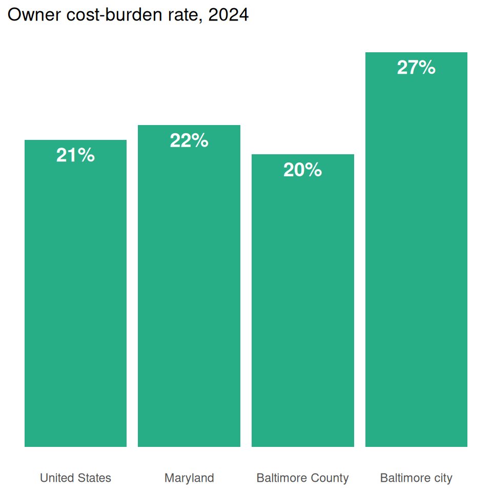
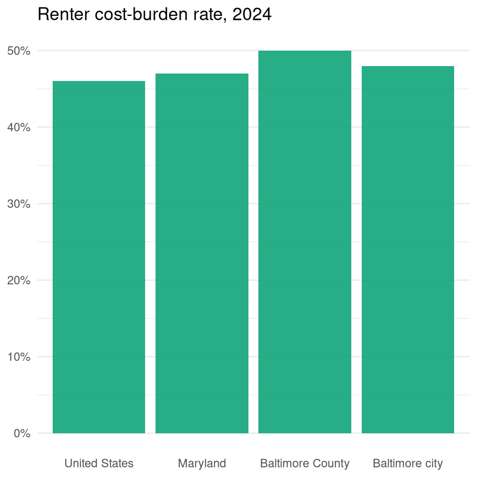
Labeling observations lets you drop the axis and gridlines, and gives your reader exact values instead of having to estimate them by position within the grid. Which of these is easier to read precisely?
county_to_lbl |>ggplot(aes(x = name, y = renter_cost_burden)) +geom_col(alpha =0.9, fill = qual_pal[2]) +scale_y_continuous(labels = percent) +labs(x =NULL, y =NULL, title ="Renter cost-burden rate, 2024") +theme(panel.grid.major.x =element_blank())
However, it’s not always necessary to know the exact value of every observation. Don’t label every point in a scatterplot, or try to label the count of every bin in a histogram. In those sorts of cases, focus on the overall pattern and noteworthy deviations (as always, this requires knowing your data and its context well).
Sometimes it can be tricky to use labels in place of legends, but it’s often a good idea, such as in Wilke’s examples with the line chart of stock prices. I’ll often make a little data frame of just the subset of my data that lets me show the labels I want. That might mean just the start and/or end points of a line chart, or a single observation (usually either the first or last) of bars I want to label. We’ll write some helper functions for this in this week’s lab.
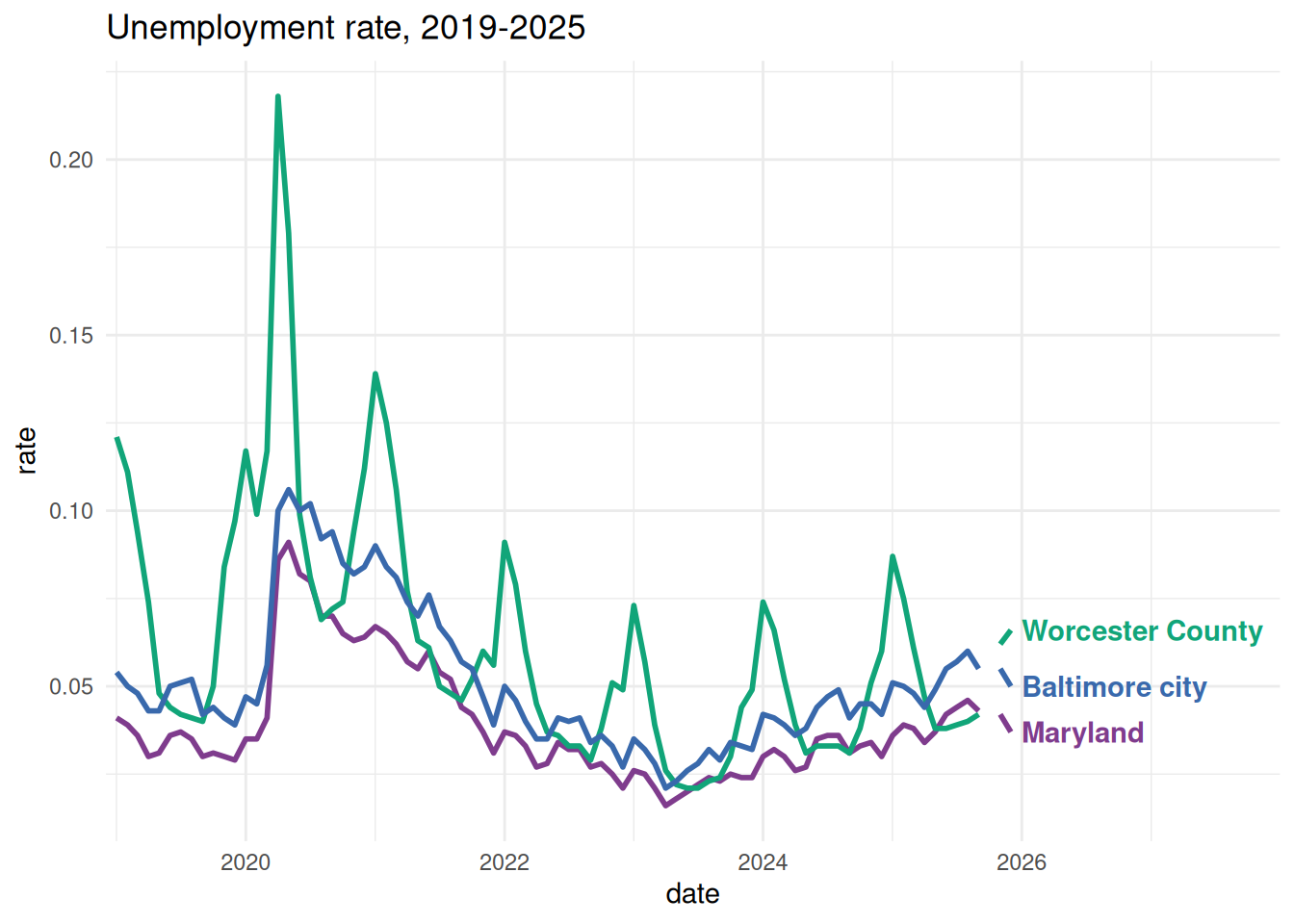
In this example, I want labels at the last date for each location. dplyr::slice_max is a shorter way to filter for rows where the date is equal to the maximum value of all dates in the data frame.
One thing to note with timeseries data is that the units will be based on days. So something like nudge_x = 30 will mean moving a marking over by the equivalent of 30 days within this scale.
Code
unemp_to_lbl <- justviz::unemployment |> dplyr::filter(lubridate::year(date) >=2019) |> dplyr::filter( name %in%c("Maryland", "Baltimore city", "Worcester County") ) |> dplyr::mutate(name = forcats::as_factor(name))# if I thought different locations might have different end dates,# I'd need to group by location first, and take max date for eachunemp_last_date <- unemp_to_lbl |> dplyr::slice_max(date)ggplot(unemp_to_lbl, aes(x = date, y = rate, color = name)) +geom_line(linewidth =1) +# use the smaller data frame for geom_text# left-align labels with hjust, then nudge themgeom_text(aes(label = name),data = unemp_last_date,hjust =0,nudge_x =30,fontface ="bold" ) +scale_color_manual(values = qual_pal) +# expand the range shown by adding extra days to right sidescale_x_date(expand =expansion(add =c(30, 365*2))) +theme(legend.position ="none") +labs(title ="Unemployment rate, 2019-2025")
Audience
Tailor your work to your audience. That includes understanding:
who is reading it
their background knowledge, experiences, and familiarity with the data
their purpose in reading it
the context in which they’re reading it
what actions you want them to take with the information, if any
I’m going to make different charts of the same data to present to a local board of education vs the math teachers in that district vs their students. I’m going to use different framing for a visualization that accompanies a technical report vs a political petition.
One of the first considerations you’ll make is the type of chart. I’ve said it already but I’m very jealous of everyone who can publish a histogram; I’m pretty much always working for an audience that I can’t assume knows how to read a histogram. I have to either pick a different chart type, or couch it in annotations and other helpers to teach my reader how to read it (interactive visualization makes this a little easier).
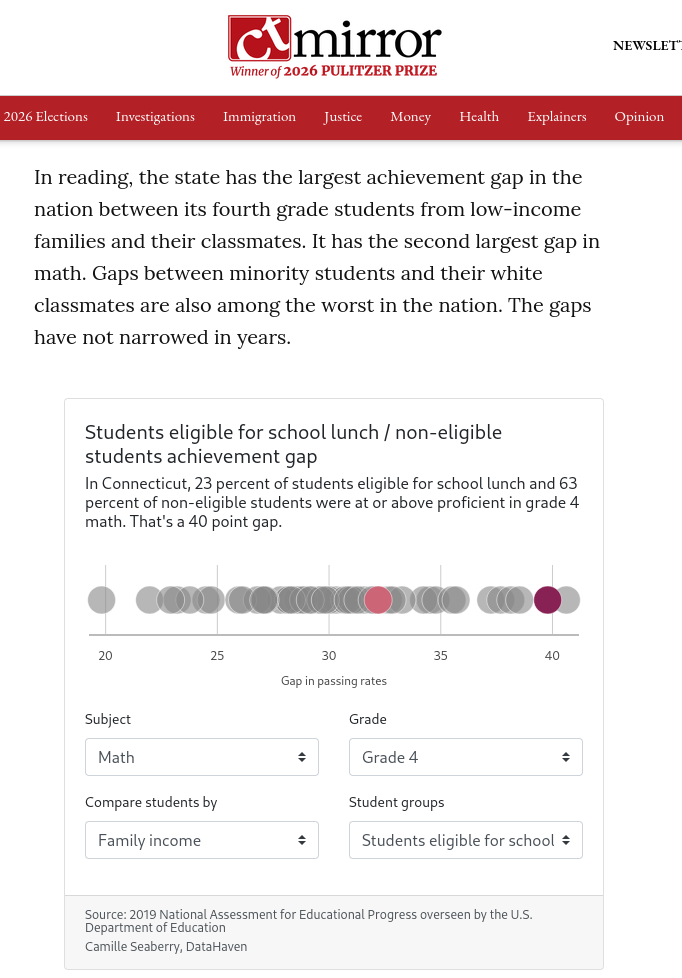
Here’s one project where I was able to display distributions of data, but that included more text than I might use otherwise, interaction, and user choices, and accompanied a 3,000-word article written by a very skilled, data-focused journalist.
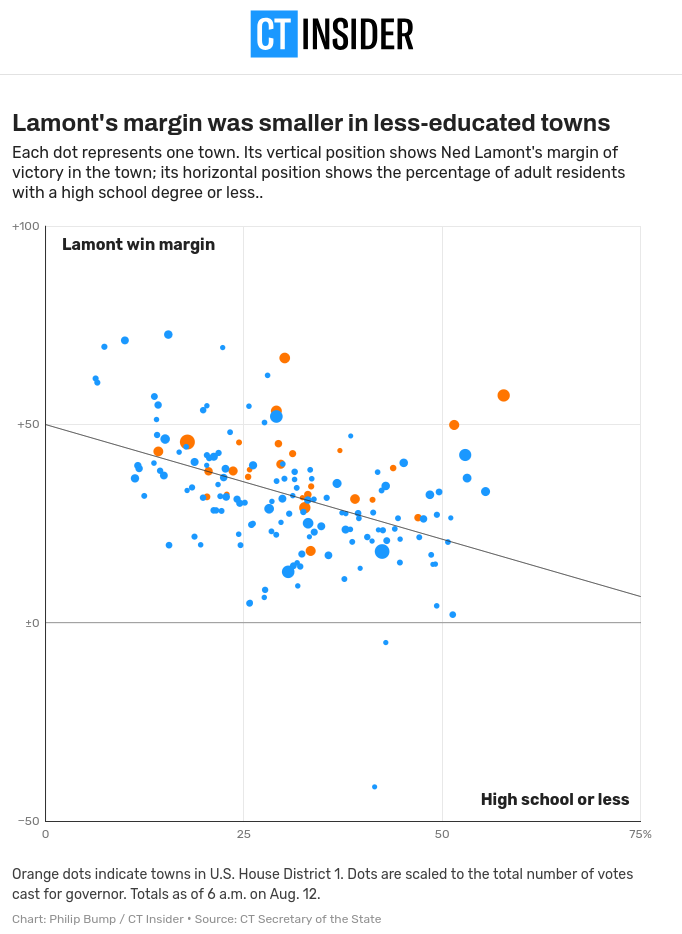
That’s not to say you can’t or shouldn’t use more complex charts in all situations; you might just need to use text and annotations, and maybe break the chart down into several parts, in order to guide your audience. Here’s an example of one of several charts that accompany a newspaper article; check out how much care was put into making a relatively complex chart legible.
Throughout my time doing data viz, accessibility has been a major oversight of mine, and it’s for no other reason than privilege. On a day-to-day basis I don’t have to think about whether learning or interacting with something will depend on my ability to see well, read complicated text, speak a certain language, navigate stimuli, process information, or access technology and resources. My hope for you all is that you start out your data viz careers being more mindful than I’ve been.
For the most part when we talk about accessibility, we mean this with respect to disabilities; in static data visualization, this mostly means visual impairments such as blindness, low vision, and colorblindness/color vision deficiency (CVD). If you go on to do interactive or web-based visualization, you’ll also need to think about things like navigation (access for keyboards and assistive devices vs clicking menus only) and animation (can be overstimulating or hard to process).
Circa 2017, scrollytelling was very cool and people were very intense with it. I’ve noticed in recent years people have eased up. It can be disorienting for some readers. Webb (2018) convinced me to scrap my scrollytelling plans for some projects during that era. I tried something similar once, and it made my partner with ADHD very agitated.
Some of the simplest tasks we can do for static data visualization are using colorblind-friendly palettes, writing alt-text descriptions, and maintaining high contrast ratios between backgrounds and text.
Colorblindness / color vision deficiency
You should generally assume your work will be read by at least a few readers with CVD and plan your color palettes accordingly. Wilke mentions this as a reason for redundant coding as well, so you’re not relying on color alone to differentiate values.
Something that blew my mind is in Frank Elavsky’s interview on PolicyViz(Schwabish, 2021). He acknowledges that awareness of CVD has become the norm in data viz, but that it actually predominantly affects white men, and that it shouldn’t be too surprising that that is often the only accommodation made in a field where white men are overrepresented.
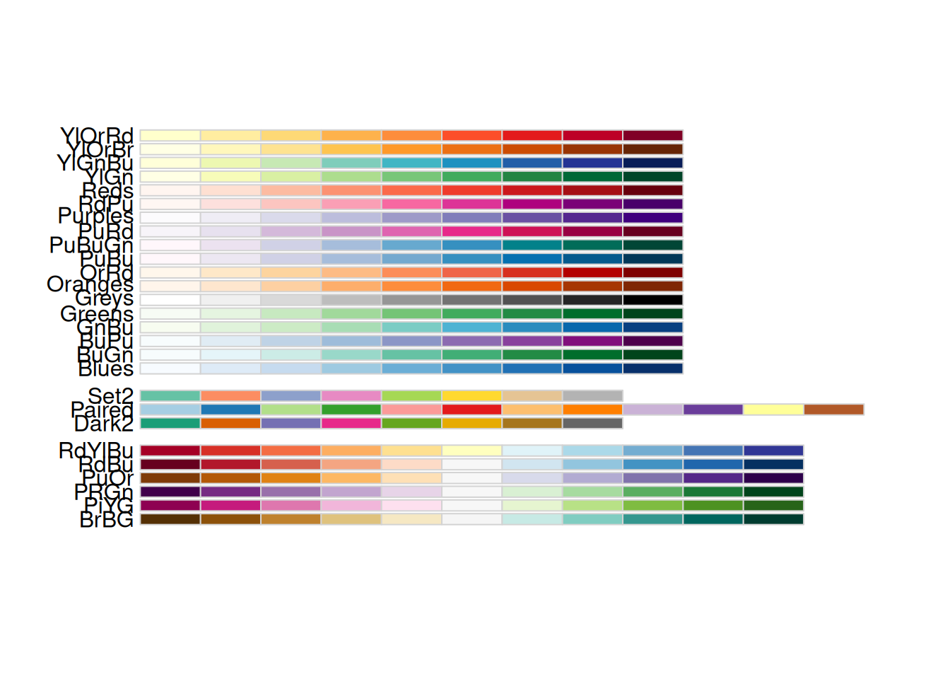
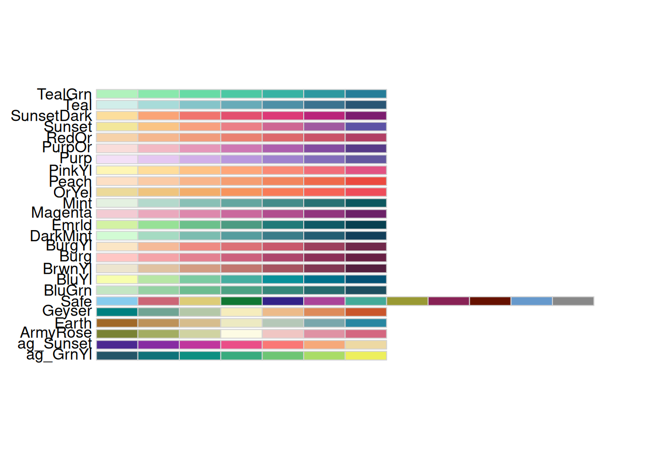
The most common form of CVD is what’s called red-green colorblindness. Many common R color palettes are colorblind-friendly, and some tools will help you tell whether a palette is or not, or for which color deficiencies they are legible.
Some code examples:
# Not all Color Brewer palettes are CVD-friendly, but you can filter in the R package# or on the website for ones that areRColorBrewer::display.brewer.all(colorblindFriendly =TRUE)
# Same goes for Carto Colorsrcartocolor::display_carto_all(colorblind_friendly =TRUE)
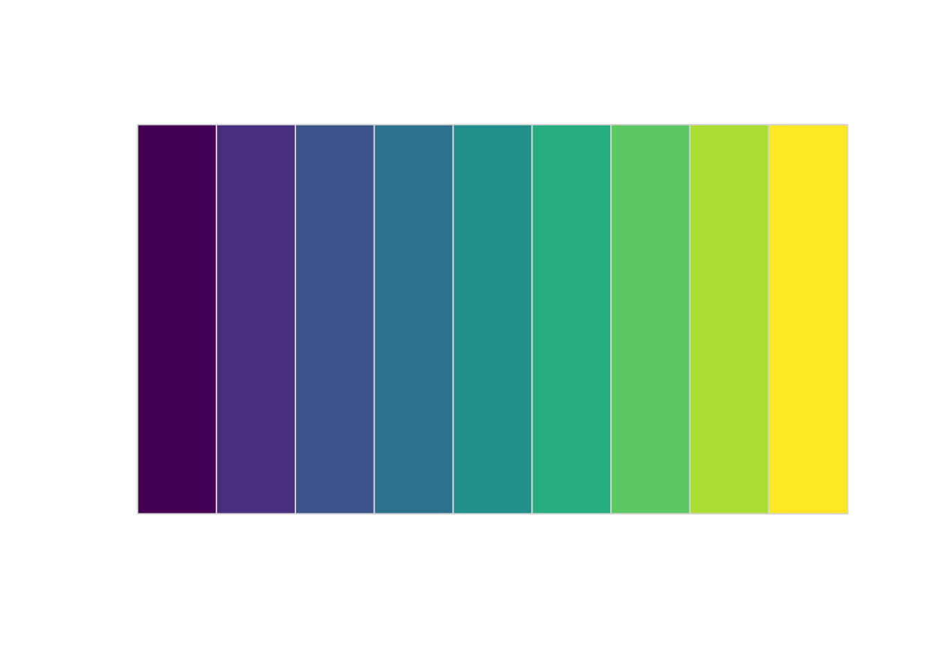
# All Viridis palettes are designed to be CVD-friendly# use them with e.g. scale_fill_viridis_c()colorspace::swatchplot(viridisLite::viridis(n =9))
# Okabe-Ito is built into R and based on lots of research into CVDcolorspace::swatchplot(palette.colors(n =9, palette ="Okabe-Ito"))
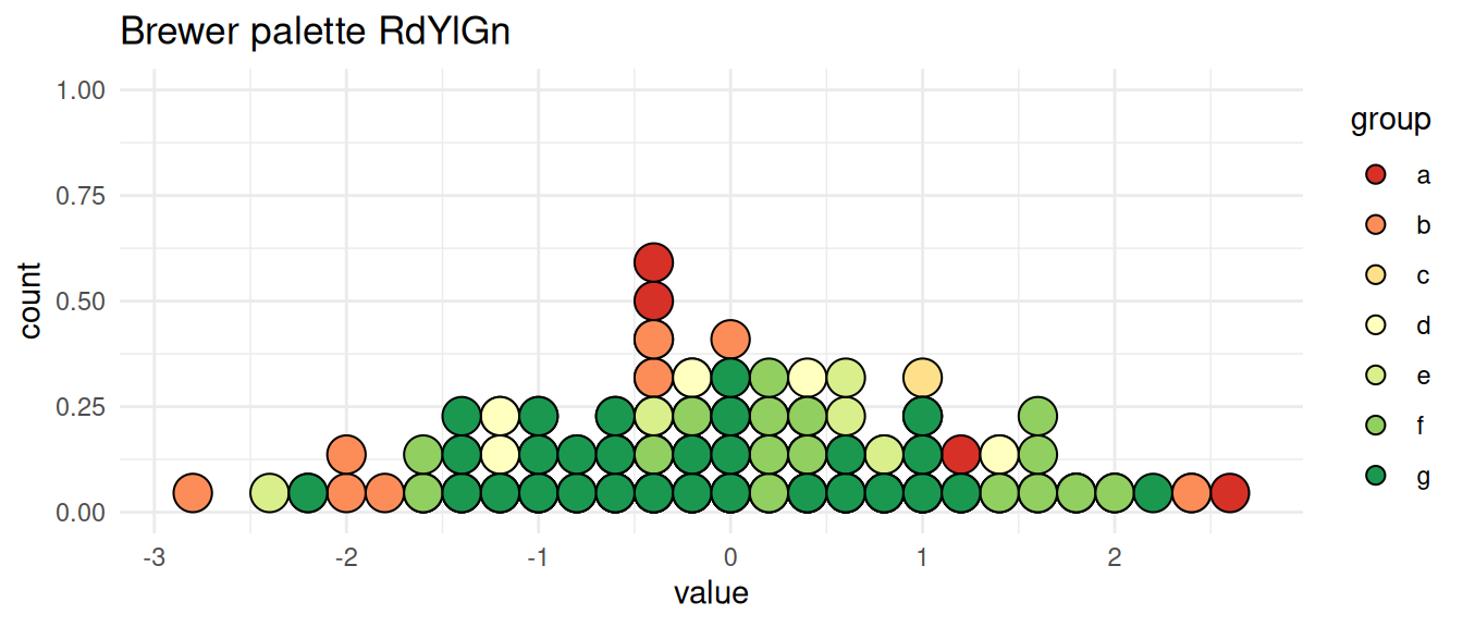
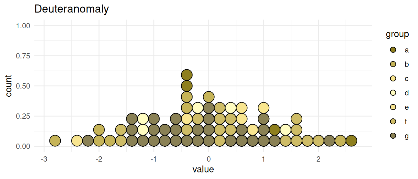
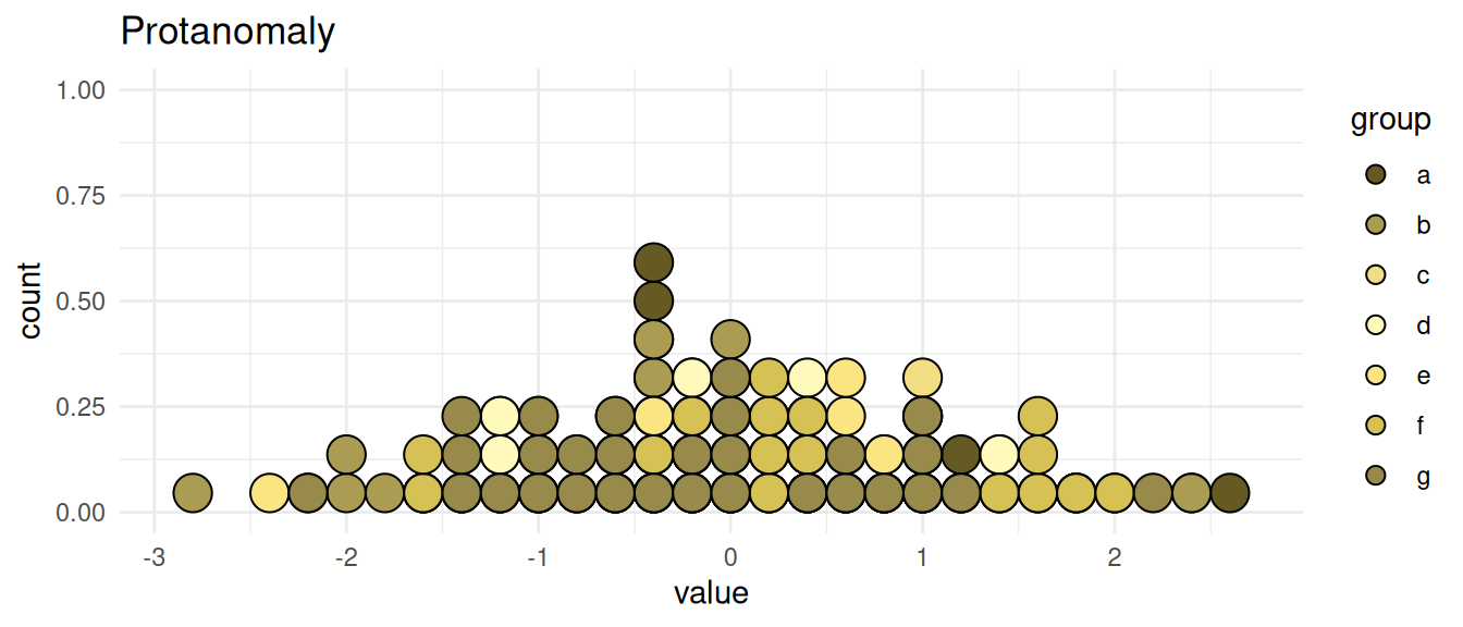
There are also a lot of tools to help you simulate different types of CVD. This is particularly useful for diverging palettes, which can be hard to make accessible.
p +scale_fill_manual(values = colorspace::deutan(div_pal)) +labs(title ="Deuteranomaly")
p +scale_fill_manual(values = colorspace::protan(div_pal)) +labs(title ="Protanomaly")
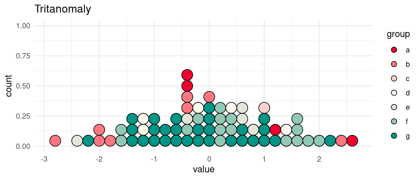
p +scale_fill_manual(values = colorspace::tritan(div_pal)) +labs(title ="Tritanomaly")
There are lots of tools to do similar simulations, although many of them require you to have a graphic already saved to a file. An online one that’s good for developing and adjusting palettes is Viz Palette by Susie Lu; this one also accounts for the size of your geometries. However, as I mentioned when we talked about color more broadly, a recent AI rebuild of the site seems to have made the contrast checker for small markings sometimes not work, so be careful.
Viz Palette takes a set of space- or comma-separated colors as hex values. If you have a vector of colors, call
cat(div_pal, sep =" ")
to get it all in one line that you only have to copy & paste once.
Alt text
Alt text is the text that’s displayed in place of, or alongside, an image online and in some types of documents (certain PDF versions, Microsoft Word, etc). If someone is using a screen reader, it will read this text aloud. This can be embedded in posts on most social media platforms as well, and is autogenerated on some (if you ever look at Facebook with a bad internet connection, you might see alt text until the images load.) As the designer of your visualizations, you’re in a unique position to write alt text, since you will have close knowledge of the data and what’s important about it. Writing alt text also helps you check your understanding of the chart and your ability to summarize it.
Including alt text in R:
For exporting ggplot charts in some file formats, you can include alt text in labs(alt = "").
In Rmarkdown documents, you can include it as the fig.alt chunk option
Similar for Quarto documents: fig-alt
When directly including images in Markdown, use {fig-alt="Alt text goes here"}
Contrast
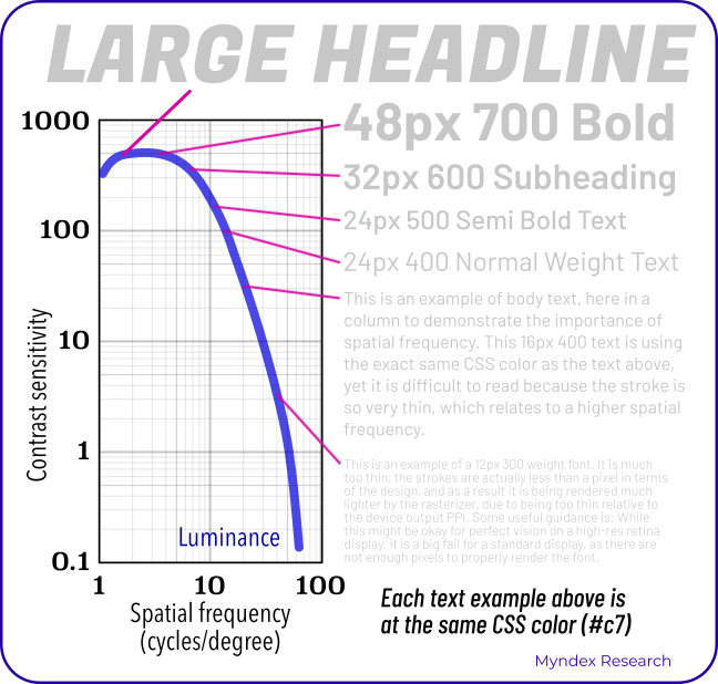
Different pieces of your visualization need to have enough contrast to be legible at different sizes, especially between text and its background. This comes up with labels like titles, but especially with direct labels. Generally your labels will be all white or all black (or slightly darker or lighter, respectively), so if you’re putting direct labels on several bars with different colors, make sure you have enough contrast across all of them.
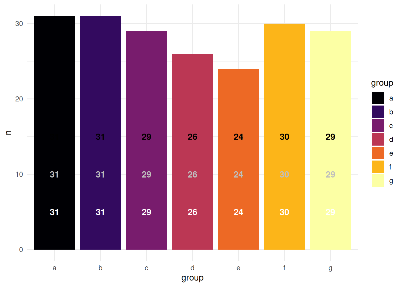
For example, this palette starts out very dark and ends very light, so neither white nor black will be legible across all bars. Switching between label colors (light on the dark bars, dark on the light bars) can be distracting or imply something about the data that isn’t there, so it’s better to use a palette where all labels can be the same color.
inferno <- viridisLite::inferno(n =7)cvd_counts <- cvd_data |> dplyr::count(group)cvd_labels <- tibble::tibble(color =c("white", "gray", "black"),y =seq_along(color) *5) |> dplyr::cross_join(cvd_counts)cvd_counts |>ggplot(aes(x = group, y = n, fill = group)) +geom_col() +geom_text(aes(label = n, y = y, color = color),data = cvd_labels,fontface ="bold" ) +scale_color_identity() +scale_fill_manual(values = inferno)
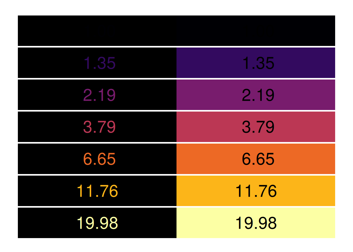
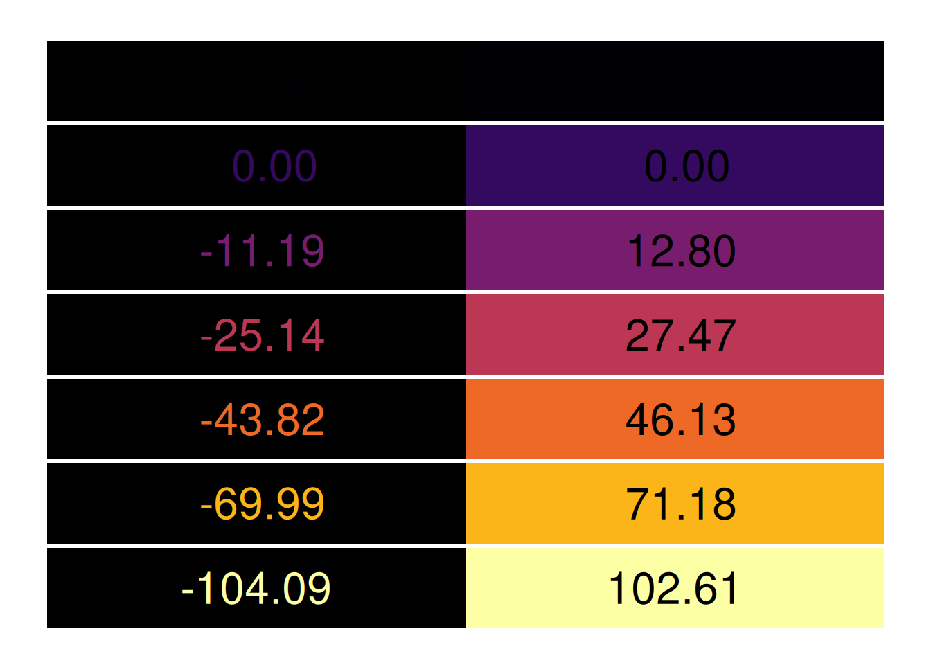
The W3C recommends a minimum contrast ratio of 4.5 for regular-sized text, and 3 for large text. You can use colorspace::contrast_ratio to get calculations of these ratios.
I learned while prepping for this semester that there are new proposed web accessibility standards that haven’t been adopted yet, and probably won’t be for another few years. The proposed color contrast algorithm is in beta, and it accounts for not just the contrast between two colors, but their markings’ relative sizes and contexts. That’s more directly applicable to us in testing contrasts for data viz, since we know that colors of points in a scatterplot are likely harder to tell apart than large bars in a bar chart. You can try this algorithm with the previous function:
While this standard hasn’t been officially adopted by the W3C and the authors say it’s not fully ready for production yet, this is a good time to familiarize yourself with it and maybe start using it in your own projects. I’ll be rewriting by job’s contrast checker to use it.
We may easily take for granted the ability to read English fluently, but it’s important to remember that, depending on our audience, many of our readers may not be able to. Twenty-two percent of US adults ages 16 to 74 are rated as having low literacy; in Maryland, this is 20% (National Center for Education Statistics, 2020). 1 So if you’re creating a visualization that needs to work for a general audience, you’ll want to keep your sentences short, language simple, and chart types pretty standard.
1 This program outlines definitions of “low literacy,” but in news stories and Wikipedia it’s being referred to as corresponding to a sixth grade reading level. I haven’t found anything directly connected to the program that corroborates that.
There are some tools online to estimate reading level algorithmically, though this can be problematic. One I’ve used is the Flesch-Kincaid grade level test.
Modes of access
Usually accessibility implies access to people with disabilities or visual impairments or differences. I like to include literally the way your reader will access a visualization as part of accessibility.
If your chart is going on social media, you’ll want it to be pretty simple and use large text so it’s easy to read on a standard smartphone screen without zooming in.
If it’s going into a PDF or other standardized document, you’ll have more room for detail.
If you need to print it in black and white, your colors might be limited (the ColorBrewer site has a flag for photocopy friendly).
If you get into building visualizations for the web, you’ll have access to mobile-first / responsive design tools, where you design first to work on a phone and then include ways elements will resize and reflow for larger screens. (Not doing this well is one of my gripes with Tableau.)
Other very cool techniques
People have come up with lots of other creative ways to make data visualization more accessible, including by bypassing the visual component. I’ve heard of people doing data sonification, physical data sculptures you can touch, and visualizations that incorporate braille. Every episode of The Data Journalism Podcast (definitely recommend it) opens with a data sonification.