| sex | edu | earn_q20 | earn_q50 | earn_q80 |
|---|---|---|---|---|
| total | no_diploma | 27868 | 43234 | 70000 |
| total | high_school_diploma | 33227 | 52520 | 85018 |
| total | some_college | 40000 | 64311 | 104451 |
| total | bachelors | 54655 | 91091 | 145771 |
| total | graduate_degree | 72873 | 116000 | 181895 |
| men | no_diploma | 30881 | 48582 | 75145 |
| men | high_school_diploma | 36436 | 58000 | 92644 |
| men | some_college | 42874 | 72057 | 115382 |
| men | bachelors | 60727 | 102938 | 162199 |
| men | graduate_degree | 81100 | 134000 | 202749 |
| women | no_diploma | 21617 | 35264 | 57928 |
| women | high_school_diploma | 30700 | 46322 | 72873 |
| women | some_college | 36436 | 56616 | 92685 |
| women | bachelors | 50000 | 80160 | 126000 |
| women | graduate_degree | 68015 | 102938 | 157891 |
03. Visual encodings
Warm-up
Hans Rosling’s 200 Countries, 200 Years, 4 Minutes (2010): Hans Rosling gives a master class in storytelling with multidimensional data.
Hans Rosling’s 200 Countries, 200 Years, 4 Minutes. (2010). BBC Four. https://www.youtube.com/watch?v=jbkSRLYSojo
Mapping data to visual elements
We’ll work with a subset of the wages data in justviz and follow along some of what’s in Wilke (2019), ch. 2 and 20. In Table 2.1, Wilke goes over types of variables that we might find in our data and the scales that fit each.
Wilke, C. O. (2019). Fundamentals of Data Visualization. https://clauswilke.com/dataviz/
In this subset of data, we have 2 qualitative variables (sex and educational attainment) and 3 continuous quantitative ones (20th, 50th, and 80th percentile earnings).
On the ACS, the Census Bureau only asks gender as male or female, so there are no gradations recorded. Educational attainment starts off quantitative: the way it’s measured is roughly the number of years of school completed (i.e. discrete), but it could also be measured to include fractions of a year (i.e. continuous). For simplicity’s sake, however, I lumped it into broader categories that no longer have specific identifiable numbers associated.
I also only included people with positive earnings in the past year in my analysis, so earnings are bounded at $1.
Here’s the foundation for a chart of median earnings by education.
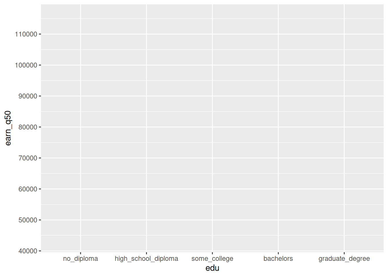
So far we’ve got a discrete x axis for education and a continuous y axis for median earnings. Without setting any geometries (bars, points, etc) the default y range is just based on what’s included in the data, which goes from about 40k to somewhere above 110k (I’ve added extra breaks on the y-axis to see this better).
If I plot points, this range doesn’t need to change.
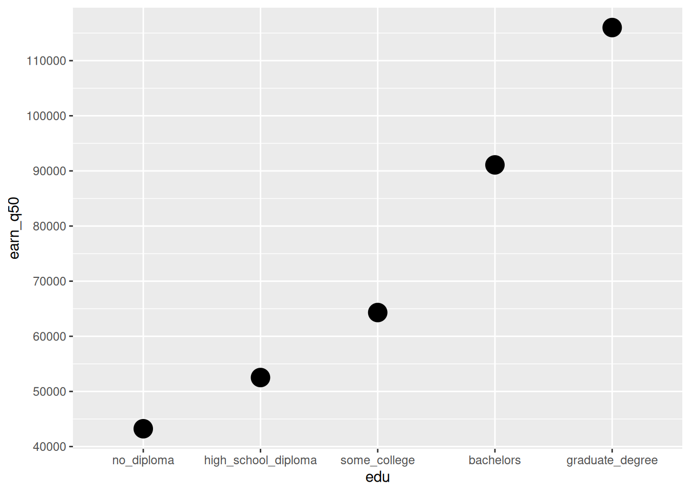
However, I want to make a bar chart. Points encode values to their positions, whereas bar charts encode their data to the length of the bar. For a value to correspond to the length of a bar, it needs to start at 0. By adding a column geometry, ggplot knows to start the y-axis at 0.
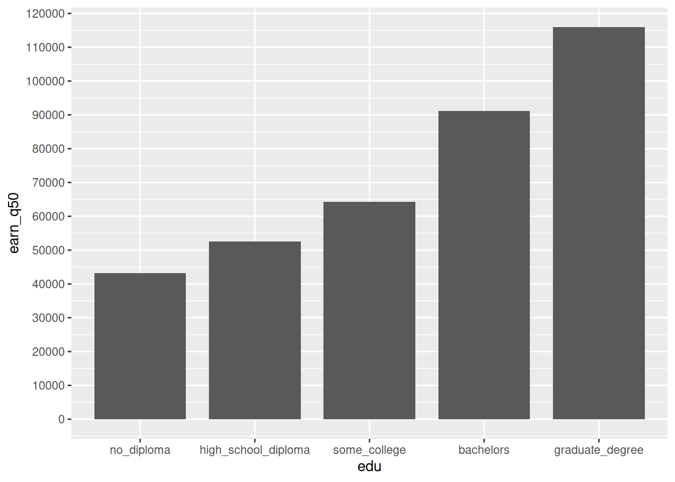
So now we’ve got a discrete axis for education, a continuous axis for median earnings, and bars whose lengths give the median earnings for each group. We have room for more encodings:
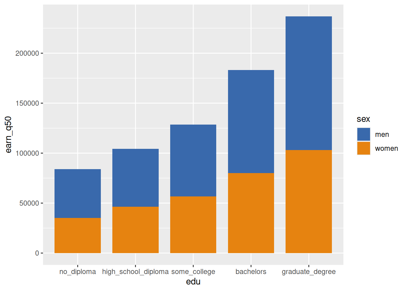
Something’s wrong, though: by stacking the bars, we’re saying that there’s some meaning to the combined lengths. That could be the case for some data (e.g. median wage earnings in one group stacked with median income from other sources like pension in another group could, in fact, give a sense of total income from multiple sources). But in this case, the average woman’s earnings plus the average man’s earnings doesn’t mean anything. So the bars should be clustered instead.
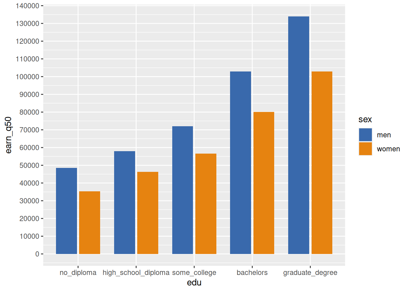
Now sex is encoded to color. Notice that the y-axis has to go a little higher now to fit values for men with graduate degrees.
We could also include other percentiles of earnings, not just medians. The type of continuous value on the y-axis will stay the same, but the range of values will change again, because the 20th percentile values will be lower than the medians and the 80th percentile values will be much higher.
Just income percentiles by education:
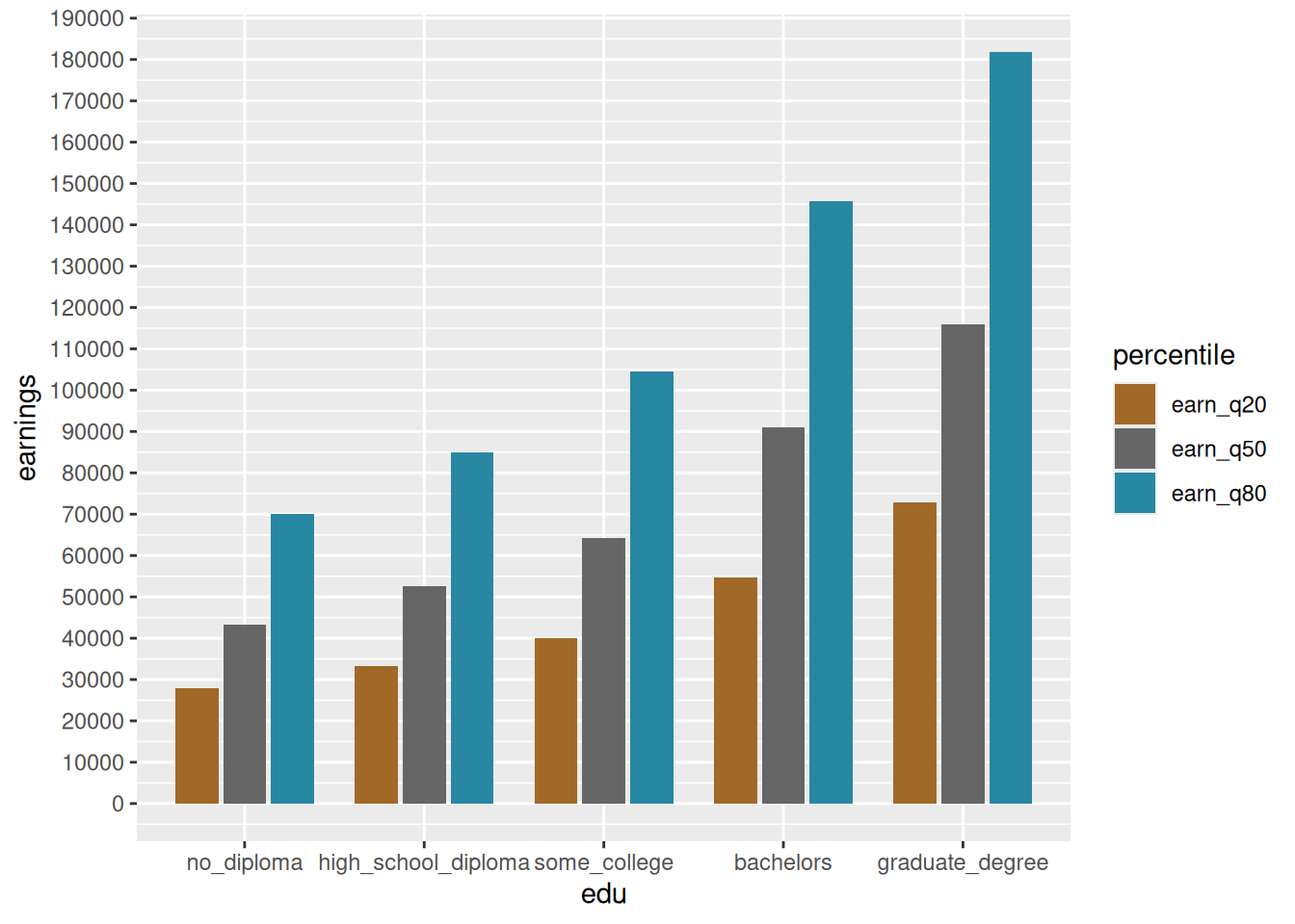
This is okay, but it’s not super interesting. It doesn’t show me anything besides what I would expect—that people with higher educational attainment average higher earnings, which we already knew, and that the 80th percentiles are much higher than the 20th percentiles, which is just true by their definition. What’s more interesting are the gaps between values. Using points instead of bars lets us zoom in a little better on the actual range of values since we don’t have to include 0, and it shifts what our attention is drawn to.
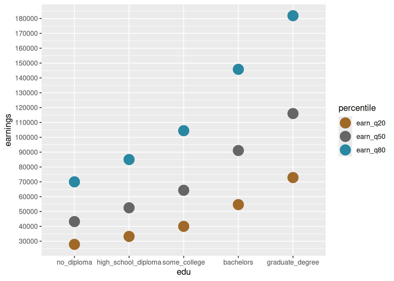
Rather than just reading amounts by the ends of bars, this emphasizes the range of values within each group. The range from 20th to 80th percentiles within each group is implied, but we can make it explicit by adding paths behind the points.
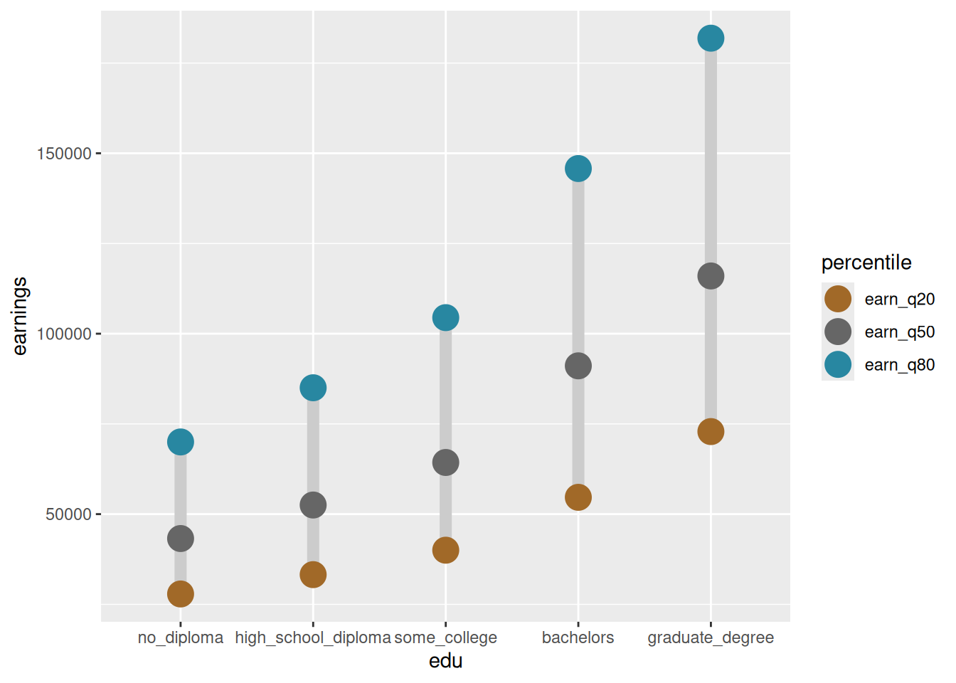
If I want the focus to be on medians, I can add size of points as another encoding, making the medians larger and other percentiles smaller. By default, size would be assumed to be continuous, but you can also make it discrete. (I might do this on the fly in practice, but here I’ll create a separate variable):
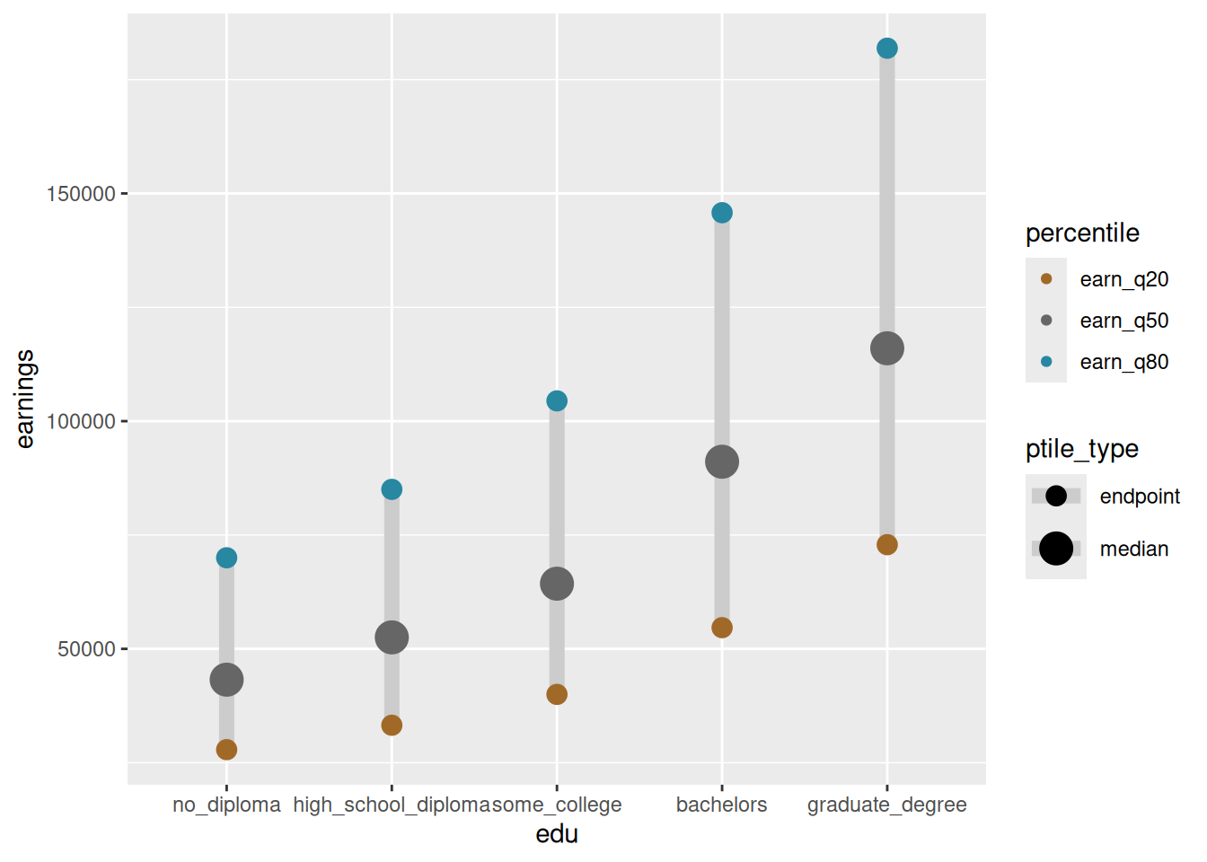
Instead of size, this could have also been something like point shape. This is what Wilke describes as redundant encodings, where the percentile comes from both color and size. I’ve chosen colors that should be colorblind-friendly, and the points in this chart don’t overlap, but in some situations having 2 encodings might help make things easier to read (see his examples with scatterplots with both color and shape).
In fact, let’s imagine we need a chart that can be printed in black and white. This color palette probably won’t hold up, so we can go ahead and add shape as a backup encoding if color fails.
Call ?scale_shape to get a cheat sheet of valid shape labels and codes. I have to do this every time.
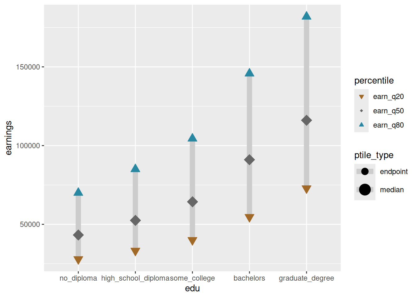
There are more things we could do now, but I’ll leave it here. We still have data by sex, which I’m really interested in, but we’ve maxed out encodings that we’ve used so far. It would be confusing to add another pair of colors or shapes, for example, so one pair can be men and another pair could be women. Instead, I’d likely split the plot into facets to get small multiples—we’ll talk about that later but see if you can imagine what that might look like.
Bad examples
Sometimes bad examples stick with you better than good examples. Lan & Liu (2025) studied and categorized bad data visualizations and came up with a taxonomy of 76 data viz mistakes. The website that goes alongside it has great & hilarious examples. See if you can identify any of these types of mistakes in any of the lab charts.
Lan, X., & Liu, Y. (2025). "I Came Across a Junk": Understanding Design Flaws of Data Visualization from the Public’s Perspective. IEEE Transactions on Visualization and Computer Graphics, 31(1), 393–403. https://doi.org/10.1109/TVCG.2024.3456341
Labs
For this week’s labs, you’ll practice identifying the encodings in different types of charts, then fix some charts with inappropriate encodings.