Quick notes on summarizing data for your visualizations. This is especially helpful for showing something like the average of a distribution, or a minimum/maximum value. I like dplyr::group_by and dplyr::summarise for this.
Many years ago there was a name collision between the summarize function in dplyr and a summarize function in some other package, don’t remember which. But because many of the tidyverse developers are from New Zealand or Australia, most of their functions have both US and British spellings available. Using summarise instead of summarize avoided the collision (namespacing with dplyr:: would have too), and it’s been habit for me ever since.
Some summary stats I might want from the ACS data, if I only had tracts:
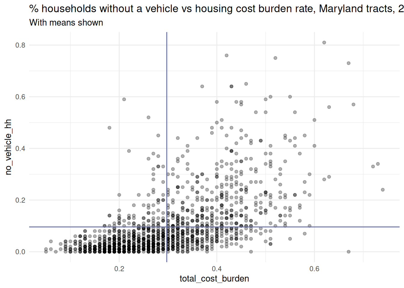
library(ggplot2)theme_set(theme_minimal())pal <- rcartocolor::carto_pal(name ="Vivid")acs_tracts <- justviz::acs |> dplyr::filter(level =="tract")md_avg <- acs_tracts |> dplyr::summarise(no_vehicle_hh =mean(no_vehicle_hh, na.rm =TRUE),total_cost_burden =mean(total_cost_burden, na.rm =TRUE) )ggplot(acs_tracts, aes(x = total_cost_burden, y = no_vehicle_hh)) +geom_point(alpha =0.3) +# horizontal line with avg no vehiclegeom_hline(yintercept = md_avg$no_vehicle_hh,linetype ="solid",color = pal[2],linewidth =0.5 ) +# vertical line with avg cost burdengeom_vline(xintercept = md_avg$total_cost_burden,linetype ="solid",color = pal[2],linewidth =0.5 ) +labs(title ="% households without a vehicle vs housing cost burden rate, Maryland tracts, 2024",subtitle ="With means shown" )
Technically, I should calculate the weighted mean. Luckily tracts are designed to be about 4,000 people, but if I were using geographies with different populations, I would need weighted means. Even with something as similar as tracts, weighted means are the proper move. (That’s actually how I calculated the statewide rates in the CDC data.)
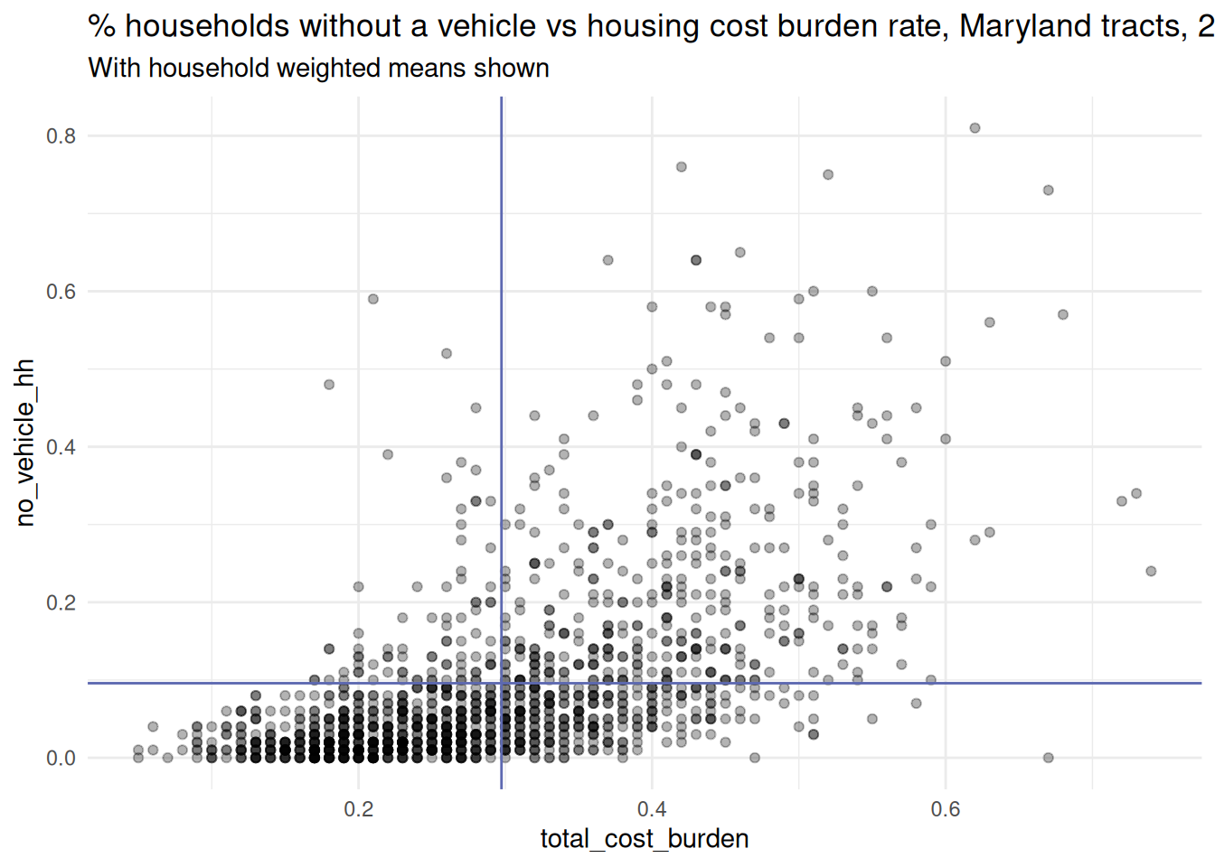
In this case, weighted & unweighted means of cost burden are exactly the same; for households without a vehicle, they’re less than 1 percentage point apart.
# weight by number of households, since these are both housing-related measures# otherwise would weight by number of peoplemd_wtd_avg <- acs_tracts |> dplyr::summarise(no_vehicle_hh =weighted.mean( no_vehicle_hh,w = total_hh,na.rm =TRUE ),total_cost_burden =mean(total_cost_burden, w = total_hh, na.rm =TRUE) )ggplot(acs_tracts, aes(x = total_cost_burden, y = no_vehicle_hh)) +geom_point(alpha =0.3) +# horizontal line with avg no vehiclegeom_hline(yintercept = md_avg$no_vehicle_hh,linetype ="solid",color = pal[2],linewidth =0.5 ) +# vertical line with avg cost burdengeom_vline(xintercept = md_avg$total_cost_burden,linetype ="solid",color = pal[2],linewidth =0.5 ) +labs(title ="% households without a vehicle vs housing cost burden rate, Maryland tracts, 2024",subtitle ="With household weighted means shown" )
If you have more than one or two aggregations to show, you might want to use a second data frame:
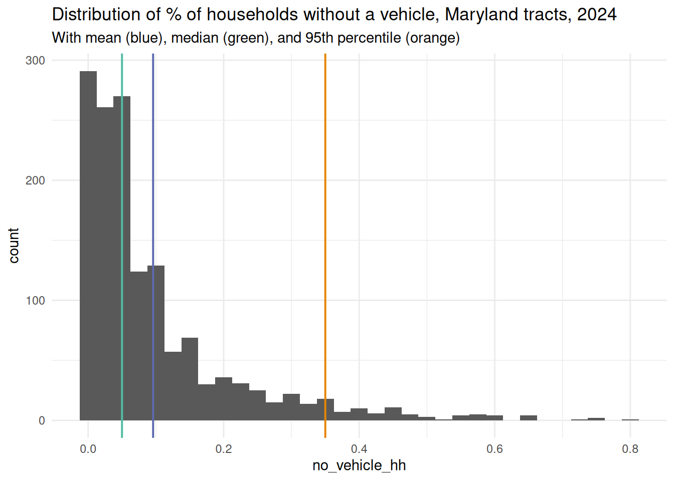
# going back to unweighted for this example because# weighted quantiles come from a different package, Hmiscdist_avg <- acs_tracts |> dplyr::filter(!is.na(no_vehicle_hh)) |> dplyr::summarise(no_vehicle_mean =mean(no_vehicle_hh),no_vehicle_median =median(no_vehicle_hh),no_vehicle_95th_pct =quantile(no_vehicle_hh, probs =0.95) )dist_avg
no_vehicle_mean
no_vehicle_median
no_vehicle_95th_pct
0.0959066
0.05
0.35
# hardcoding all these geom_vlines sucks and doesn't scale wellggplot(acs_tracts, aes(x = no_vehicle_hh)) +geom_histogram(binwidth =0.025) +geom_vline(xintercept = dist_avg$no_vehicle_mean,color = pal[2],linewidth =0.7 ) +geom_vline(xintercept = dist_avg$no_vehicle_median,color = pal[3],linewidth =0.7 ) +geom_vline(xintercept = dist_avg$no_vehicle_95th_pct,color = pal[1],linewidth =0.7 ) +labs(title ="Distribution of % of households without a vehicle, Maryland tracts, 2024",subtitle ="With mean (blue), median (green), and 95th percentile (orange)" )
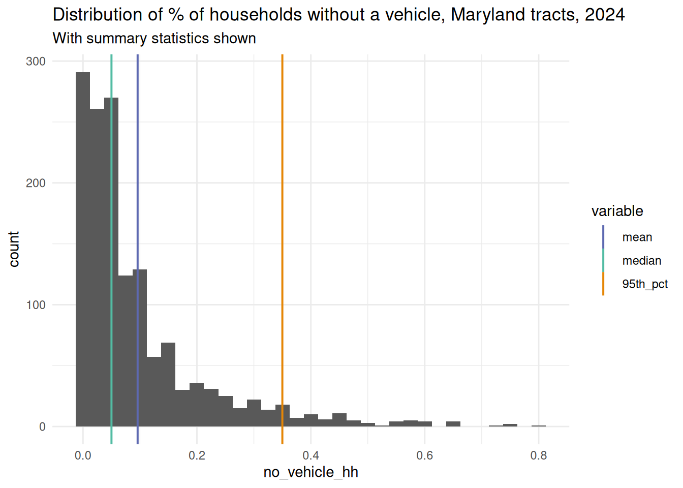
# reshaping the average data frame and mapping to aesthetics is cool and Flexible# also that gets us a legenddist_avg_tidy <- dist_avg |> tidyr::pivot_longer(cols = dplyr::everything(),names_to ="variable",values_to ="value" ) |># just get the type of summary stat, make a factor to keep in order dplyr::mutate(variable = stringr::str_remove(variable, "no_vehicle_") |> forcats::as_factor() )# vline can take either a hardcoded intercept or an aes call to map from a variableggplot(acs_tracts, aes(x = no_vehicle_hh)) +geom_histogram(binwidth =0.025) +geom_vline(aes(xintercept = value, color = variable),data = dist_avg_tidy,linewidth =0.7 ) +# keep same order of colorsscale_color_manual(values = pal[c(2, 3, 1)]) +labs(title ="Distribution of % of households without a vehicle, Maryland tracts, 2024",subtitle ="With summary statistics shown" )
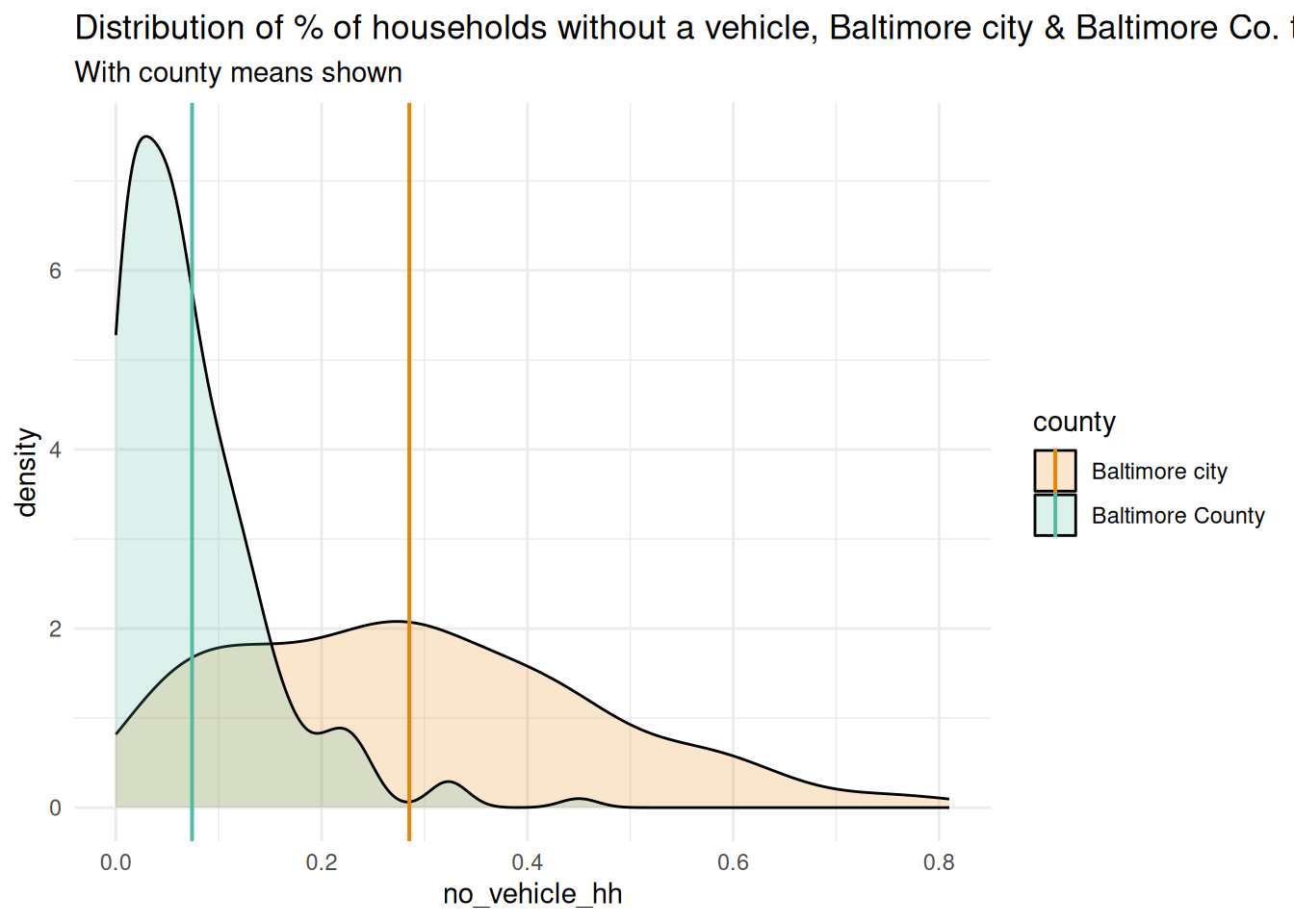
ggplot(balt_tracts, aes(x = no_vehicle_hh, fill = county)) +geom_density(alpha =0.2) +geom_vline(aes(xintercept = no_vehicle_mean, color = county),data = balt_avg,linewidth =0.7 ) +scale_fill_manual(values = pal[c(1, 3)]) +scale_color_manual(values = pal[c(1, 3)]) +labs(title ="Distribution of % of households without a vehicle, Baltimore city & Baltimore Co. tracts, 2024",subtitle ="With county means shown" )
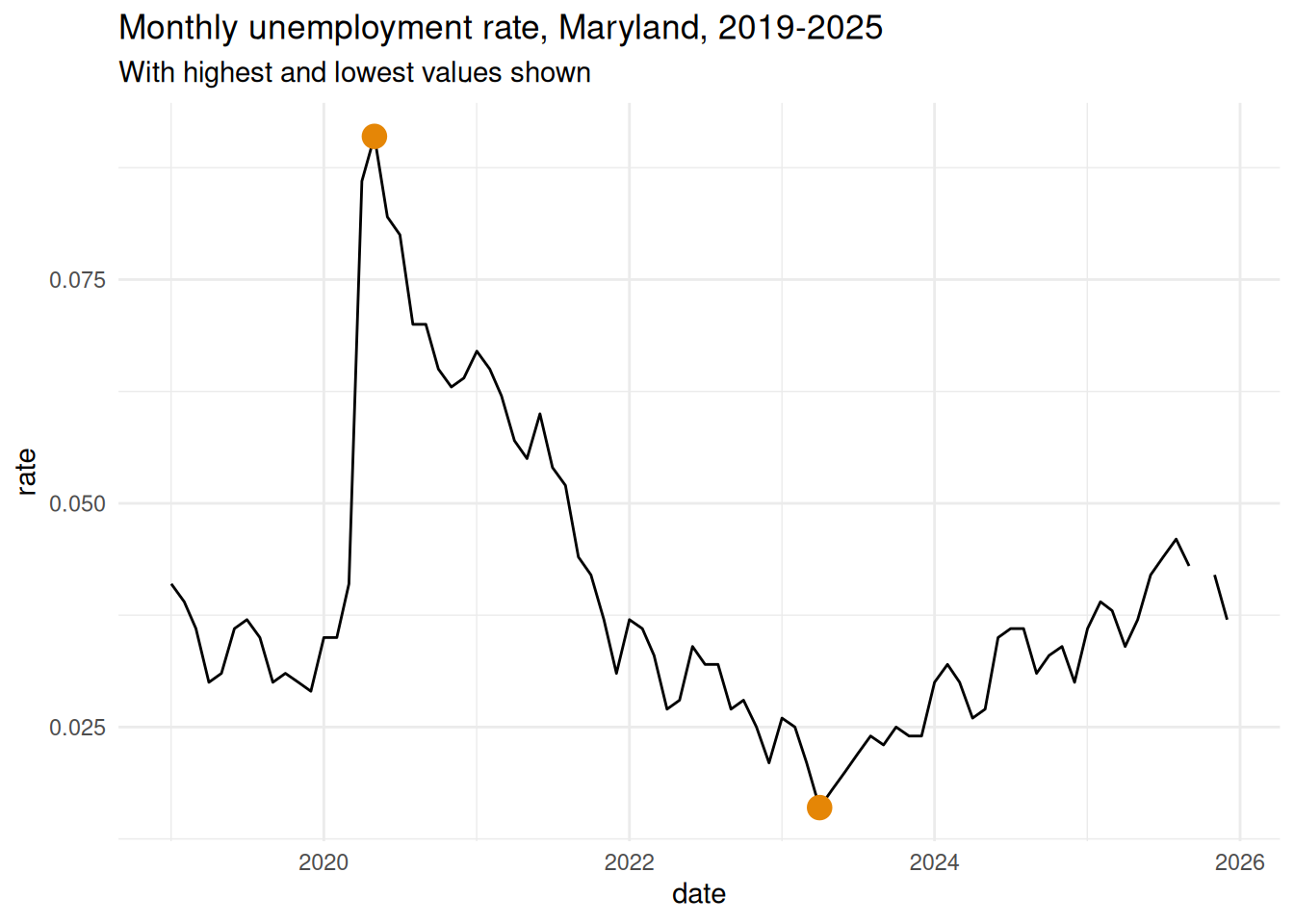
This is also helpful for places you want to highlight. We could show similar markings over a trendline to show something like min & max values that would be uniform across the whole chart. Or we can use summary stats to pull out points to highlight, retaining other information like where those extreme values occurred.
recent_md_unemp <- justviz::unemployment |> dplyr::filter(name =="Maryland", lubridate::year(date) >=2019)unemp_extreme_vals <- recent_md_unemp |> dplyr::summarise(max_rate =max(rate, na.rm =TRUE),min_rate =min(rate, na.rm =TRUE) )# extract observations with these values (there are other ways, this feels most straightforward)unemp_extreme_obs <- recent_md_unemp |> dplyr::filter( rate %in%c(unemp_extreme_vals$max_rate, unemp_extreme_vals$min_rate) )ggplot(recent_md_unemp, aes(x = date, y = rate)) +geom_line() +geom_point(data = unemp_extreme_obs, color = pal[1], size =4) +labs(title ="Monthly unemployment rate, Maryland, 2019-2025",subtitle ="With highest and lowest values shown" )
There are many many other ways to use summary stats in your visualizations, especially for building context, but these should be enough examples to get you started.