| mean_homeownership | median_homeownership |
|---|---|
| 0.6762981 | 0.745 |
Hacking together a legend
Here’s a way to get a legend when your main dataset doesn’t necessarily get you one: create a little dummy dataset of your aggregate values or baselines or whatever else, and assign its values to the encodings you want. Here I make a data frame of just the mean and median across all tract observations, then “tidy” it into a long-shaped data frame so I have one column with the measure type and one with the corresponding values.
| measure | homeownership |
|---|---|
| mean_homeownership | 0.6762981 |
| median_homeownership | 0.7450000 |
Now assign measure to some aesthetics that will have legends associated with them, such as color and linetype:
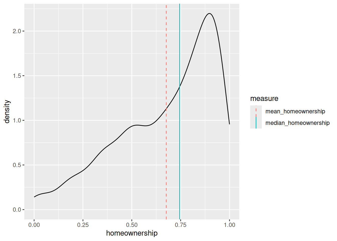
This can get kind of hacky. In fact, I went looking on Stack Overflow for questions about hacking ggplot legends (there are 7,716 questions tagged “ggplot2” about legends) and ended up answering one myself, albeit one based on some bad design choices.
Back to top