06. Details, summarization, specificity, and uncertainty
Author
Camille Seaberry
Modified
September 22, 2026
Level of detail
Because data visualization is an abstraction and representation of data—one where you have had a subjective hand in deciding how to represent it—one of your main decisions is how much detail to include. It’s rare that you can show every data point you have, or every feature you know of an observation. And if you try to, it’s unlikely it will be legible or have patterns that are discernable to most people.
For example, the ACS data we work with has 60926 pieces of information in it (rows x columns). When we made scatterplots last week, we were working with about 1,500 observations with 2 encodings (x & y position), and even then we had to come up with strategies to make it less crowded.
You have to figure out the level of detail that’s appropriate for a given chart, which will depend on many things, such as:
your audience (What do they need? How fluent are they in reading data visualizations? How much time do they have?)
your chart’s context (Will this 1 chart have to stand on its own, or will it be part of a larger spread, article, poster, campaign, book, etc?)
the reliability of the data (Are observations of smaller groups or populations trustworthy?)
You’ll be limited first by what’s available—small sample sizes, missing measurements, survey questions that change—and after that you’ll make further compromises. The strategy I find works best is to start out more granular in EDA to get a more full picture of the data and identify patterns in it. Then as I figure out patterns (still in EDA), I start sketching charts that zoom further and further out. Then, based on the project and the needs of my audience, I’ll figure out how abstract it needs to be, maybe squeeze in a little extra detail, and start drafting something that could become public.
This is also especially hard with static visualizations. Interactive visualizations give you some leeway—maybe the user can zoom in on the level they want, or hover over specific points—but have tradeoffs.
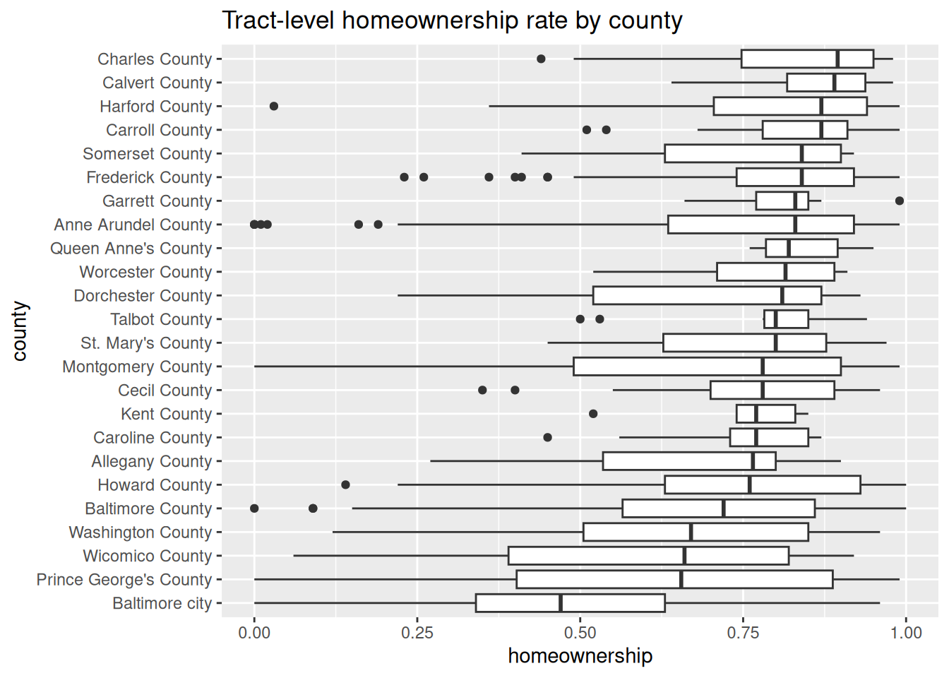
So when I’m doing EDA and want to get a sense of the distribution of my variables, I’ll make something like this:
justviz::acs |> dplyr::filter(level =="tract", total_hh >=100, !is.na(homeownership)) |> dplyr::mutate(county = forcats::as_factor(county) |> forcats::fct_reorder(homeownership, .fun = median) ) |>ggplot(aes(x = homeownership, y = county)) +geom_boxplot() +labs(title ="Tract-level homeownership rate by county")
That has a lot of information: for each county, the boxplot shows its median, its 25th and 75th percentiles, the upper and lower values considered cutoffs for outliers, and the values of any outliers. If you look at the docs (?geom_boxplot) there are even more bits of data I could encode here.
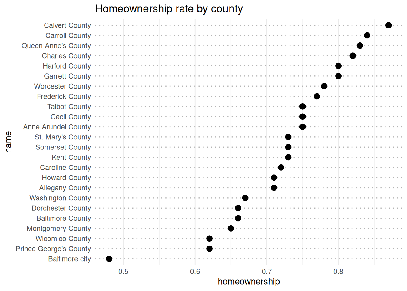
Most people don’t know or care what all of that means (sad but true). Instead, they’ll probably just want the overall values for each county, or just to know about their own county and how it compares to other areas.
This type of chart is called a Cleveland dot plot, named after William Cleveland whose research on how people read and interpret visual encodings you read a couple weeks ago. This is a great alternative to a bar chart where you want to show one or a few values for each category, with the categories ordered to show their relative rank, and where the focus should be on the spread of numbers more than the absolute values.
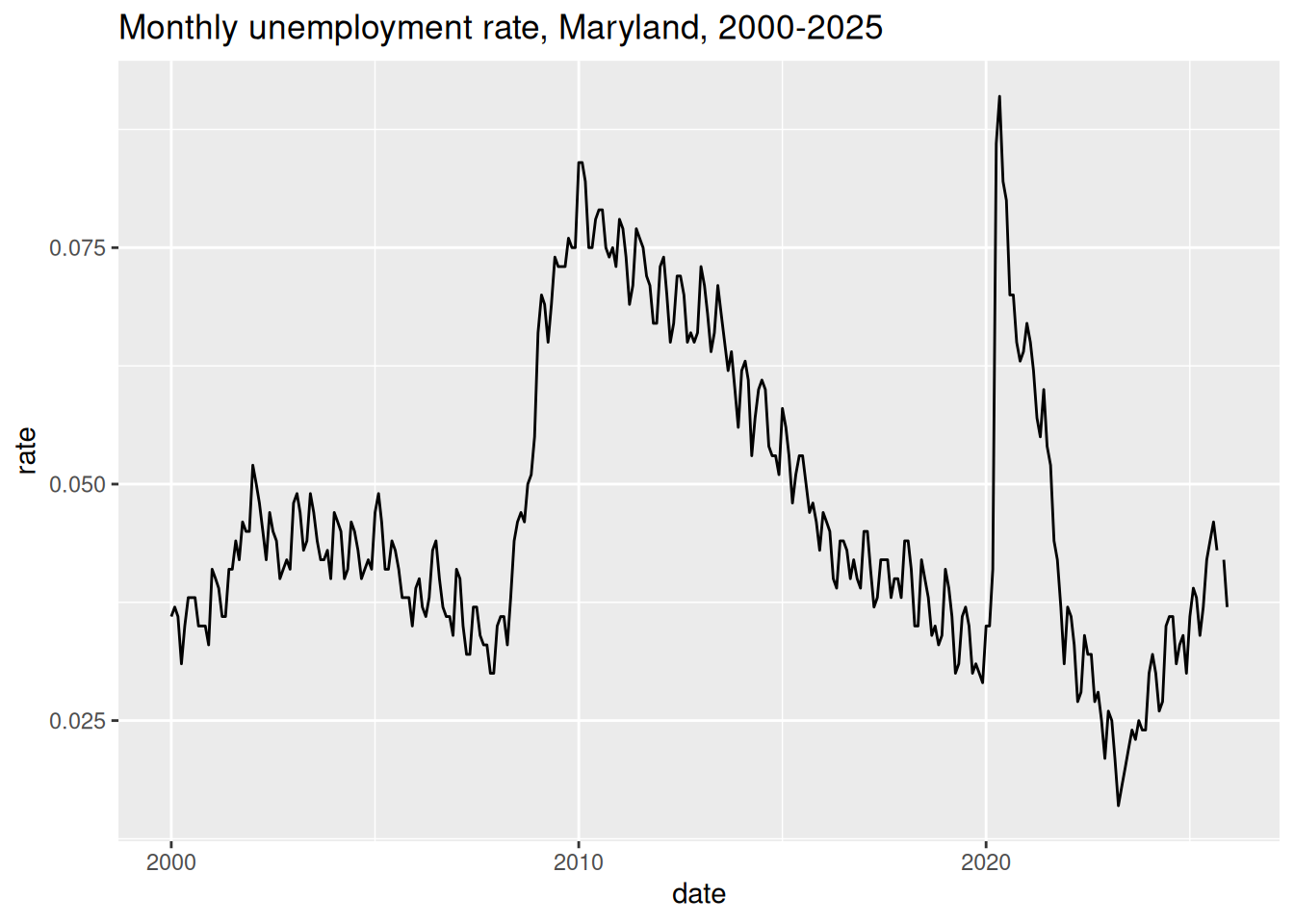
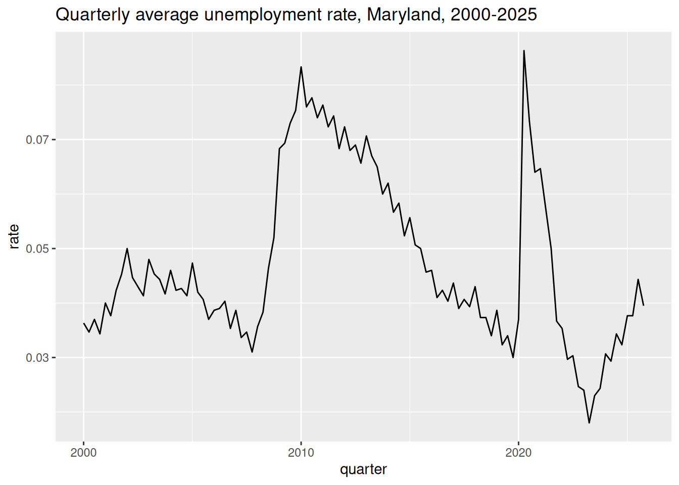
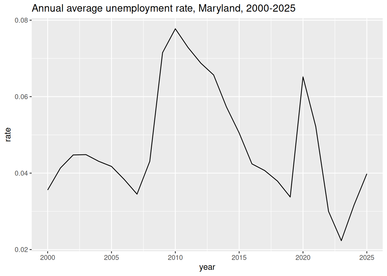
It’s easy to simplify your data too much. This happens pretty easily with trend lines. Here’s Maryland unemployment rates:
Even washed out like this, you can see the post-9/11 economy, the Great Recession, and covid, but it’s losing important specificity. Unemployment at the start of covid was a jolt; it came on very quickly, but it also subsided quickly. (Unemployment is also a very imperfect measure that, especially during a disaster, will miss lots of unemployed people.) The spike in May 2020 (9.1%) is higher than the peak during the recession (8.4%, January & February 2010). But those high values during the recession lasted a long time, so the entire year of 2010 was very high. Meanwhile other than a couple months, 2020 averages out to a pretty normal year. We end up with a chart that shows a larger peak in 2010 than in 2020, even though 2020’s peak itself was higher. This is how you gaslight people with data viz.
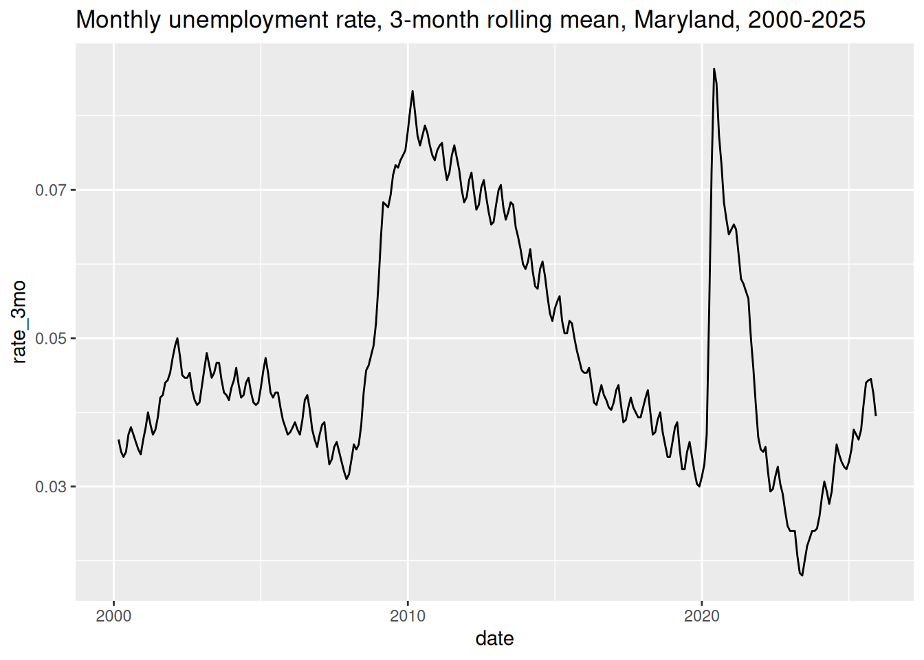
A better way to smooth out data like this is rolling averages. I usually use the tsibble and slider packages for making time series data frames and sliding averages, respectively. Rolling averages are especially helpful for something where you expect a fair amount of noise in the data, like from something relatively rare or unpredictable; we use rolling means for showing trends in drug overdose deaths. (You can do this without a special time series data type but I’m always nervous I’ll mess up a time series, so I opt for tools specially designed for it.)
md_unemp_rolling <- md_unemp |> dplyr::mutate(date = tsibble::yearmonth(date)) |> tsibble::as_tsibble(index = date, key = name) |> tsibble::group_by_key() |># take the mean of the current month and the 2 before dplyr::mutate(rate_3mo = slider::slide_dbl( rate, mean,.before =2,.complete =TRUE,na.rm =TRUE ) )md_unemp_rolling |> tibble::as_tibble() |> dplyr::mutate(date =as.Date(date)) |>ggplot(aes(x = date, y = rate_3mo)) +geom_line() +labs(title ="Monthly unemployment rate, 3-month rolling mean, Maryland, 2000-2025" )
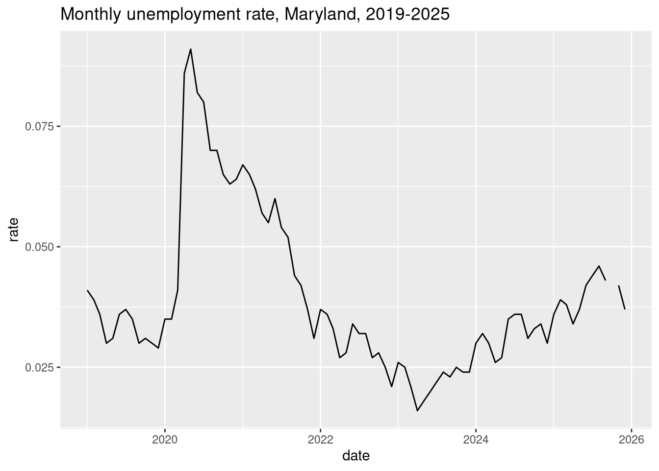
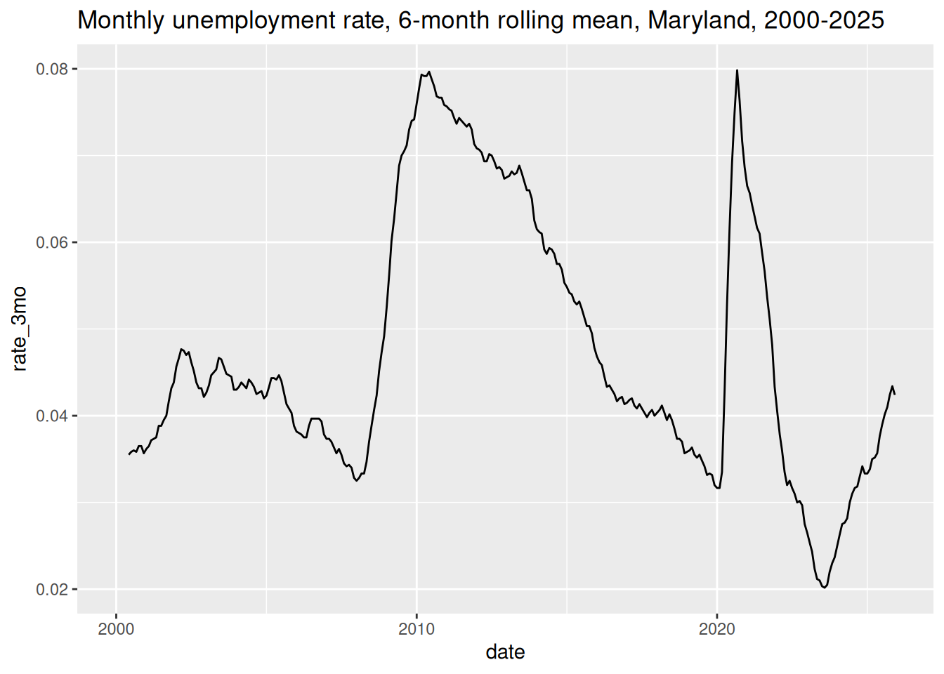
I knew there was something iffy with the annual average data because I know what these numbers should be, so I caught the fact that the covid peak was washed out. I often use 3 months as a rolling average size anyway, but in this case that’s especially important since 3 months is about the time that spike lasted. You’ll lose that magnitude if you average across a bigger window; here’s a 6-month rolling mean instead.
So this is, as always, an example of why you need to know your data first.
Uncertainty
It can be really hard to imagine or estimate uncertainty. We expect data to be exact, and it pretty much never is. Visualization can help explain this to people, but that can conflict with our usual desire to make our visualizations simple and quick to read. In fact, I dropped all the margins of error from the datasets in the justviz package when I made it, so I’m part of the problem.
Wilke’s chapter on uncertainty has some good examples of how to show uncertainty in terms of margin of error in a few different types of charts. At the same time, there are some arguments against using error bars like he’s done in some of the examples. One of the (possible) case study readings (Correll & Gleicher (2014)) finds that these can actually harm people’s ability to understand uncertainty.
Correll, M., & Gleicher, M. (2014). Error Bars Considered Harmful: Exploring Alternate Encodings for Mean and Error. IEEE Transactions on Visualization and Computer Graphics, 20(12), 2142–2151. https://doi.org/10.1109/TVCG.2014.2346298
Probably the most famous and famously controversial recent attempt at visualizing uncertainty was the gauge chart the New York Times used on election night 2016. It was meant to show that the vote margins were in flux as counts came in, but the jittering effect was actually hard-coded into the visualization rather than based directly on tallies updating. People got extremely stressed and mad.
For working in ggplot, the ggdist package has some good options for showing distributions and uncertainty together (That’s what’s used in the Wilke chapter as well).
Showing error
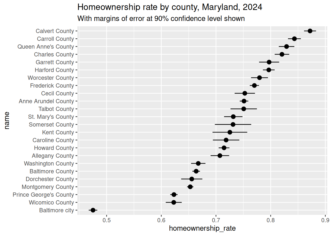
To make up for having dropped MOEs earlier, I redid the analysis of homeownership by county with MOEs intact for the estimates of counts and my calculation of the rate. 1 Some simple ways to show the uncertainty as described by MOE could be error bars or the strategies in ggdist to make the estimates visually blurry. The built-in range functions (see ?geom_errorbar for all of them) take a position along with min & max endpoints.
tenure_moe |> dplyr::mutate(upper_rate = homeownership_rate + homeownership_rate_moe,lower_rate = homeownership_rate - homeownership_rate_moe ) |>ggplot(aes(x = homeownership_rate, y = name)) +geom_pointrange(aes(xmin = lower_rate, xmax = upper_rate)) +labs(title ="Homeownership rate by county, Maryland, 2024",subtitle ="With margins of error at 90% confidence level shown" )
Notice a few things:
Some counties have wider margins of error. This can come from many places—actual size of each variable for the county, sample size of each variable in the county in the survey data. For these estimates, the relationship between the estimate of a count and the MOE of that same count is roughly but not perfectly linear.
The Census Bureau uses 90% confidence levels for its estimates (at least in their tables of ACS data), whereas 95% is often standard. I’m sure there’s a justification for it. If you do your own analyses from their microdata samples, as I did for the wage gap data, you can set whatever confidence level you want, but for consistency you should probably still do 90%.
I took the advice from Wilke and said explicitly up top what the error bars represent, because “error” can mean many different things.
Note also that this type of chart isn’t limited to error; you can also use something like to show the spread of different quantiles in a distribution.
Quantifying subjective descriptions
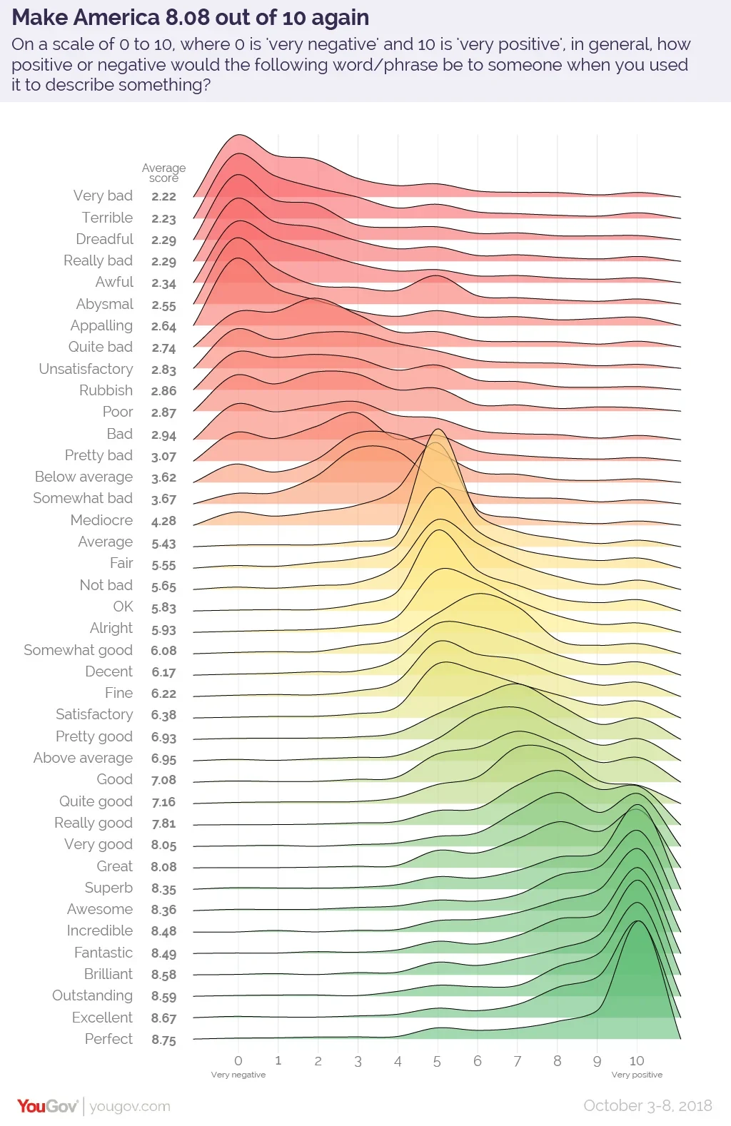
See this experiment from YouGov on how people quantify relative descriptors like “good,” “bad,” or “excellent.” There was a similar survey a few years ago on Reddit with descriptions of probabilities (e.g. “a good chance,” “almost certain”). Turns out people don’t all do this the same, and you should keep that in mind when working with and describing data. No matter what, someone will interpret your work strangely, such as the people in that survey who rated “perfect” as 5 out of 10. (Also shows impact of vocab: Americans don’t know how to quantify “rubbish”.)
This type of plot is called a ridgeline plot or sometimes a joyplot, named after the visualization of pulsar data on the cover of Joy Division’s excellent 1979 album.
You can use the ggridges package to make ridgeline plots. (Getting even more off-topic, Wilke changed the name of the package from ggjoy to ggridges because of the gruesome meaning of the band’s name.)
There are lots of strategies for handling missing data, and lots of reasons why data would be missing ranging from logistical and benign to political, bigoted, or malicious. We could investigate missingness for a whole semester. Some reasons that I encounter regularly are:
Small sample sizes or other limitations in data collection
Changing wording in questionnaires or common parlance (definitions of race and/or ethnicity have changed many many times over the course of the US decennial census.)
Destruction of records (plenty of reasons to purge documents, some good, some bad. One of the datasets I use to teach this course was deleted in the early 2025 purge of federal data but I’d already made a copy)
Simplification of categories and other gray areas (binary gender, lumping ethnic groups together)
Weird outside circumstances (covid disrupted a lot of data collection)
On the first run of the census in 1790, the demographic groups were free white men, free white women, all other free people, and slaves (no gender).
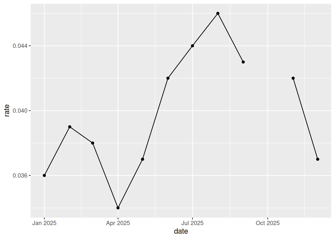
That last one shows up in the unemployment data. If we zoom in, we can see there’s a small gap (ggplot also throws a warning about missing values):
Warning: Removed 1 row containing missing values or values outside the scale range
(`geom_point()`).
md_unemp |>
    dplyr::filter(is.na(rate))
name
date
rate
Maryland
2025-10-01
NA
The missing month is October 2025, when there was a federal government shutdown that prevented the Bureau of Labor Statistics from releasing unemployment data. I thought maybe they’d put it out retroactively, since they do go back at revise numbers all the time, but that didn’t happen. We ran into this at my job with an analysis we were doing where we were comparing a few years’ annual averages. We ended up just averaging the other 11 months for our 2025 number and including a note about that month being missing; our next best option was using 2024 instead, but we wanted more up-to-date data. That’s why it was on my radar to point out to you now.
You could handle that in a few different ways.
The easiest is to just leave a gap like I already did. That’s not wrong, but it might not be great.
You could impute the missing value. Rolling means are one way to do this.
For more complex data with more observations missing, you might build a larger model to fill in missing points. I’ve done this for employment counts using a LOESS model, or to estimate median incomes above the Census Bureau’s upper threshold by modeling with other economic and housing characteristics.
A fine compromise for just a small gap like this is to use a solid line for the actual observed values and a dotted line to jump between them. I recently did this to denote the 2 years of missing K-12 standardized test data during lockdown. We’ll work through an approach in this week’s lab.