Some notes on wrangling data for visualization. We won’t have time to go into a lot of detail, but there are lots of resources available to help solve these sorts of problems, such as:
Wickham, H., Çetinkaya-Rundel, M., & Grolemund, G. (2023). R for data science (2nd ed.). O’Reilly Media, Incorporated. https://r4ds.hadley.nz/
Also, for folks who haven’t yet taken GES 668, Building Spatial Datasets, see that class’s online notes, especially Week 4.
I was able to quickly get the notes for our class set up by copying the basic template Eli was using for Building Spatial Datasets. Shout out to open source.
Some concerns in wrangling data as they relate to our work with ggplot:
the shape (is it a tidy format, i.e. has observations of given types in rows and features/variables in columns)
what’s included (filtering out data we don’t need to visualize)
additional encodings (deriving new variables from existing ones)
I like to think through what I’ll need in order to make the plot I want, especially what visual encodings there will be, then work backwards from there as needed.
Example 1
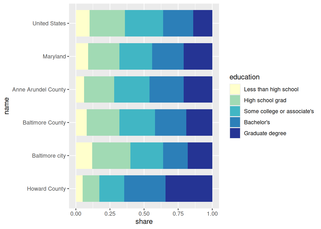
I want to use the ACS data to make a stacked bar chart of education level for the US, the state, and a few counties. The encodings I’ll need are:
location (discrete) on the y-axis, ordered by geographic level (nation / state / county)
value / percent share (continuous) on the x-axis
education (discrete ordinal) as fill, ordered by level (less than high school / high school only / some college or associate’s / bachelors / graduate degree)
Note that for a stacked bar chart, each segment will correspond to the share of adults in each location with each level of education, e.g. there will be one segment for the share of adults in Baltimore city with a graduate degree; its y position will be in a row for the city, its length will correspond to the value, and its position within the bar will depend on the education level relative to the other education levels (should be the last level).
First, I’ll subset the data for just the rows (US, MD, selected counties) and columns (level, name, all the education-related variables) I need. With most dplyr functions, you can use bare column names (i.e. don’t need quotation marks). This is part of a more complicated programming paradigm that I can barely explain, certainly not in these notes.
library(ggplot2)# grab a sequential color paletteseq_pal <- RColorBrewer::brewer.pal(n =5, name ="YlGnBu")edu <- justviz::acs |> dplyr::filter( name %in%c("United States","Maryland","Baltimore city","Baltimore County","Anne Arundel County","Howard County" ) ) |> dplyr::select( level, name, less_than_high_school, high_school_grad, some_college_or_aa, bachelors, grad_degree )edu
level
name
less_than_high_school
high_school_grad
some_college_or_aa
bachelors
grad_degree
us
United States
0.10
0.26
0.28
0.22
0.14
state
Maryland
0.09
0.23
0.24
0.23
0.21
county
Anne Arundel County
0.06
0.22
0.26
0.25
0.21
county
Baltimore County
0.08
0.24
0.26
0.23
0.19
county
Baltimore city
0.12
0.28
0.24
0.18
0.18
county
Howard County
0.05
0.12
0.18
0.30
0.34
In order to have education level mapped to bar fill and percentage of adults with each education level by location mapped to the length of a bar segment, I’ll need one variable to assign to fill and one variable to assign to x. That means I need to reshape the data from a wide format to a long format, i.e. I need to tidy it. tidyr::pivot_longer will take us from a wider data frame to a longer one. (Guess what tidyr::pivot_wider does.) It has some complicated arguments but we’ll keep it simple: which columns will be reshaped into a single column, what will that column be called, and what will those columns’ values be called.
Older code will use tidyr::gather and tidyr::spread; these still work, but have been deprecated a few years now.
edu_tidy <- edu |># there are other ways to select columns---see tidyselect docs---but it's good to start out explicit tidyr::pivot_longer(cols =c( less_than_high_school, high_school_grad, some_college_or_aa, bachelors, grad_degree ),names_to ="education",values_to ="share" )edu_tidy
level
name
education
share
us
United States
less_than_high_school
0.10
us
United States
high_school_grad
0.26
us
United States
some_college_or_aa
0.28
us
United States
bachelors
0.22
us
United States
grad_degree
0.14
state
Maryland
less_than_high_school
0.09
state
Maryland
high_school_grad
0.23
state
Maryland
some_college_or_aa
0.24
state
Maryland
bachelors
0.23
state
Maryland
grad_degree
0.21
county
Anne Arundel County
less_than_high_school
0.06
county
Anne Arundel County
high_school_grad
0.22
county
Anne Arundel County
some_college_or_aa
0.26
county
Anne Arundel County
bachelors
0.25
county
Anne Arundel County
grad_degree
0.21
county
Baltimore County
less_than_high_school
0.08
county
Baltimore County
high_school_grad
0.24
county
Baltimore County
some_college_or_aa
0.26
county
Baltimore County
bachelors
0.23
county
Baltimore County
grad_degree
0.19
county
Baltimore city
less_than_high_school
0.12
county
Baltimore city
high_school_grad
0.28
county
Baltimore city
some_college_or_aa
0.24
county
Baltimore city
bachelors
0.18
county
Baltimore city
grad_degree
0.18
county
Howard County
less_than_high_school
0.05
county
Howard County
high_school_grad
0.12
county
Howard County
some_college_or_aa
0.18
county
Howard County
bachelors
0.30
county
Howard County
grad_degree
0.34
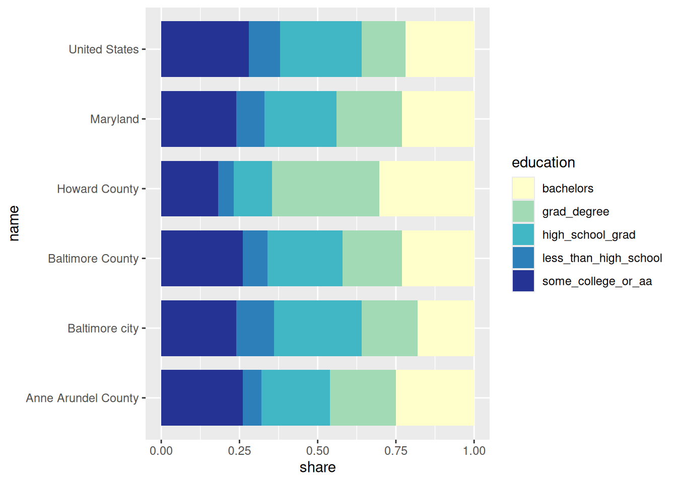
Now each row is a unique combination of geographic level, location, education level, and percentage. I could plot it like this to get started:
edu_tidy |>ggplot(aes(x = share, y = name, fill = education)) +geom_col(width =0.8, position =position_fill()) +scale_fill_manual(values = seq_pal)
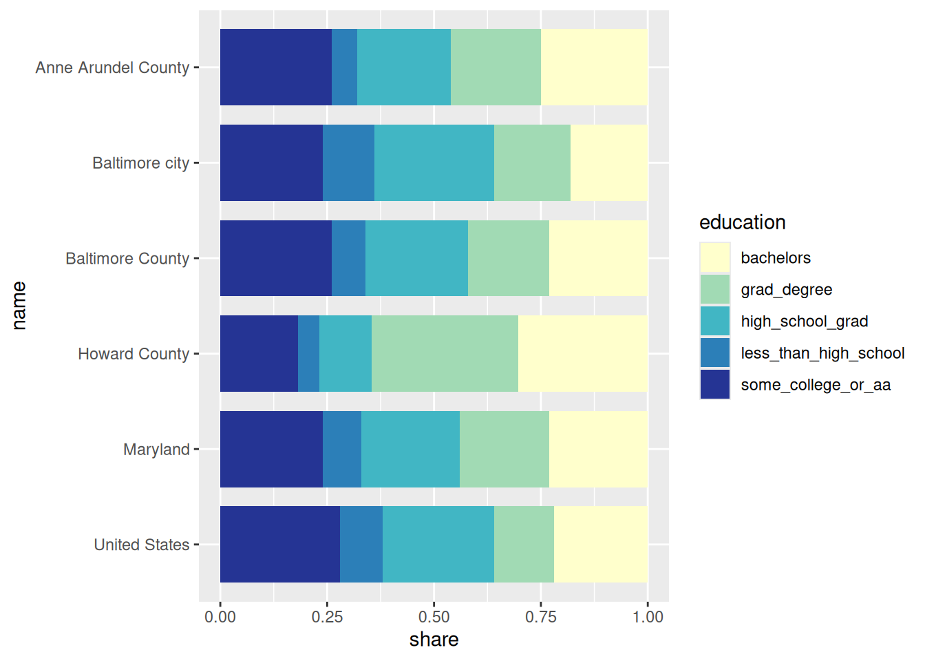
Pay attention to the orders of our categorical variables: location (y-axis) is in alphabetical order starting at the bottom, and education level is in alphabetical order from the top of the bar to the bottom. You could keep location in alphabetical order and just flip it (A on top, Z on bottom); it’s not wrong. In my work, however, it’s usually more correct to order first by geographic level, then alphabetically within geographic levels.
The most surefire way to get categorical variables in the order you want is to make them into factors, and forcats is a great package for helping with that.
By default, R orders factors alphabetically. We can then reverse the order of levels with forcats::fct_rev.
edu_tidy |> dplyr::mutate(name =factor(name) |> forcats::fct_rev()) |>ggplot(aes(x = share, y = name, fill = education)) +geom_col(width =0.8, position =position_fill()) +scale_fill_manual(values = seq_pal)
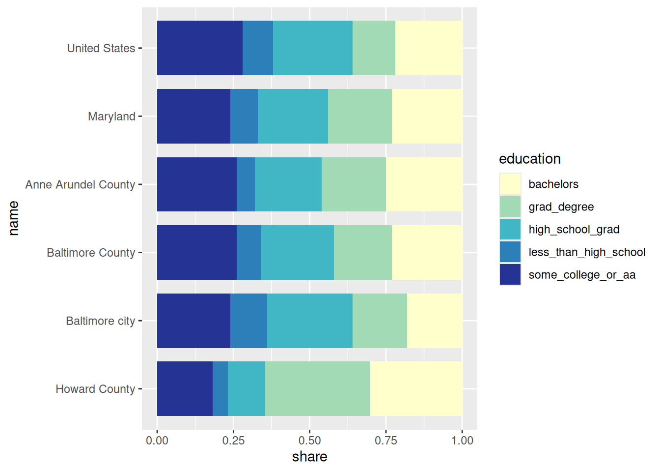
If we want to order locations by geographic level, we have a few options. forcats::as_factor will convert the variable to a factor, with levels ordered as they appear. I set the data up to be ordered by geographic level, so this is actually all you need here because I was looking out for you. But if that weren’t the case, you could make geographic level a factor in a logical order, then make location name a factor, then arrange the data frame by geographic level and name, then make location name a factor with that order. Here’s the more complicated version of that so you have it as reference:
edu_tidy |> dplyr::mutate(level = forcats::as_factor(level)) |> dplyr::arrange(level, name) |> dplyr::mutate(name = forcats::as_factor(name) |> forcats::fct_rev()) |>ggplot(aes(x = share, y = name, fill = education)) +geom_col(width =0.8, position =position_fill()) +scale_fill_manual(values = seq_pal)
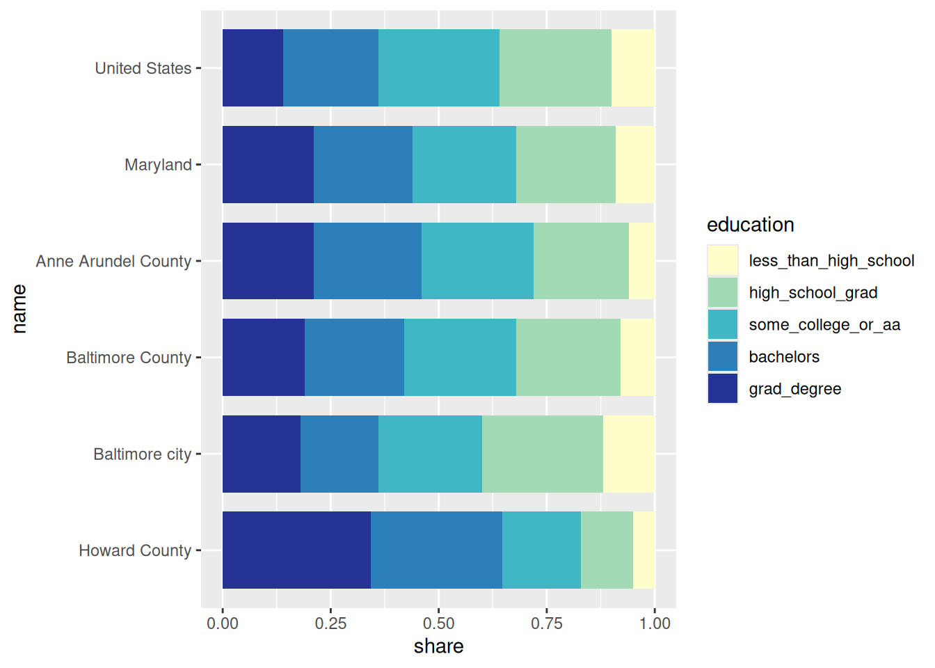
While the order of locations didn’t have a single right answer, the order of education levels does. One is by definition higher than another. I put the columns in order when I built the data frame (again, looking out for you), and when tidyr::pivot_longer reshapes the data, it keeps education in the order it encounters their columns, so we can just use that ordering and make education a factor:
(If you didn’t have a professor who set things like this up to make it easier on you, you could also order the education levels manually with forcats::fct_relevel.)
Lastly, we’ll clean up the levels of the education factor. Right now they have values that can work as syntactically valid column names—that’s where they came from, after all. I like the snakecase package for starting my string cleaning like this, then doing manual clean-up as needed. forcats::fct_relabel takes a function to apply (I love functional programming but we won’t get to do much with it), and forcats::fct_recode replaces levels manually.
edu_tidy |> dplyr::mutate(level = forcats::as_factor(level)) |> dplyr::arrange(level, name) |> dplyr::mutate(name = forcats::as_factor(name) |> forcats::fct_rev()) |> dplyr::mutate(education = forcats::as_factor(education) |> forcats::fct_relabel(snakecase::to_sentence_case) |> forcats::fct_recode("Some college or associate's"="Some college or aa","Bachelor's"="Bachelors","Graduate degree"="Grad degree" ) ) |>ggplot(aes(x = share, y = name, fill = education)) +# add reverse = TRUE to order from bottom of bar to topgeom_col(width =0.8, position =position_fill(reverse =TRUE)) +scale_fill_manual(values = seq_pal)
Example 2
Next I’ll make changes to the CDC dataset to make a table of multiple variables. As it stands, the data is already tidy, but for a table I’d print, I actually want it untidy. That is, I’ll want each health condition as a column, and each location as a row.
Warning
FYI You’ll need justviz version 0.2.6 for this, because I just found a bug in how the CDC data labeled Baltimore city vs Baltimore County (they were both just Baltimore) while working on this!
First I’ll pull together a subset of the data for the country, state, Baltimore city, and Baltimore County, and just a few indicators I’m interested in. These would all make sense to go in a table together to study access to health care.
health_risk <- justviz::cdc |> dplyr::filter( location %in%c("US", "Maryland", "Baltimore city", "Baltimore County") ) |> dplyr::filter( indicator %in%c("Annual checkup","Health insurance","Dental visit","Mobility disability" ) ) |># don't need population column dplyr::select(-pop)health_risk
level
year
location
indicator
value
us
2023
US
Health insurance
11.000000
us
2022
US
Dental visit
63.900000
us
2023
US
Annual checkup
77.700000
us
2023
US
Mobility disability
13.500000
state
2022
Maryland
Dental visit
63.390038
state
2023
Maryland
Annual checkup
78.681404
state
2023
Maryland
Health insurance
9.050286
state
2023
Maryland
Mobility disability
12.294061
county
2023
Baltimore city
Health insurance
10.100000
county
2023
Baltimore County
Mobility disability
12.700000
county
2023
Baltimore city
Annual checkup
80.400000
county
2023
Baltimore city
Mobility disability
16.500000
county
2023
Baltimore County
Annual checkup
80.300000
county
2022
Baltimore County
Dental visit
63.500000
county
2023
Baltimore County
Health insurance
8.100000
county
2022
Baltimore city
Dental visit
54.100000
A few things I notice:
In the chart, I had United States instead of US, and I want that to match here
Locations should be in geographic order again (US, MD, counties alphabetically)
Some indicator labels are unclear, but because I read the data documentation, I know how to relabel them
Values will be printed as percentages, but right now are written as though they have a denominator of 100 already (i.e. 12 instead of 0.12 for 12%). I can decide what to do for formatting numbers.
Indicators are from either 2022 or 2023, and I want to note the year in the column names in my table I’ll do this as a second example
# same type of formatter we've defined before, but give it 1 decimal placepercent <- scales::label_percent(accuracy =0.1)health_relabeled <- health_risk |> dplyr::arrange(level) |> dplyr::mutate(location = forcats::as_factor(location)) |> dplyr::mutate(indicator = forcats::as_factor(indicator) |> forcats::fct_recode("No health insurance"="Health insurance") |># reorder to start with access, then outcomes forcats::fct_relevel("No health insurance","Mobility disability","Annual checkup","Dental visit" ) ) |># convert back to decimal to use a percent formatter dplyr::mutate(value =percent(value /100)) |># calling arrange again confirms I have factors in the order I want dplyr::arrange(location, indicator)health_relabeled
level
year
location
indicator
value
us
2023
US
No health insurance
11.0%
us
2023
US
Mobility disability
13.5%
us
2023
US
Annual checkup
77.7%
us
2022
US
Dental visit
63.9%
state
2023
Maryland
No health insurance
9.1%
state
2023
Maryland
Mobility disability
12.3%
state
2023
Maryland
Annual checkup
78.7%
state
2022
Maryland
Dental visit
63.4%
county
2023
Baltimore city
No health insurance
10.1%
county
2023
Baltimore city
Mobility disability
16.5%
county
2023
Baltimore city
Annual checkup
80.4%
county
2022
Baltimore city
Dental visit
54.1%
county
2023
Baltimore County
No health insurance
8.1%
county
2023
Baltimore County
Mobility disability
12.7%
county
2023
Baltimore County
Annual checkup
80.3%
county
2022
Baltimore County
Dental visit
63.5%
Now that the data is formatted how I want, I can reshape it from long to wide. The new columns will be based on unique items in the indicator column, and their corresponding values will be what’s in the value column.
health_wide <- health_relabeled |># think of the id_cols argument as an anchor while you reshape the data tidyr::pivot_wider(id_cols =c(level, location),names_from = indicator,values_from = value ) |> dplyr::rename(Level = level, Location = location)health_wide
Level
Location
No health insurance
Mobility disability
Annual checkup
Dental visit
us
US
11.0%
13.5%
77.7%
63.9%
state
Maryland
9.1%
12.3%
78.7%
63.4%
county
Baltimore city
10.1%
16.5%
80.4%
54.1%
county
Baltimore County
8.1%
12.7%
80.3%
63.5%
Since there are 2 different years in this data, I might want to include the year of each indicator in its column label. I can use more than one column to create names, and supply a separator to go between them:
Realistically, you’ll probably run into other data wrangling needs in this course. I can’t predict them all, but these are some of the basic ones you’ll most likely encounter, and we can work through any others as they come. Also, as always, READ THE DOCS.